
By John Gruber
-Light.png)
Mux — Video API
for developers.
Build better video.
Treating URL Protocol Schemes as Cruft
Monday, 24 November 2008
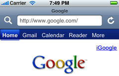
One of the more visible changes in last week’s iPhone OS 2.2 update is a new toolbar in Safari. Here’s the previous toolbar from Safari in iPhone OS 2.1:
It now looks like this:
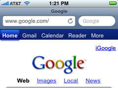
The new toolbar looks much more like an iPhone-sized version of the desktop Safari toolbar, with the rectangular location text field on the left and the oval search text field on the right. But the new toolbar is functionally equivalent to the old one, with the same three tappable targets: location field, search, and reload.
I prefer the old 2.1 toolbar, but, at this point, I’m hesitant to say that the reason amounts to anything more than 17 months of (very frequent) habit. Here’s what the differences amount to:
- The location field is shorter, so you see less of the URL.
- The reload button seems to be a smaller target, and, because it’s so close to the search field, it seems too easy to mistakenly tap the search field when aiming for the reload button.
- The search field is now a bigger target, and therefore easier to tap, but the old 2.1 search button never felt too small to me. They’ve made something bigger that was already big enough.
So two of the three items in the toolbar have been made worse at the expense of improving the other one needlessly.
But I have a theory why Apple did this anyway. My guess is that testing showed that many iPhone users didn’t know that the magnifying glass in the toolbar was a button they could tap to start a web search. The new layout makes it unambiguous what the search item in the toolbar does, and that may well make the small usability hit to the size of the location field and reload button worth it.
To make better use of the available space in the location field, Safari no longer shows the “http://” or “https://” protocol scheme. You do see the protocol scheme, however, when you tap the location field to edit the URL:
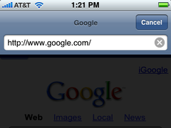
But it’s hidden, sort of like file name extensions in the Mac OS X Finder, in the normal display view.
The best argument in favor of always displaying the protocol scheme is to make it visible when you’re connected via HTTPS, but the lock icon in the location field serves the same purpose, and is almost certainly better recognized by typical users than the extra “s” in “https://”.

This is a pretty clever idea, and once seen in action, it seems so obvious that I’m now surprised that the iPhone version of Safari hasn’t been doing this all along. And it makes me wonder whether the desktop version of Safari will follow this lead — space isn’t at such a premium there, but it’s always struck me as somewhat ungraceful that we spend all day staring at dozens of URLs that all start with the same repetitive prefix.
Various Addenda
DF reader Matt Gough, via email:
It seems Apple could make the Safari address bar more pleasant looking and useful if they just resized the search field to fit the placeholder text for Google or Yahoo!
He included the following mockup:
Looks like a total win to me. It retains the improvement to obviousness, remains a large tap target, and adds a few extra pixels to the location field.
Andy Baio, linking to this article, observes:
I’m a little surprised they didn’t merge the search and location bar into a single field.
Space-wise, this would be very efficient, and for us, the sort of people who read (or write) web sites like the one you’re reading now, it’d be pretty cool. But I think it’d have the wrong effect on the sort of iPhone users who didn’t even know they could initiate a web search from the previous iPhone Safari toolbar. The whole point of this change, I think, was to increase obviousness, even if at the expense of a bit of efficiency.