By John Gruber

Finalist Day Planner:
Made for your Dock
Uniformity vs. Individuality in Mac UI Design
Friday, 7 January 2011
The new Twitter for Mac is somewhat polarizing, what with its almost entirely custom UI. I used to have a fervor for uniform consistency in Mac UI design. A perusal through the early DF archives will show that. But the HIG is dead. It died long ago. And it was Apple that killed it. In Mac OS 9 (and prior), no one’s apps were more uniformly consistent to the HIG standards than Apple’s own. In Mac OS X, Apple began experimenting — especially in their flagship apps. Whether this change has been for better or for worse is certainly debatable, but there can be no debate that the mores of Mac UI designers have changed. Apple sets the tone, for better or for worse. Always has, always will. (No one but Apple could have made Brushed Metal popular.)
This piece today by Tim Morgan offers a detailed and thoughtful critique of the Mac App Store titlebar/toolbar and the new Twitter for Mac — but it’s a critique from the perspective of a critic who still believes in HIG-rooted uniformity.
I spent a few minutes there trying to think of a way to rewrite the preceding sentence without that but. That but sounds dismissive, like I’m using it to say that his criticism, no matter how accurate, can be dismissed, because he still subscribes to a set of standards from a bygone era. That’s not why I used that but, though. (Or, to be honest, at least not only why.) It’s simply that when you read Morgan’s piece — and if you haven’t already, you should as soon as you finish this sentence — it’s worth keeping in mind which of his criticisms fall under “this is non-standard” and which fall under “this isn’t good design”.
There’s a conservative/liberal sort of fork in UI design, in the sense of traditional/non-traditional. The conservatives see non-standard custom UI elements as wrong. Liberals see an app built using nothing other than standard system UI elements as boring, old-fashioned, stodgy.
“This is non-standard” criticisms will thus generate one of two responses. “Agreed, that’s wrong” say the conservatives. “So what?” say the liberals.
“This isn’t good design” criticisms, however, if accurate, are the sort of thing most designers ought to agree with, regardless of their position on the conservative/liberal UI design spectrum. The problem is that once you see that a certain piece of UI criticism is coming from someone at a distant position from yours on the conservative/liberal design spectrum, there’s a natural tendency to close your mind and discount everything they say.
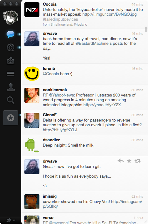
To be clear, here’s the app we’re talking about:

No title bar. Completely custom close/minimize/zoom buttons (which ignore your system-wide settings for color; no red/yellow/green for you). You drag the window using that black sidebar. It’s all set in Helvetica (like iOS apps), not Lucida Grande (like Mac apps).
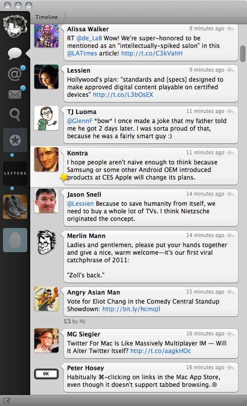
But let’s also be clear about where the app is coming from: Loren Brichter’s Tweetie for Mac:

Brichter, now a full-time employee of Twitter, is still the app’s primary developer. It’s been renamed from “Tweetie” to “Twitter”, but the version number has gone to 2.0 because what we have today is the next version of the same app. You can see it in the screenshots. Same direction, just further out there.
Morgan’s complaints about the Mac App Store app and his initial remarks about Twitter are of the conservative variety: non-standard windows and UI elements are wrong. But then there’s this:
Clicking on the different tabs in the main window (tweets, lists, mentions, etc.) reveals the corresponding content with a “slide out” animation. Upon opening the application, you are presented with your timeline. Click the “@” and your mentions slide out on top of the timeline. Click the timeline again, and you would expect perhaps for the mentions to slide back in, revealing your timeline, but instead your timeline slides out on top of your mentions. This endless sliding out creates a sensation of “stacking” UI views infinitely on top of each other, when in fact you are merely switching between six different tab views.
That’s quite astute, and pinpoints something I found mildly unsettling about the new Twitter for Mac but couldn’t put my finger on. iOS uses these sliding animations to give you a sense of place. The canonical example is Mail on the iPhone. It’s a four-column design: accounts, mailboxes, message list, message contents. You slide left to right, visually, as you navigate between columns. You can’t see more than one column at a time, but the animations help give you a sense of where you are. It’s because of the animation that Apple could make a four-column layout with a screen that was only 320 pixels wide.
Twitter for iPhone follows this model to a T: accounts, tweets, tweet details — arranged left to right, with animation as you move between them. In today’s new Twitter for Mac, though, the sliding animations when you switch between tabs add nothing contextually. They’re not merely harmless eye candy, either. As Morgan notes, these animations create a false sense of stacking where no stack exists. They’re technically excellent,1 but conceptually misleading.2
That’s the sort of criticism that should register regardless of one’s position on the standard-vs.-custom UI design spectrum.
As for where things are going, I think this new Twitter for Mac and the iPad-esque Mac App Store app are it. Morgan closes with a reference to yours truly:
Gruber once said (and for the life of me I can’t find the quote) that the difference between the Mac OS and iOS is that you don’t need to be a designer to make a good-looking Mac app: Apple provides you the assets you need; if you adhere to common sense and the HIG, you will create a good-looking (if not unique) application. On the iOS, all the best apps have had enormous amounts of design effort invested in them. As the App Store (and OS X 10.7) blur the lines between iOS and Mac OS, I fear we may lose this distinction as well.
Whether you think this is a good thing or not, there’s no use fearing it. Apple’s passion for UI uniformity went away with the six-color logo. Change is inevitable. Individuality is the new norm. Mac UI design is only just starting to take influence from iOS UI design.
-
What Brichter has done, I believe, is more or less write his own UIKit — a replacement for AppKit based on Core Animation. The old Tweetie for Mac used quite a bit of animation, and it looks good. But the new Twitter for Mac uses animation far more extensively, and the animation has quite a different feel to it. It’s far more iOS-like, and that is a strong complement. Try flipping around the app with the Shift key held down, to watch them in slow motion. They’re exquisite. ↩︎
-
The animations in Tweetie for Mac 1.2 make conceptual sense. In the sidebar, the tabs are stacked top-to-bottom: timeline, replies, DMs. As you switch between these tabs, the content views slide in not from the left or right, but from the top or bottom, corresponding to the relative positions in the sidebar of the tab you’re switching from to the one you’re switching to. ↩︎
