
By John Gruber

Material Security:
Stop scaling headcount. Scale your workspace.
Miscellaneous Thoughts and Observations on iTunes 11
Thursday, 29 November 2012
There are redesigns and there are redesigns. This one’s the real deal. It’s not a rewrite though. Clearly, in its heart, under the hood, this is still the same iTunes. It’s what you see (at least in the main window; see below) that’s all new. That’s not a complaint, and it shouldn’t be surprising. iTunes 11 still does — at least as far as I can tell — everything that iTunes 10 did. Apple has addressed the biggest problem with iTunes 10: its presentation was severely cluttered.
My first impression of the new design: impressed. I thought the same thing when I saw the demo at the music event in September, and playing with it here for a few hours reinforces it — iTunes 11 is in many ways a redefinition of what it means to be a modern Mac app. There’s an iOS-inspired emphasis on putting less stuff in your face at the same time. Moving away from the sidebar design pattern really works here. Fewer simple textual table views, more and bigger graphics. (The old-style sidebar interface is still there if you want it: View → Show Sidebar. But I say give the new one a chance.) With the old sidebar interface, everything was treated, semantically, as a peer. Everything from your media libraries (music, movies, podcasts) to playlists to devices (iPods, iPhones, iPads) to the entire iTunes Store — all these widely disparate things were presented together in a single (albeit segmented) list.
The new presentation is far more logical, based on a simple horizontal bar atop the window. Libraries (including Home Sharing libraries) are in a popover-ish menu on the left. Segmented tabs in the center specify the view of the thing you’re looking at (e.g. Songs/Albums/Artists/Genres/Videos/Playlists/Match for Music). Then on the right, two buttons: Devices and Store. Click Devices and you get an informative popover listing all available devices managed by this device; the listing shows available storage and, for devices connected by USB, battery charge status.
Kicking It Old-School
Outside the main window and new MiniPlayer, not much has changed. (See next item, re: the Preferences window.) Even some of the new features, like Up Next, sport decidedly old-school dialog boxes, like this one, which Dan Moren aptly describes as the “most annoying dialog box in iTunes 11”. Pretty much every dialog box is unchanged from iTunes 10 and prior — Get Info, for example.
You Can Pry iTunes’s Modal Preferences Dialog From Its Cold Dead Hands
What’s the deal here? Does Apple have a single other remaining app with a modal preferences dialog? I have a sort of soft spot for it, though. It’s like the last remaining vestige of classic Mac OS.
Expanded View
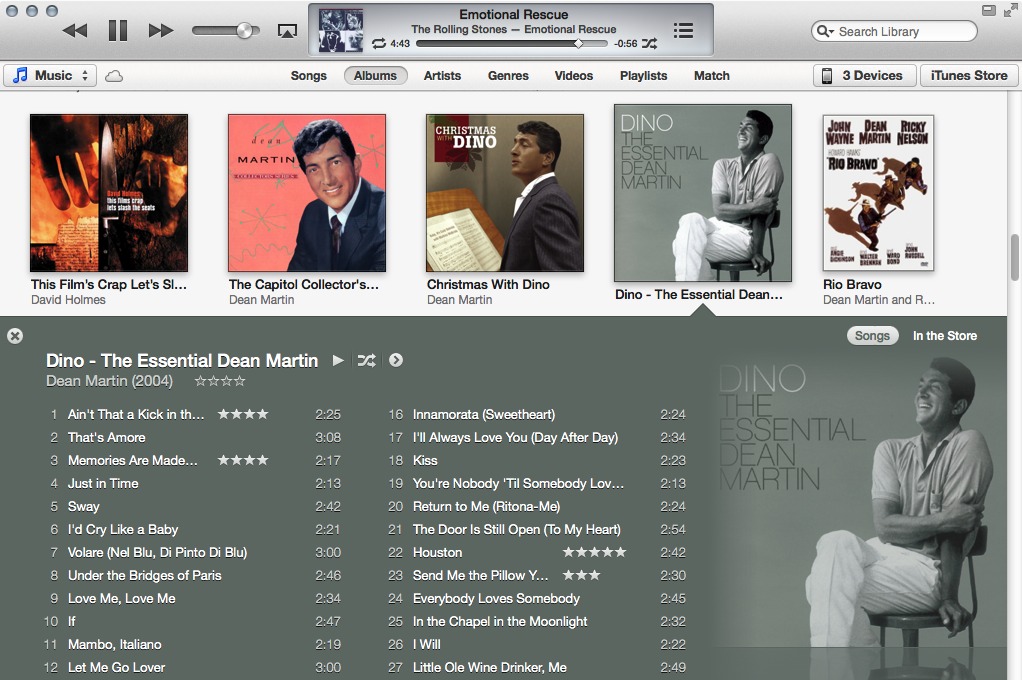
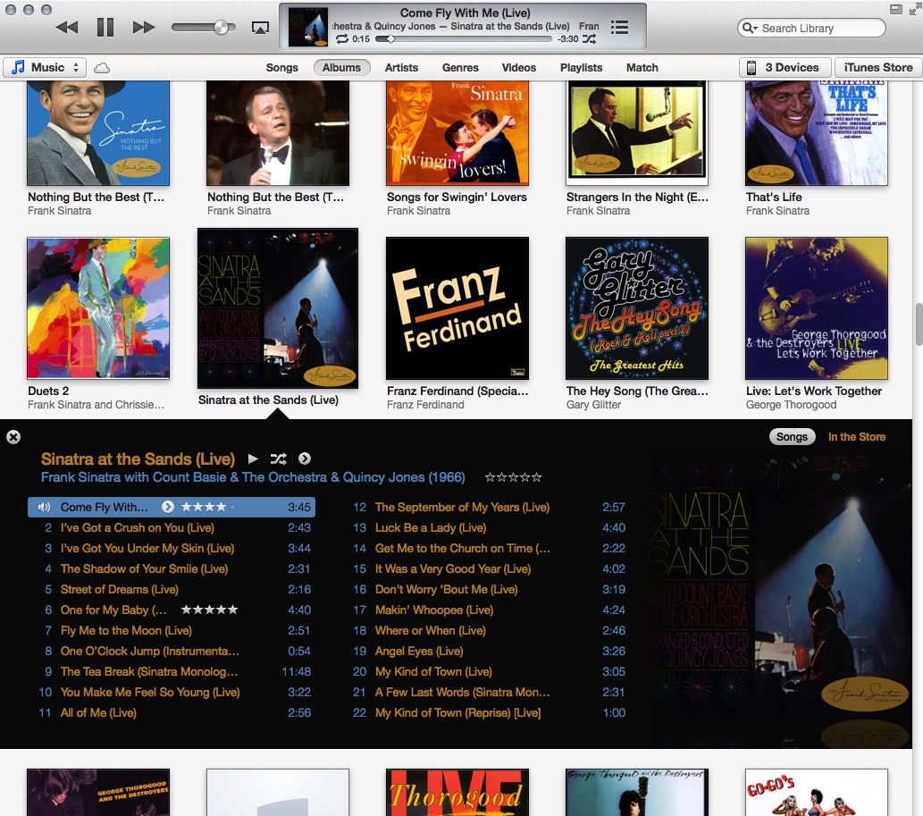
I think my favorite new design element is what Apple is calling “Expanded View”. In a graphical list of albums or movies or shows, you click one and it opens in a subview right there under the album/movie/show. Instead of going to a new view, you stay where you are. No way to get confused about where you are, more of a sense of direct manipulation. I think this is a brilliant design for everyone, particularly typical users. And there’s a neat trick: the colors for the song listing are chosen algorithmically based on the album or poster art. (Examples: here and here.) Very clever, very fun. It’s a digital approximation of going through real-world albums or DVD jewel boxes and opening them in place — with the custom color palettes, the listings feel like the “inside” of the albums.
AppleScript Still Works
Even in new views like Expanded View, selected tracks work in AppleScript just like they have in standard table views. I can’t vouch that every old AppleScript still works, but the ones I use do. (I always worry about AppleScript going away as iOS influences the Mac.)
Doug’s AppleScripts for iTunes (easily the best resource for iTunes AppleScript information) has already found a few bugs, though.
Helvetica
Everything in the main window is set in Helvetica. Looks good on regular Macs, looks downright gorgeous on a retina MacBook Pro. More credence to my hunch that Lucida Grande’s days as the OS X system font are numbered.
Animation, or Lack Thereof
iTunes 11 is not as animated as I’ve come to expect from iOS. It simply zaps between full and mini-player state, for example. Why not zoom, like a window going into the Dock? (See below for the answer.) No iBooks-style secret-door-flip rotation when switching from your library to the iTunes Store, either. (Expanded View is animated, though.)
Up Next
This is pretty much how I always wanted the old Party Shuffle feature to work — show me what’s coming up, and let me add whatever strikes me to the top of the queue. But I suspect people who liked the old Party Shuffle feature are going to be upset, because Up Next replaces it.
A nice touch: on regular displays, the Up Next icon is a bullet list. But on retina displays, it’s a numbered list with minuscule numerals.
MiniPlayer
If I recall correctly, on stage at the music event in September when iTunes 11 was previewed, Jeff Robbin explicitly stated that their goal with the redesigned MiniPlayer was to allow you to do almost everything you’d want music-playback-wise without leaving the MiniPlayer mode. I think they got pretty close.
Except it’s not actually a mode anymore. Previously, MiniPlayer was a separate mode of the main iTunes window. You toggled it with the standard zoom button in the window title bar — the green one with the “+” when you hover over it. (Which in turn meant that if you wanted the standard zoom button behavior of zooming the window, you had to Option-click the button.)
Now in iTunes 11, MiniPlayer is actually a separate window from the main iTunes window. The green zoom button now behaves like a standard one, and they’ve added a new MiniPlayer toggle button in the top right corner, next to the standard full-screen mode button. This title bar button acts like a modal switch: click it in the regular window, and the regular window closes and the MiniPlayer opens; click it in the MiniPlayer and vice-versa. But, in iTunes’s Window menu, you can open both the main window (“iTunes”) and the MiniPlayer at the same time. There are two separate MiniPlayer items in the Window menu, in fact: “MiniPlayer”, which just opens the MiniPlayer window and keeps the main window open; and “Switch to MiniPlayer”, which acts like the title bar toggle button.
That they’re really two separate windows is, I can only guess, why there’s no zoom animation when toggling. I still think they should animate the toggling somehow, though.
Update: It’d be nice if you could keep using the MiniPlayer while the main window is in full screen mode, but alas, that doesn’t work. Even with both windows open, when you full screen the main window, the MiniPlayer disappears until you un-full screen it.
| Previous: | Best Dell Ad Ever |
| Next: | Why ‘The Daily’ Failed |