
By John Gruber

Paper — The connected canvas for teams shipping with agents
Apple Watch Series 4
Wednesday, 19 September 2018
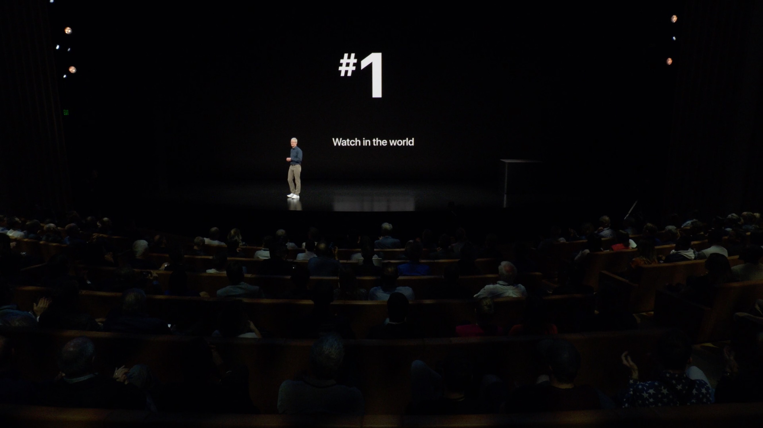
Tim Cook opened the Apple Watch segment of the event last week by stating that Apple Watch wasn’t just the number one smart watch in the world (come on, that’s obvious), but that “it’s the number one watch, period”, standing in front of a slide with a big “#1” on it.
Number one by what measure, though? They didn’t say, which I find irksome. Presumably Cook meant number one by revenue. At last year’s event he noted revenue specifically, mentioning that Apple Watch had surpassed Rolex.
Apple has several products that lead their markets in revenue or profit. What makes Apple Watch different from every other product the company makes, though, is a measure near and dear to the company’s soul by which they cannot claim Apple Watch to be number one: nicest.
Nicest is inherently subjective, of course. But iPhone, iPad, MacBook, and iMac can all reasonably be argued to be the nicest products in their respective markets. You can definitely add Apple Watch to that list if you limit the comparison to other smart watches and fitness trackers. I would say hands-down, no question, Apple Watch is the nicest of those. But that’s like saying you’re the richest person in the poorhouse. And Tim Cook is the one who stood on stage boasting about Apple Watch’s position among all watches.
Traditional watches are Apple’s competition for nicest watch. And Apple Watch just isn’t there. It’s not even close. Don’t get me wrong — Apple Watch is nice, and always been. I think that’s ultimately what defined the minimum viable product for the original Apple Watch. Apple could have made something that did what the original Apple Watch did years earlier, I’m sure. But it wouldn’t have been nice enough. But as nice as Apple Watch has always been, there are many watches that are nicer. And that makes Apple Watch unique in the history of the company. What successful product has Apple ever made that wasn’t at least arguably the nicest in its category? Apple Watch is the first.
Apple Watch is a hit despite this because it’s such a great product. People love it for what it does, how it works, and for how nice it actually is. Apple Watch is thriving despite being far from the nicest watch because all of the watches that are nicer do so much less. That’s the flip side of Apple Watch’s anomalous status in Apple history. Apple’s products, especially new ones, generally do less than their competitors. Apple Watch is taking over the watch industry because it does so very, very much more than traditional watches could ever do.
A thought experiment that practically proves my argument: Most of the watches that are nicer than Apple Watch only tell the time and date. Often not even the date. If Apple Watch had been exactly as we know it — same shape, same materials, same display, and the same prices — but functionally did nothing other than show the date and time, would Apple Watch be the number one watch in the world? By any measure? No. It would be absurd. Conversely, if Apple were to actually make a watch that only displayed the time and date, it wouldn’t look anything like Apple Watch as we know it. It would be so much nicer. It probably would be one of the nicest watches in the world.
The luxury watch market is in large part about niceness. No one buys a Rolex or Omega or Panerai or Patek Philippe because of its timekeeping accuracy. They buy them because of how nice they are. Jony Ive is a watch guy. He knows this. Phil Schiller is a watch guy. Apple is full of people who love traditional watches, because they appreciate craftsmanship, attention to detail, typography. Nice watches are all about design down to the smallest details.
Of course it bothers Apple that Apple Watch can’t do all the things that it does and fit into one of the nicest watch cases in the world. At some level it must kill them. They’re winning, but they don’t just want to win the race. They want to win the race while driving the best-looking car on the track.
I’ve known this ever since I saw Apple Watch introduced in September 2014, but I was never able to put my finger precisely on niceness as the key to understanding Apple’s otherwise somewhat baffling approach to the product. Wearing an Apple Watch Series 4 for a few days, and taking time to consider why I’m so fond of it, prompted a moment of clarity.
An appreciation of nice watches, and an honest reckoning of where Apple Watch stands in that regard, informs everything about the entire product, including, I think, the absurdly expensive 18-karat gold Edition models in the original lineup. The fundamental problem Apple faces is that the smallest possible computer they can make — today — to do what they want Apple Watch to do isn’t small enough to fit it into a watch case of size and shape that would be considered among the very nicest in the world.
Every other aspect of Apple Watch other than the case is, in fact, world-class nice. The default watch strap, the Sport Band, is absolutely wonderful. Jony Ive’s close friend Marc Newson is renowned in the watch world. Ive brought Newson to Apple to make an even better version of his 1996 Ikepod strap. You know what’s not nice about most watch straps? The extra bit of strap that sticks out after you buckle it. Newson’s insight, that it could be neatly tucked under the other side of the strap, is simply genius. Tens of millions of Apple Watch owners now enjoy this design. And that’s just the default strap — Apple Watch’s well-liquor straps are far better-designed than the top-shelf-liquor straps from many luxury watchmakers.
Apple’s higher-end bands put most Swiss watch companies to shame. Apple’s link bracelet is extremely nice, and features a way to add and remove links to adjust the size that requires nothing more than your thumbnail. No one else has a link bracelet like this. The whole idea of easily swappable bands and straps — using nothing more than your thumbnail — is an astounding innovation. It’s a key driver of Apple Watch’s success as a watch. People have been wearing wristwatches for over 100 years, but until Apple entered the market no company had ever thought to design a connector system that would allow for seasonal new straps and bands. It helps make Apple Watch fun for owners and helps make money for Apple.
Apple didn’t start with one band and slowly grow its lineup over time. They entered on day one with an incredible strap lineup. No one would say Apple Watch debuted as the nicest watch in the world. But you can argue it debuted with the nicest lineup of straps.
Apple has long been guided by a good/better/best approach to its product lines. But the stainless steel Apple Watches are identical functionally to the aluminum models. They cost hundreds of dollars more and the only thing that makes them better is that they’re made from nicer materials. That makes no sense at all in the world of computers. It makes perfect sense in the world of watches. I think Jony Ive made those gold Edition models and drove his team to create such a wide lineup of straps on day one to send a message. Ive owns and admits to still occasionally wearing a few traditional watches (his favorite: a stainless steel Patek Philippe Nautilus1) and he wanted to prove that he wasn’t lowering his standards one iota, and that there’s no aspect of the watch industry — from working with precious metals to designing a perfect deployment clasp — that Apple couldn’t do at the highest level.
The Series 4 Apple Watch is defined by being a nicer watch. The upcoming ECG feature is deservedly headline grabbing, but I wouldn’t even consider buying a Series 4 to replace my year-old Series 3 if it still looked the same. In fact, I would consider buying a Series 4 even if the only changes from Series 3 were the new case size and new display and watch faces. It’s that much nicer.
Apple has this diagram on their nifty Apple Watch Comparison page, where the Series 4 and 3 watches are reduced to icons to convey their relative dimensions:
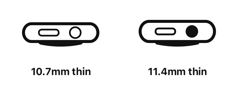
That the Series 4 watch is rendered so much thinner than the Series 3 even though the stated difference in thickness is only 0.7 mm may strike you as shameless marketing exaggeration. But after wearing and looking at a Series 4 watch on my wrist all week, I’d say this illustration conveys the difference completely accurately, and far better than any side-by-side photograph could. It really feels that much thinner.
For watches, 0.7 mm is significant. The Series 4 Apple Watch sits better on the wrist. It doesn’t look nearly so chubby.
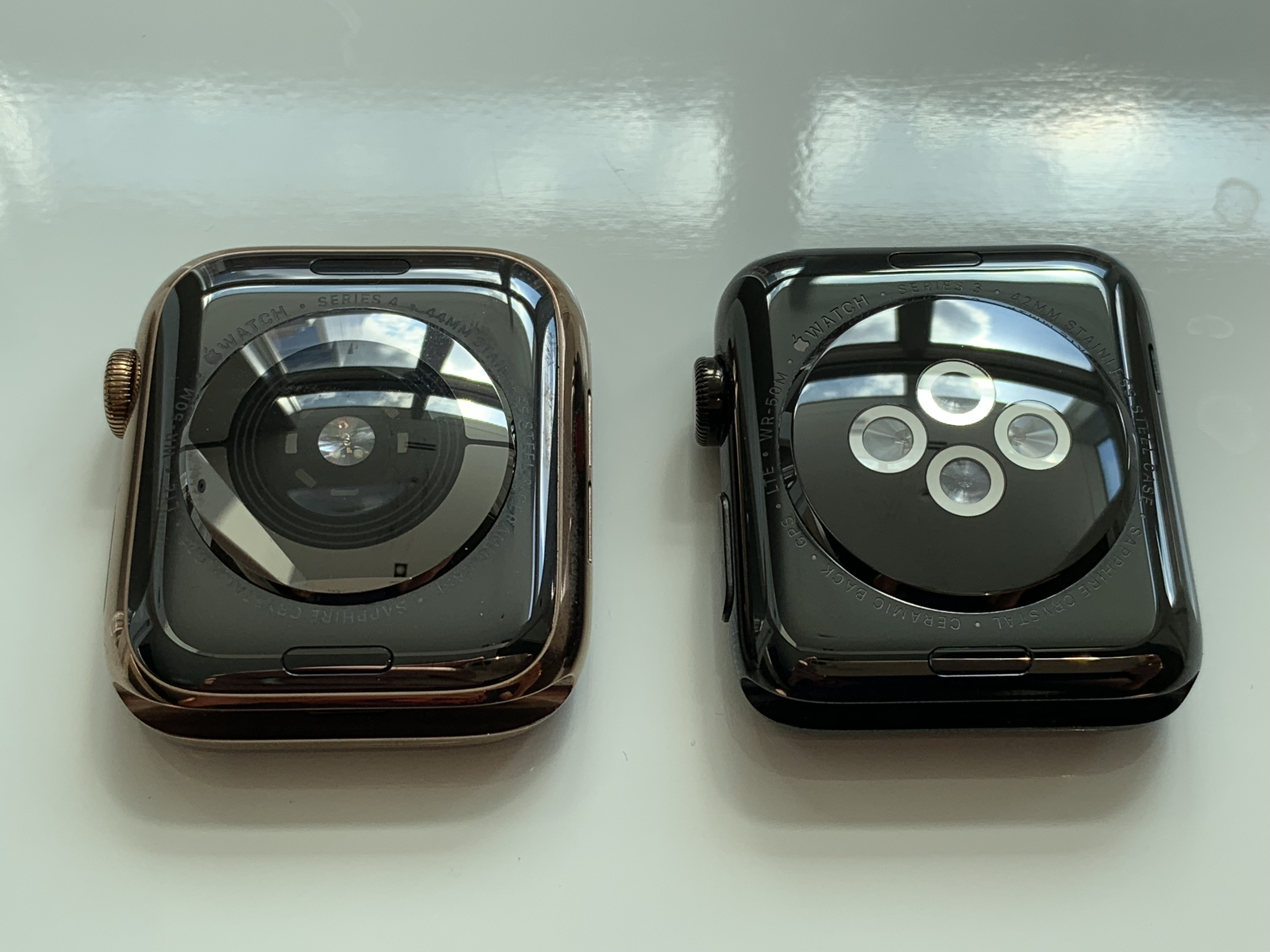
My review unit is a 44 mm model in stainless steel with the new gold finish. It’s smaller by volume than the Series 0-3 42 mm models, but larger by surface area. And the display simply seems immense. It makes me wonder if I might not prefer the new 40 mm size, the display of which is slightly larger than the display of the old 42 mm models. I would encourage anyone on the fence about which size to get to go to a store and try them on before deciding. It’s not that I think this 44 mm model is too big for me, it’s that I wonder if the 40 mm model would be big enough.
Apple provided me with the gold Milanese Loop as well. I wore it around the house for a day. It’s very nice, but not my style. It is interesting that there is no Link Bracelet in gold. That means the Milanese Loop is the only matching metal band for the gold watch.
The gold is a very interesting color. It really has quite a different effect depending on which strap you wear with it. I’ve been wearing it with a black Nike Sport band (they call the color Anthracite), and I’m amazed at how much I like the combination. I don’t generally like gold, but I do like this gold with a black strap. This watch looks really good with a black strap.
The gold finish is applied using a physical vapor deposition (PVD) process. Apple tells me this process is very similar to the process that applies the diamond like coating (DLC) to the space black watches. One thing about both of these processes is that they take several hours to apply per watch, according to Apple. That’s why the space black stainless steel models have always been more expensive. But the gold Apple Watch models cost the same as the regular stainless steel models ($699 for 40 mm, $749 for 44 mm). And, in a nice touch, the space black models are now the same price as regular stainless steel as well.
The Series 4 Digital Crown is clearly all new. Apple — during the event and in their marketing materials — is trumpeting the Crown’s new haptic feedback. It “clicks” as you spin it, and the clicks correspond to whatever it is you’re scrolling. This is a very nice touch. But the best thing about the new Digital Crown is how freely it spins. There’s almost no friction at all. It makes the Crown on my Series 3 watch feel like it’s rusty. The feel of this new Digital Crown is so much nicer than the old ones.
I’ve long believed through personal experience that haptic taps felt noticeably better on aluminum Apple Watch models than the stainless steel ones. With my Series 0 space black watch, taps were so faint I often didn’t feel them. It makes sense that it would be more difficult to provide good haptic feedback through a more rigid material. But in way it’s counterintuitive that the more expensive models would provide a worse experience for one of Apple Watch’s key features. The taps on this Series 4 watch are the best I’ve ever felt on any Apple Watch. They’re strong but not too strong. The Series 4 pages at Apple.com don’t seem to even mention the Taptic Engine, though. I asked Apple if they improved the Taptic Engine for Series 4, and the answer was something like, “We’re always working to improve every aspect of the experience” — typical Apple-ese for “We don’t want to answer that.” They did say though, that the Taptic Engine should feel better because the Series 4 watch sits better on the wrist. Perhaps that explains what I’m feeling, but I suspect it’s both — that taps are helped simply because the watch sits better on the wrist and Apple improved the Taptic Engine.
Back in September 2014 at the event where Apple Watch was unveiled, I had a post-event briefing where I got to spend time examining and trying several prototype Apple Watches. (Remember: Apple announced it in September 2014, but it didn’t begin shipping until late April 2015.) In my post-event thoughts and observations piece, I wrote:
The digital crown feels amazing. It didn’t actually control anything on-screen on the demo watches I handled last week, but it has the most amazing feel of any analog controller I’ve ever used. Lubricious (in the second sense, if not the first as well) is the word that springs to mind.
This Digital Crown feels exactly how I remember that prototype Digital Crown feeling. Lubricious. I also vividly recall that the taps I got from those prototype watches felt almost humane — as though I were being tapped on the wrist by a friend trying to subtly get my attention. That’s what the taps on this watch feel like. Assertive, but polite. In the way that a notification sound can be pleasant, these taps are pleasant. This makes me think it took Apple four years to get to the point where the Digital Crown and Taptic Engine in production Apple Watches feel the way they’ve wanted them to feel all along. In hindsight I’m rather shocked that Apple granted me hands-on time with what were clearly prototypes.
Which brings us to the most striking new hardware on the Series 4: the display. I cheated a bit when I wrote the following bit in my thoughts and observations piece regarding last week’s event, because I’d been wearing this review unit for several days already:
With the exception of the Photos watch face (which Apple added to early models only grudgingly, knowing it looked bad but also knowing people would want it), previous Apple Watch faces all took advantage of the way OLED’s deep black could blend in almost seamlessly with the surrounding black bezel to effectively hide the corners of the display. A sharp-cornered rectangular display doesn’t look good on a round-cornered device. The entire concept was to blur the transition from the edges of the display to the bezel. The Series 4 watch faces embrace the corners of the display, celebrate the corners even, enabling fun and colorful watch faces that Apple surely never even considered for previous models. All previous Apple Watch faces were dark; most of the new ones are bright and colorful. It’s a big change.
There are a few new watch faces exclusive to Series 4, including its default watch face, Infograph. Infograph Modular is also exclusive to Series 4. This isn’t marketing spite — they just wouldn’t fit on the old displays. The other new full-bleed faces — Fire and Water, Kaleidoscope, Liquid Metal, and Vapor — are available on all watches running WatchOS 5, but they look far better on Series 4. On older watches they fill a circle in the middle of the display. On Series 4 they fill the display. I feel like it was a mistake for Apple to put any of them on the older watches. The Series 0-3 watches were meant to have faces with black backgrounds. Breathe is the only new face that I think looks at home on both old and new watches, but that’s because it isn’t meant to go full-bleed on the Series 4.
These colorful new full-screen watch faces look good and look fun. They make all the previous analog faces with black backgrounds look a bit staid. Me, I like staid. But a lot of people like fun more than staid.
But the other thing I’ve found is that the older watch faces, at least the analog ones, don’t look as good on a Series 4 watch as they do on Series 0-3. The old faces look better on the old watches and the new faces look better on the new ones.
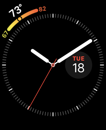
Here’s an example. My very favorite watch face since Series 0 in 2015 has been Utility. I prefer minimal, uncluttered faces. This is how I’ve run Utility for years:
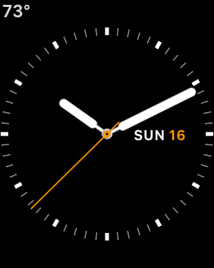
Here’s what that layout looks like on Series 4:
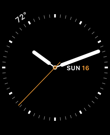
I don’t like the temperature at an angle up there at 11 o’clock. It fits with the Series 4 aesthetic where complications follow the curve of the dial rather than sit straight up and down in the corners, but it doesn’t look right to me. Because it’s only two characters, it doesn’t look like it’s following the curve of the dial. It just looks crooked. I don’t know that it would look better the old way either. The nature of the Series 4 has changed too much with this bigger display. It sounds like roll-your-eyes-prima-donna-designer talk, but Apple’s faces really are designed hand-in-hand with the hardware.2
What I like better is this layout using the new Infograph face:
It’s nowhere near as minimal, but that low-high temperature graph does provide useful information at a glance. And it looks like it’s meant to follow the curve of the dial. In the abstract, just looking at them as screenshots, I like this Infograph layout the least of all three, but on the Series 4 watch, on my wrist, I like it the most.
Miscellaneous
As promised, the speaker is much louder. It’s great for making short phone calls. The people I spoke to via calls over the watch said I sounded good, too. But I say “short calls” because it’s tiresome to hold your wrist in front of your mouth.
Infograph in its default configuration is beautiful, but in my opinion far too busy to be the default watch face. It’s the most information-dense face you can configure. And the default clock dial has a white background, which is even more distracting than the black background for Infograph that Apple is using in Series 4 product marketing photographs and video.
Even the back of the Series 4 watch looks cooler.
Complications have always been fun to play around with. It’s not full-on designing, but it is tinkering. You can lose a lot of time just tinkering around with Infograph alone.
Setting up a new Apple Watch still takes a very long time. It’s not a nice experience.
The side button now sits perfectly flush with the case, but is just as easy to press. That’s nice.
I haven’t fallen down this week.
The Bottom Line
Here’s one more morsel I’ll re-use from my event wrap-up:
I would argue that the landmark iPhone models were the original, the iPhone 4, the iPhone 6, and the iPhone X. It’s kind of interesting to me how the Apple Watch’s evolution has paralleled the iPhone’s. A first-generation model like nothing seen before, good enough to change an entire industry but deeply flawed in certain obvious ways. Second and third generation models that simply address those obvious flaws. And then a fourth generation model that takes things to an altogether new level, particularly pertaining to the display and the physical case of the device.
If you want a one sentence summary of what I think of the Series 4 Apple Watch, it’s this: Series 4 is to Apple Watch what iPhone 4 was to iPhone — the model that takes the original design to a new level.
The Series 4 Apple Watch models cost more than the Series 3 models did last year. Last year the Series 3 models started at $329 without cellular, $399 with. This year the Series 4 starts at $399 without cellular, $499 with.
That doesn’t seem right, you might think. You were waiting for these, and you love what you see, but they cost more than you expected to pay.
Welcome to the world of nicer watches.
-
Retail: $43,000. Also, do those hour and minute hands on the Nautilus look familiar? ↩︎
-
This is why I continue to believe Apple will never open Apple Watch to free-form third-party watch faces. ↩︎︎
| Previous: | The iPhones XS |
| Next: | The Great DF Random Slowdown Should Be Over |