
By John Gruber

WorkOS MCP: Manage your auth platform from any AI agent.
Proof That iOS Still Hasn’t Gotten Undo Right
Wednesday, 5 December 2018
I’ve been reading Apple’s App Store awards for 2018, and something jumped out at me. Both the iPhone and Mac apps of the year are image editors: Procreate Pocket on iPhone, Pixelmator Pro on Mac. Both are excellent apps, well-deserving of these awards. Here’s Apple’s story on Procreate Pocket; here’s their story on Pixelmator Pro (both of which articles are only visible from iOS or MacOS Mojave, in the App Store app — I feel like I’m linking to AOL content here).
What struck me was this paragraph from Apple’s story on Procreate Pro:
Even curious hobbyists will be drawn (pun intended) to the simple user interface. As you’re creating, you can readily go back and remove the rogue line you just drew by tapping with two fingers. (Didn’t mean to undo the stroke? Tap with three and it’ll reappear.)
The whole story is only seven paragraphs long, and one of them is devoted to explaining how to invoke Undo and Redo. This is — inadvertently on the part of the App Store editorial team — a scathing indictment of the state of iOS’s user interface standards.
Before reading a word of it, how much would you wager that Apple’s story on Pixelmator Pro for Mac does not mention how to invoke Undo and Redo? I would’ve bet my house — because even if you’ve never even heard of Pixelmator, you of course know how to invoke Undo and Redo in any Mac app: Edit → Undo and Edit → Redo, with the shortcuts ⌘Z and ⇧⌘Z. In fact, even their placement in the Edit menu is always the same, in every Mac app: the first two items in the menu.
Undo has been in the same position in the same menu with the same keyboard shortcut since 1984. Undo and Redo are powerful, essential commands, and the ways to invoke them on the Mac have been universal conventions for almost 35 years. (Redo came a few years later, if I recall correctly.)
iOS does in fact have a standard convention for Undo, but it’s both awful and indiscoverable: Shake to Undo, which I wrote about a few months ago. As I mentioned in that piece, iOS does have support for the ⌘Z and ⇧⌘Z shortcuts when a hardware keyboard is connected, and the iPad’s on-screen keyboard has an Undo/Redo button. So for text editing, on the iPad, Undo/Redo is available through good system-wide conventions.
But on the Mac, Undo and Redo are invoked the same way for any action in any app — everything from editing text and making illustrations, to trashing or moving files or mail messages.
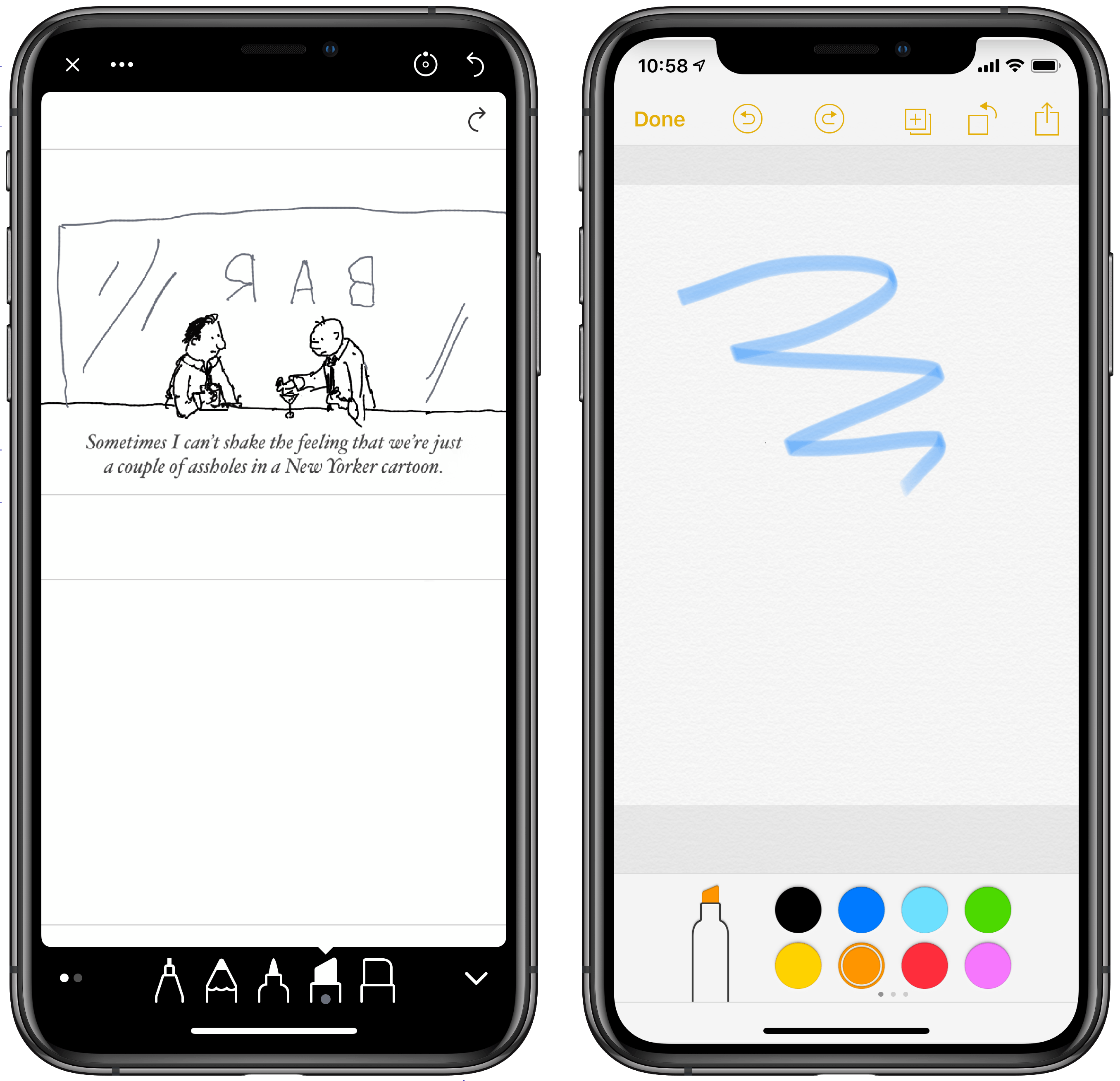
There is a common convention for Undo/Redo in iOS drawing apps — circular arrow buttons, counterclockwise for Undo and clockwise for Redo. (And, thankfully, these are the same icons used for Undo/Redo on the iPad on-screen keyboard. Consistency is not completely lost.) You can see them in these screenshots from Apple Notes and Linea Go on iPhone.
But it speaks to how weak this convention is that Procreate Pocket could do something not just different but totally different — multi-finger taps with no on-screen buttons — and not just get away with it but be celebrated by Apple for it. I’m not saying Procreate’s two/three-finger taps are better or worse than on-screen buttons. (Well, stay tuned.) And I can see the thinking — screen space on an iPhone is so precious that any reduction in on-screen buttons is a win in terms of reducing UI clutter and maximizing the screen space available for showing the content of the illustration. Also, I’m sure the two/three-finger taps are very fast once you’re used to them.
The developer of a drawing app on iOS is forced to make a choice:
- Do the obvious thing and add persistent “⟲” and “⟳” buttons, consuming precious screen real estate.
- Do the non-obvious thing and implement Undo/Redo with gestures like Procreate’s multi-finger taps.
- Do the stupid thing and rely on Shake to Undo, even though most people don’t know Shake to Undo exists, and even if they do, probably hate it and/or feel silly doing it.1
Personally, if I were designing an iOS drawing app I’d go the first route, and follow Apple Notes’s lead with “⟲” and “⟳” buttons. (Linea supports the two- and three-finger taps in addition to its explicit buttons — they too are a quasi-convention.) But to Procreate’s credit, they clearly know these multi-finger tap gestures are both unusual, not intuitive, and utterly non-discoverable, because the very first thing they do when you first launch the app is teach you about them.2 Think about that: iOS user interface conventions are so shallow, so widely and wildly inconsistent, that an app proclaimed by Apple as the very best of the year has to start, as the very first thing you see when you launch them, by teaching you how to use Undo. That’s a sad state of affairs.
Apple created wide-ranging Human Interface Guidelines and preached consistent adherence to them as a top priority from the very earliest days of Mac not for some abstract reason, but for very practical reasons. From the 1987 edition of the Human Interface Guidelines:
The purpose of visual consistency is to construct a believable environment for users. The transfer of skills is one of the most important benefits of a consistent interface, especially for beginning users. [...]
Consistency makes it easier for a user to learn new applications; it also makes it less likely that a user who follows habits learned from one application will make a disastrous mistake when using a different one.
Or feeling utterly lost in a different app — like not knowing how to use Undo. If there’s a mistake the original HIG made, it was emphasizing “especially for beginning users”. Seasoned users benefit too — they’re the ones whose habits and expectations are broken by apps that break conventions.
What it comes down to, I think, is that the menu bar has become a vastly underestimated foundation of desktop computing. Once heralded, the menu bar is now seen as a vestige. I’m not arguing that iOS should have a Mac-style menu bar.3 I’m simply pointing out that without one, iOS is an 11-year-old platform that is still floundering to establish consistent conventions for some basic features, let alone complex ones, that are simple and obvious on the Mac.
Imagine going back in time to tell a MacPaint user in 1985 that they’d have to learn how to use Undo in an Apple-award-winning paint app in 2018. That’s where we are.
-
Think about using Shake to Undo to undo the last, say, four strokes in a drawing app. You’d have to shake, then confirm the undo action in the confirmation alert, and then repeat that sequence three more times. That’d be infuriating. ↩︎︎
-
One counterargument to my complaint here is, I’m sure, something along the lines of “If the app shows you explicitly how to use the two- and three-finger taps when you first launch it, what’s the problem? So what if it’s different?”. Here’s the problem. What happens if you install the app, go through the first-run lesson, and then don’t use the app again for, say, six months? I personally had Procreate Pocket installed for years and I either never knew or had completely forgotten about this. And I would have never guessed to try a two-finger tap for Undo. One overlooked aspect of consistency, of adhering to the idiomatic design patterns of the native platform, is that doing so helps users guess how to do something they’ve never done before. ↩︎︎
-
Is anyone willing to argue that the “More” popover in Apple’s iWork apps for iOS apps is something other than a menu bar hidden behind a decidedly un-Apple-like “···” button? The thinking here seems to be “We need a menu bar for a bunch of commands in a hierarchical structure, but we don’t want to admit we need a menu bar on iOS so we’re not going to make one, and instead we’ll just use a popover on iPad and a modal full-screen sheet on iPhone and hide them behind this admittedly ungraceful dot-dot-dot button.” Which puts these apps in the ridiculous situation where all of the commands fit on screen on iPhone but you have to scroll to see them all on iPad, even though the iPad has a much larger display, because Apple constrained these popovers with a maximum height smaller than an iPhone display.
What exactly does Apple mean by “More” for these commands and sub-menus hidden behind the dot-dot-dot button? More than what they could fit in the interface of these apps without a menu bar — that’s what. “Everything should be as simple as possible, but not more so” goes the old design adage. The contortions Apple is willing to jump through on iOS to avoid creating a system-standard functional peer to the Mac menu bar fall into “but not more so” territory. ↩︎︎