
By John Gruber

WorkOS Pipes: More context makes for smarter products.
Disclosing a Few Thoughts on Facebook’s UI Design
Monday, 2 November 2020
I ran into this piece at MacRumors about Facebook only now beginning to roll out Dark Mode for its flagship iOS app, and the screenshots caught my eye. I’ve never actually used the Facebook iOS app because I’ve never had a Facebook account, so I’d never seen their settings UI. (I almost signed up for an account back in 2014 just so I could use the wonderful Paper app made by an astonishingly talented small iOS team Facebook put together back then, but I resisted the urge and Facebook let Paper wither on the vine because making great things has never been their game.)
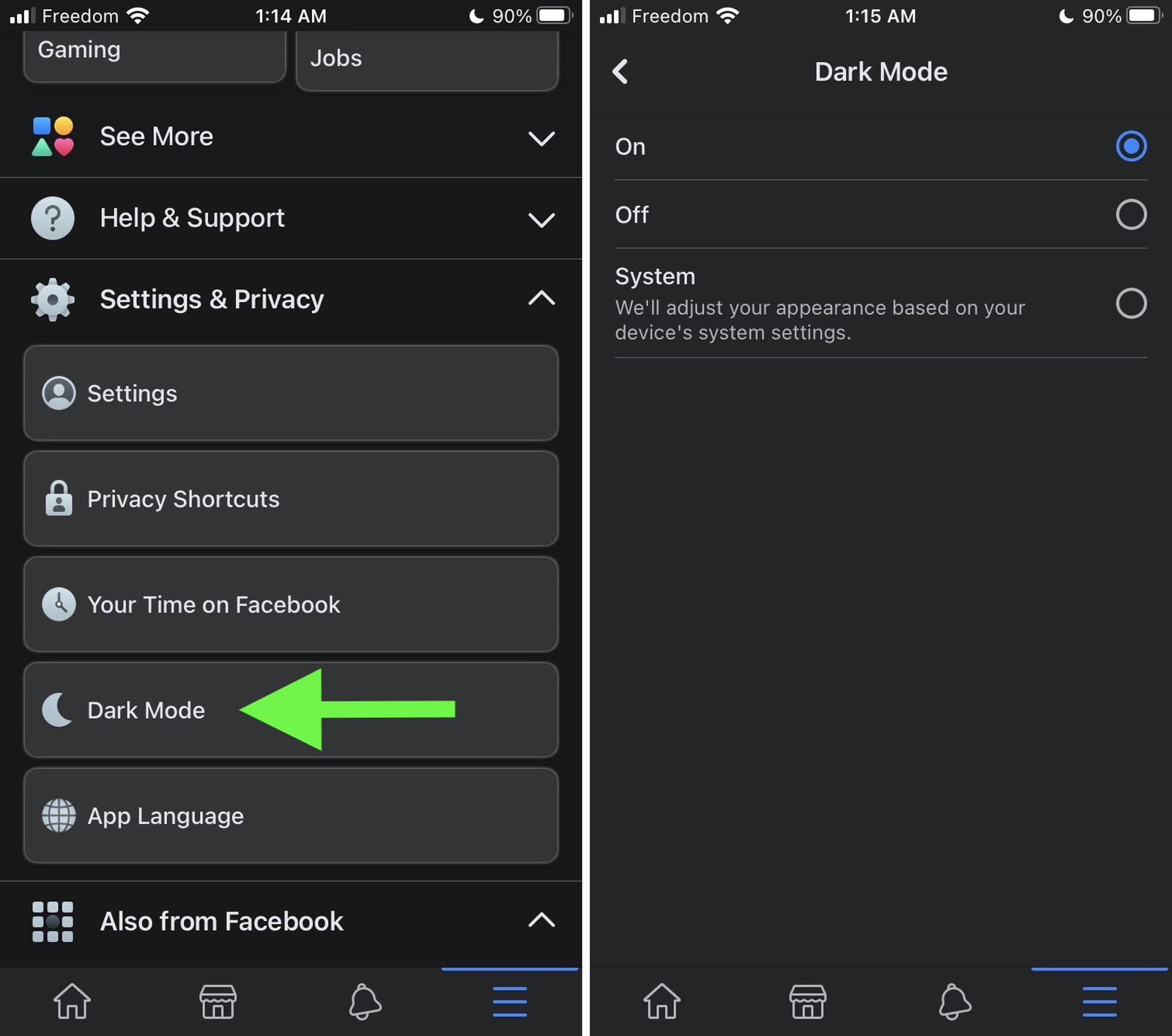
Two thoughts about these Dark Mode settings in Facebook. First, given that Dark Mode was introduced in iOS 13 over a year ago, and is both incredibly popular and a wonderful accessibility feature for many people, how is this only rolling out now? That’s embarrassing.
Second, I noticed immediately — and was completely unsurprised — that Facebook gets their disclosure chevrons for hiding/showing hierarchical content wrong. Facebook is doing it the dumb way, like Android does, where the chevrons indicate action, not state. iOS disclosure chevrons work the smart way, where they indicate state, just like they have on the Mac since 1984.
In the Facebook/Android style, a down-pointing chevron is a button you tap to expand more content, and an up-pointing chevron is a button you tap to collapse it. In the iOS/Mac style, a right-pointing chevron (or triangle, depending on the OS) indicates the collapsed state, and a down-pointing chevron indicates the expanded state. The Android way, a down-pointing chevron means “will open, if you tap”; the Mac/iOS way, a down-pointing chevron means “is open, tap to close”. You can argue that the Android style isn’t wrong, per se, just different, but (a) I’ll go to the mat arguing that disclosure chevrons should show state and imply action (the Mac/iOS way), not show action and imply state (the Android/Facebook way); and (b) it’s undeniably wrong for an iOS app — they’re breaking a core platform idiom. For examples that do it the right way, look at the list of accounts at the root level of iOS Mail, or the new collapsible “Pinned” header in iOS 14 Notes.
Windows used to use ridiculous little +/- buttons for this because of course Windows started with the worst possible UI, but even Microsoft eventually did the right thing and switched to Mac-style state-indicating right and down triangles.
Anyway, this is making me think I should never join Facebook.