
By John Gruber

Paper — The connected canvas for teams shipping with agents
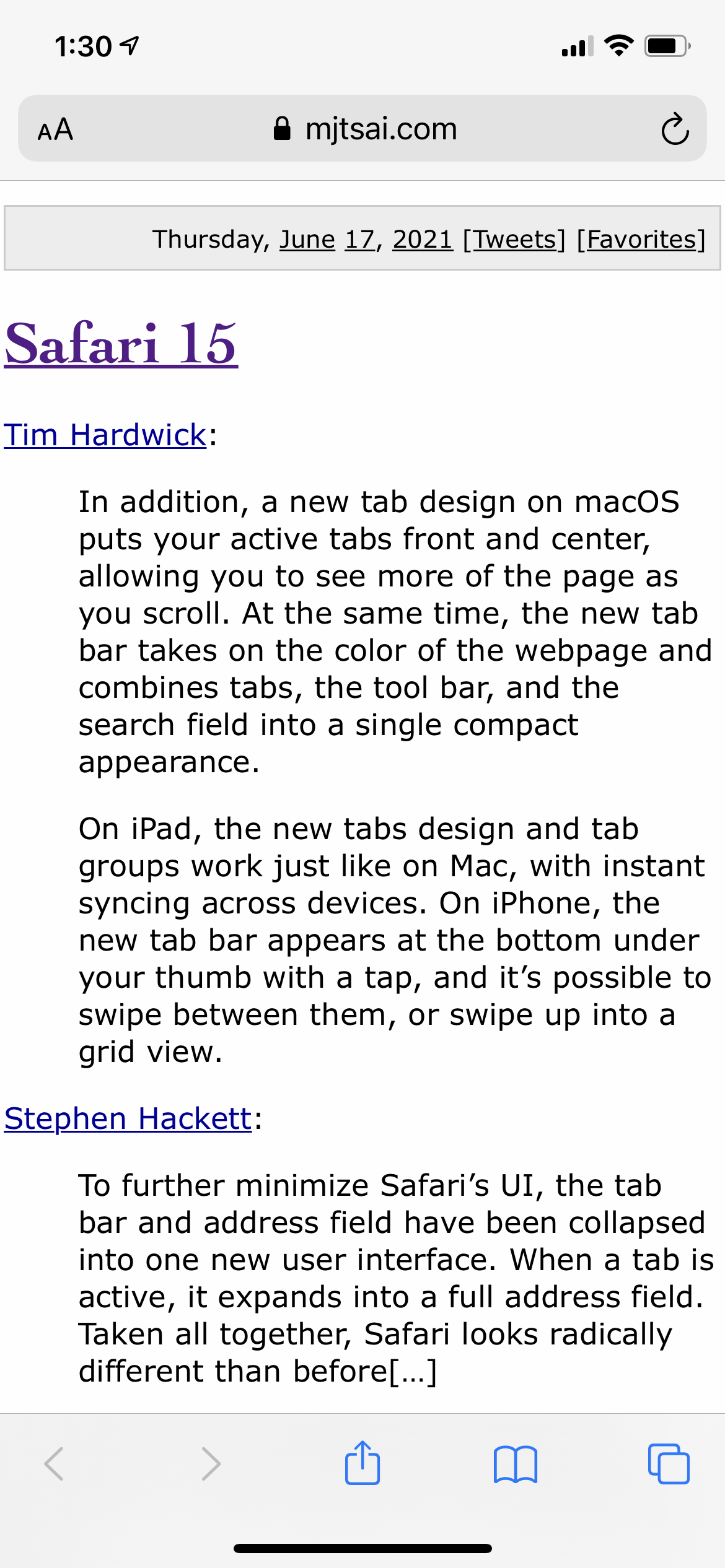
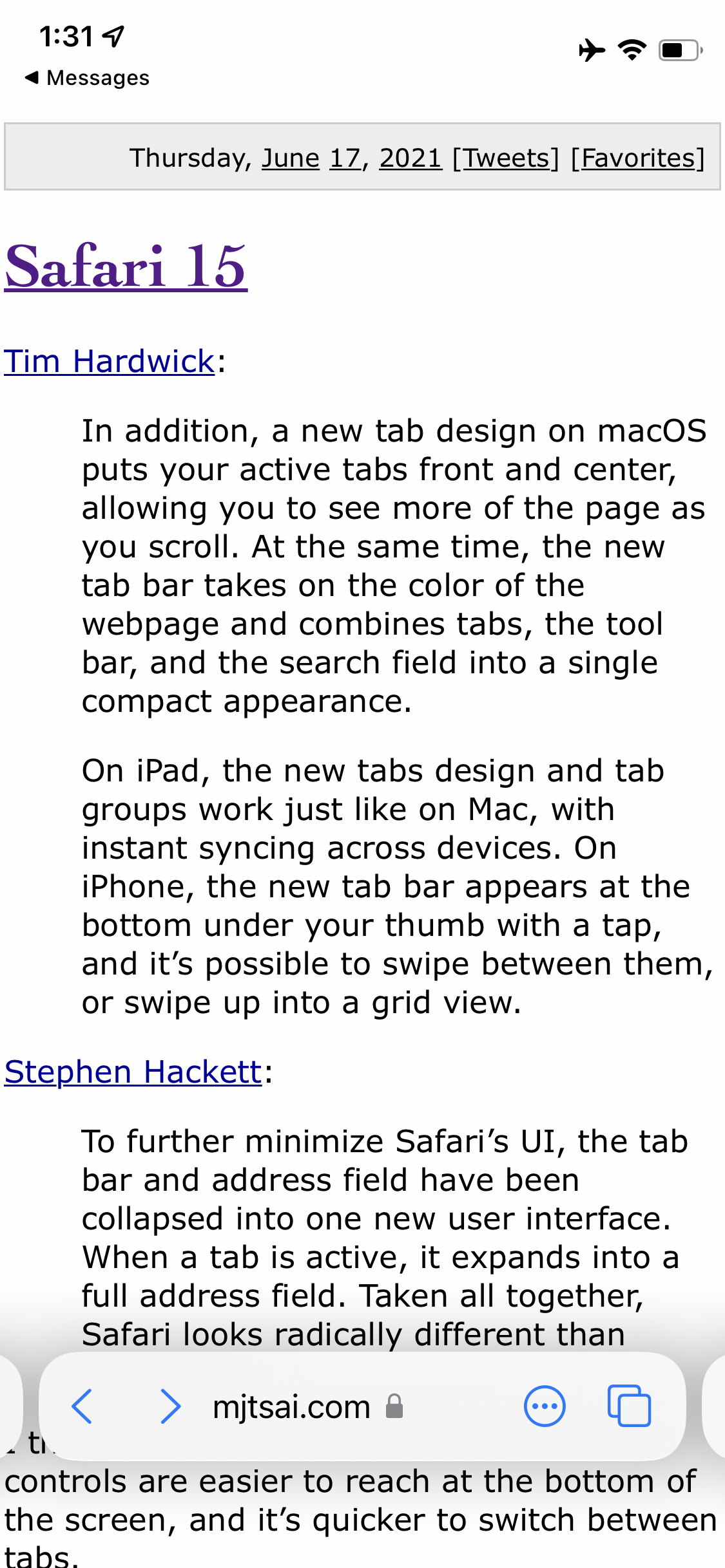
Regarding the Safari 15 Public Betas for Mac and iOS
Friday, 2 July 2021
I think I like the changes for iPhone. The controls are easier to reach at the bottom of the screen, and it’s quicker to switch between tabs.
I get the move to the bottom, in theory — clearly this is about reachability. But I use Safari on my iPhone a lot and I have never minded using a second hand to get to the controls that, heretofore, were at the top: the “ᴀA” menu, the location field, and the reload/stop button.
Here are screenshots from Safari on iOS 14.6:
and iOS 15 beta 2:
Both the old and new designs put these controls one tap away: back/forward, location field, and the tabs button.
The only other one-tap control in the new design is the “···” junk drawer menu button, which can be long-pressed to toggle Reader Mode. All the other controls are inside the “···” popover menu.
The old design has no “···” menu because it doesn’t need one. It has an “ᴀA” button at the top which can be long-pressed to toggle Reader Mode and when tapped shows a popover menu of site-specific viewing options. At the bottom it has one-tap buttons for Share and Bookmarks. I use the Share and Bookmarks buttons all the time on my iPhone.
The system-wide standard iOS/iPadOS Share popover menu is one of the best UIs Apple has come up with in the last decade. It is extremely useful, very well supported by both first- and third-party apps, and extraordinarily consistent across the entire system. Because it is widely supported and very consistent, it is well understood by users. I realize that the nature of my work is such that I deal with URLs more frequently than most people, but sharing URLs is really common.
I also think the “ᴀA” button is a much better idea than putting all the options previously contained therein in the catch-all “···” menu. Long-pressing “ᴀA” to toggle Reader Mode feels intuitive; long-pressing “···” to toggle Reader Mode feels like they just didn’t know where else to put it. The new iOS Safari “···” menu could have been a “here’s what not to do” example from Apple’s own WWDC session this year on “Discoverable Design”.
Bookmarks are almost completely lost in the new design, and unless I’m missing something, there’s no longer any way to run bookmarklets. I know bookmarklets are an old-school web nerd thing, but I have a few I use frequently, which, if Apple sticks with this design for the next year, I guess I’ll have to rewrite as Shortcuts shortcuts or something.1
The only new thing the new iOS Safari design has going for it is that you can swipe side-to-side on the floating browser chrome at the bottom to switch between tabs. I don’t think that is significantly more convenient than tapping the Tabs buttons to switch tabs. How often you want to swipe through tabs one at a time rather than see your tabs and select one in particular? And if you swipe just a little bit too low, you wind up switching between apps, not tabs.
All that said, I agree with Tsai that the new Safari for Mac is even worse:
For Mac, the new design makes no sense to me, and I’ll likely switch to Chrome if it can’t be disabled:
- Not only does the location bar move when you change tabs, but, because it changes width, all the other tabs move, too. It feels disorienting.
- With everything on one line, there’s less space for tab text than before.
- It’s harder to get at buttons and extensions hidden under the … menu.
- There’s less empty space where it’s safe for me to click in order to drag the window.
- Having the page background color bleed into the tab area makes it harder to read, and it feels weird for the current page’s color to affect the way other tabs look. It also works inconsistently, even on the same pages on Apple’s site. At least there’s a preference to turn it off.
You don’t have to install MacOS 12 Monterey to use the new Safari design; the latest versions of Safari Technology Preview have it too, and Safari Technology Preview is installed as a separate app, not a replacement for the current version of Safari.
Tabs in Safari on Mac (and, in my opinion, iPad) were a solved problem. The new Safari tab UI strikes me as being different for the sake of being different, not different for the sake of being better. The new design certainly makes Safari look distinctive. But is it more usable or discoverable in any way? I honestly can’t think of a single problem the new design solves other than saving about 30 points (60 @2× pixels) of vertical screen space by omitting a dedicated tab bar. But I think the tab bar was space put to good, obvious use with traditional tabs. Matt Birchler points out that horizontally, the new tab design uses space less efficiently. Good luck convincing Chrome users to switch to Safari with this design. Not to mention that every other tabbed app in MacOS 12 still uses a traditional tab bar. It’s consistent neither with other popular web browsers nor with the rest of MacOS 12.
Nick Heer, writing at Pixel Envy:
Over the past several releases of MacOS and iOS, Apple has experimented with hiding controls until users hover their cursor overtop, click, tap, or swipe. I see it as an extension of what Maciej Cegłowski memorably called “chickenshit minimalism”. He defined it as “the illusion of simplicity backed by megabytes of cruft”; I see parallels in a “junk drawer” approach that prioritizes the appearance of simplicity over functional clarity. It adds complexity because it reduces clutter, and it allows UI designers to avoid making choices about interface hierarchy by burying everything but the most critical elements behind vague controls.
If UI density is a continuum, the other side of chickenshit minimalism might be something like Microsoft’s “ribbon” toolbar. Dozens of controls of various sizes and types, loosely grouped by function, and separated by a tabbed UI creates a confusing mess. But being unnecessarily reductionist with onscreen controls also creates confusion. I do not want every web browser control available at all times, but I cannot see what users gain by making it harder to find the reload button in Safari.
There’s an axiom widely (but alas, probably spuriously) attributed to Albert Einstein: “Everything should be as simple as possible, but not simpler.” But I don’t even think that applies to this new Safari design. It’s worse. It just looks simpler. All the old functionality remains — it’s just harder to access, harder to discover intuitively, and more distracting. One can only presume that Apple’s HI team thinks they’re reducing needless “clutter”, but what they’re doing is systematically removing the coherence between what apps look like and the functionality they offer.
Here’s another axiom, whose attribution is certain: “Most people make the mistake of thinking design is what it looks like. People think it’s this veneer — that the designers are handed this box and told, ‘Make it look good!’ That’s not what we think design is. It’s not just what it looks like and feels like. Design is how it works.”
-
“AppleScript scripts” has always felt a little repetitively awkward, but talking about shortcuts in Shortcuts is worse. I wish Apple had called them “workflows” or something instead. I might use that here at DF when I’d otherwise write “Shortcuts shortcuts” though. ↩︎