
By John Gruber

WorkOS MCP: Manage your auth platform from any AI agent.
The iPhones 16
Wednesday, 18 September 2024
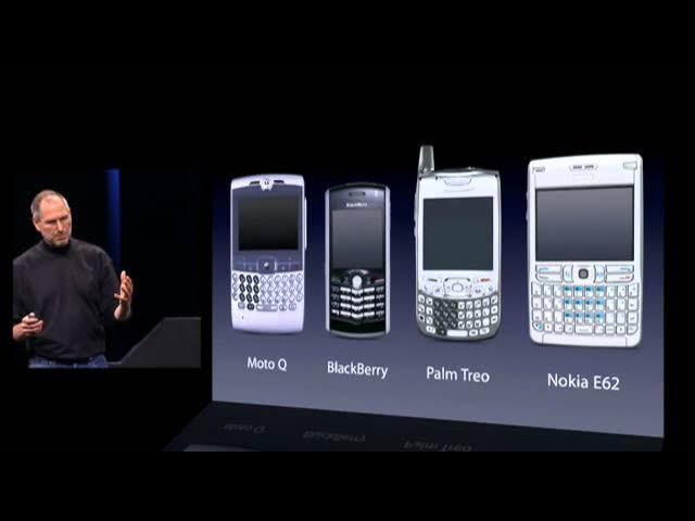
One of the many memorable moments in Steve Jobs’s 2007 introduction of the original iPhone was this slide showing four of the then-leading smartphones on the market. Jobs explained:
Now, why do we need a revolutionary user interface? Here’s four smartphones, right? Motorola Q, the BlackBerry, Palm Treo, Nokia E62 — the usual suspects. And, what’s wrong with their user interfaces? Well, the problem with them is really sort of in the bottom 40 there. It’s this stuff right there. They all have these keyboards that are there whether or not you need them to be there. And they all have these control buttons that are fixed in plastic and are the same for every application. Well, every application wants a slightly different user interface, a slightly optimized set of buttons, just for it.
And what happens if you think of a great idea six months from now? You can’t run around and add a button to these things. They’re already shipped. So what do you do? It doesn’t work because the buttons and the controls can’t change. They can’t change for each application, and they can’t change down the road if you think of another great idea you want to add to this product.
Well, how do you solve this? Hmm. It turns out, we have solved it. We solved it in computers 20 years ago. We solved it with a bitmapped screen that could display anything we want. Put any user interface up. And a pointing device. We solved it with the mouse. We solved this problem. So how are we going to take this to a mobile device? What we’re going to do is get rid of all these buttons and just make a giant screen. A giant screen.
At the time, what seemed most radical was eschewing a hardware QWERTY keyboard and instead implementing a touchscreen keyboard in software. Steve Ballmer, then CEO of Microsoft, in the infamous clip in which he laughed uproariously after being asked for his reaction to seeing the iPhone: “500 dollars? Fully subsidized, with a plan? I said, that is the most expensive phone in the world, and it doesn’t appeal to business customers because it doesn’t have a keyboard, which makes it not a very good email machine.”
Apple didn’t get rid of all the buttons, of course. But the buttons they kept were all for the system, the device, not for any specific application: power, volume, a mute switch (that, oddly, was copied by almost no competitors), and the lone button on the front face: Home.1 That’s it.
When Apple’s competitors stopped laughing at the iPhone and started copying it, they got rid of their hardware keyboards — theretofore the primary signifier differentiating a “smartphone” from a regular phone — but they couldn’t bring themselves to eliminate the not one but two dedicated hardware buttons that, to their unimaginative minds, were inherent to making any cell phone a phone: the green “call” and red “hang up” buttons. Android phones had those red/green buttons. The BlackBerry Storm had them too. Every phone but the iPhone had them. Until they caught up and realized those buttons were obviated too.
The thinking might have been rooted in the very name of the devices. Of course all phones — dumb phones, BlackBerry-style hardware-keyboard phones, iPhone-style touchscreen phones — ought to have phone buttons. I suspect they pondered very deeply how Apple was bold enough to eschew a hardware keyboard for an all-touchscreen design, but that they thought Apple was just taking minimalism to its extreme by eschewing green/red hardware call buttons. No matter how many other things they do, they’re phones first — it’s right there in their name!
But the iPhone has never really been fundamentally a telephone. On the iPhone, the Phone was always just another app. A special app, no question. Default placement in the Dock at the bottom of the Home Screen. Special background privileges within an otherwise highly constrained OS where most apps effectively quit when you’d go back to the Home Screen. Incoming phone calls instantly took over the entire screen. Jobs spent a lot of time in that introduction demonstrating the Phone app — including Visual Voicemail, a genuine breakthrough feature that required AT&T/Cingular’s cooperation on the back end.2
But, still, the Phone part of iPhone was then and remains now just an app. If you compared an iPhone to an iPod Touch, there was nothing on the iPhone hardware that indicated it was any more of a phone than the iPod Touch, which not only wasn’t a phone but didn’t even offer cellular networking. No buttons, for sure. No stick-out antenna. No carrier logo on the device. Look at a modern iPhone and there’s really only one function whose purpose is clearly visible from a conspicuous hardware protrusion: the camera lenses. Five years ago, in the lede of my review of the iPhones 11, I wrote, “A few weeks ago on my podcast, speculating on the tentpole features for this year’s new iPhones, I said that ‘iCamera’ would be a far more apt name than ‘iPhone’.”
What more proof of the camera’s singular importance to the iPhone would one need than the ever-growing block of camera lenses on the back of each year’s new models, or the “Shot on iPhone” ad campaign — the longest-running (and still ongoing) campaign in Apple’s history? A dedicated hardware button?
Camera Control
The facile take is that Apple has run out of hardware ideas and now just adds a new button to the iPhone each year — Action button last year, Camera Control this year, maybe they’ll finally add those green/red phone call buttons next year. But that’s underestimating just how radical it is for Apple, in the iPhone’s 18th annual hardware iteration, to add a hardware button dedicated to a single application.
And I mean application there in the general sense, not just the app sense. By default, of course, pressing Camera Control launches the iOS Camera app,3 but while setting up any new iPhone 16, Apple’s own onboarding screen describes its purpose as launching “a camera app”, with a lowercase c. Any third-party app that adopts new APIs and guidelines can serve as the camera app that gets launched (and, once launched, controlled) by Camera Control. (I’ll default to writing about using the system Camera app, though.)
Apple seemingly doesn’t ever refer to Camera Control as a “button”, but it is a button. You can see it depress, and it clicks even when the device is powered off (unlike, say, the haptic Touch ID Home button on iPhones of yore and the long-in-the-tooth iPhone SE). But it isn’t only a button. You can think of it as two physical controls in one: a miniature haptic slider (like a trackpad with only one axis) and an actually-clicking button.
When the Camera app is not already in shoot mode (whether your iPhone is on the Lock Screen or if another app is active — or even if you’re doing something else inside the Camera app other than shooting, like, say, reviewing existing photos):
- A full click of the Camera Control button launches the Camera app (if necessary) and puts you in shoot mode.
- A light press triggers nothing, nor offers any haptic feedback. Light pressing only does something when you’re in the Camera app ready to shoot.
When the Camera app is active and ready to shoot:
- A full click of the Camera Control button takes a photo or starts a video, depending on your current mode. (If you’re in still-photo mode, clicking-and-holding Camera Control will start a video, just like pressing-and-holding the on-screen shutter button.)
- A light press on Camera Control opens an overlay that allows you to adjust the current settings mode by sliding your finger left to right, trackpad-style.
- A double light press on Camera Control changes to the overlay to select which setting to adjust. The options are: Exposure, Depth (ƒ-stop), Zoom, Cameras, Style, Tone.
Just writing that all out makes it sound complicated, and it is a bit complex. (Here’s Apple’s own illustrated guide to using Camera Control.) Cameras are complex. But if you just mash it down, it takes a picture. Camera Control is like a microcosm of the Camera app itself. Just want to point and shoot? Easy. Want to fiddle with ƒ-stops and styles? There’s a thoughtful UI to do that. In the early years of iPhone, Apple’s Camera app was truly point-and-shoot simplistic. The shooting interface had just a few buttons: a shutter, a photo/video toggle, a control for the flash, and a toggle for switching to the front-facing camera. The original iPhone and iPhone 3G didn’t even support video, and the front-facing camera didn’t arrive until the iPhone 4. Those old iPhones had simple camera hardware, and the app reflected that simplicity.
Apple’s modern camera hardware has become remarkably sophisticated, and the Camera app has too. But if you just want to shoot what you see in the viewfinder, it’s as simple as ever. Pinch to zoom, tap to focus, press the shutter button to shoot. But so many other controls and options are there, readily available and intelligently presented for those who want them, easily ignored by those who don’t. Apple’s Camera app is one of the best — and best-designed — pieces of software the world has ever seen. It’s arguably the most-copied interface the world has ever seen, too. You’d be hard-pressed to find a single premium Android phone whose built-in camera app doesn’t look like Apple’s, usually right down to the yellow accent color for text labels.
After over a week using several iPhone 16 review units, my summary of Camera Control is that it takes a while to get used to — I feel like I’m still getting used to it — but it already feels like something I wouldn’t want to do without. It’s a great idea, and a bold one. As I emphasized above, only in the 18th hardware revision has Apple added a hardware control dedicated to a single application. I don’t expect Apple to do it again. I do expect Apple’s rivals to copy Camera Control shamelessly.
At first, though, I was frustrated by the physical placement of Camera Control. As a hobbyist photographer who has been shooting with dedicated cameras all the way back to the late 1990s, my right index finger expects a shutter button to be located near the top right corner. But the center of Camera Control is 2 inches (5 cm) from the corner. I’ll never stop wishing for it to be closer to the corner, but after a week I’ve grown acclimated to its actual placement. And I get it. I’m old enough that I shoot all of my videos and most of my photos in widescreen orientation. But social media today is dominated by tallscreen video. As Apple’s Piyush Pratik explained during last week’s keynote, Camera Control is designed to be used in both wide (landscape) and tall (portrait) orientations. Moving it more toward the corner, where my finger wants it to be, would make it better for shooting widescreen, but would make it downright precarious to hold the iPhone while shooting tall. I hate to admit it but I think Apple got the placement right. Shooting tallscreen is just way too popular. And, after just a week, my index finger is getting more and more accustomed to its placement. It might prove to be a bit of a reach for people with small hands, though.
I’ve also been a bit frustrated by using Camera Control to launch Camera while my iPhone is locked. With the default settings, when your iPhone is unlocked, or locked but with the screen awake, a single click of Camera Control takes you right to shooting mode in the Camera app. That sounds obvious, and it is. But, when your iPhone is locked and the screen is off, or in always-on mode, clicking Camera Control just wakes up the screen. You have to click it again, after the screen is awake, to jump to shooting mode. Apple’s thinking here is obvious: they want to prevent an accidental click of Camera Control while it’s in your pocket or purse from opening Camera. Unlike almost every other mode you can get into on an iPhone, when you’re in shooting mode in Camera, the device won’t go to sleep automatically after a minute or two of inactivity. The current default in iOS 18, in fact, is to auto-lock after just 30 seconds. (Settings → Display & Brightness → Auto-Lock.) In shooting mode, the Camera app will stay open for a long time before going to sleep. You don’t want that to happen inadvertently while your iPhone is in your pocket.
But what I’ve encountered over the last week are situations where my iPhone is in my pocket, and I see something fleeting I want to shoot. This happened repeatedly during a Weezer concert my wife and I attended last Friday. (Great show.) What I want is to click Camera Control while taking the iPhone out of my pocket, and have it ready to shoot by the time I have it in front of my eyes. That’s how the on/off button works on dedicated cameras like my Ricoh GR IIIx. But with an iPhone 16, more often than not, the single click of Camera Control while taking the iPhone out of my pocket has only awakened the screen, not put it into shooting mode. I need to click it again to get into shooting mode. With a fleeting moment, that’s enough to miss the shot you wanted to take. The whole point of this is being a quick-draw gunslinger.
Apple offers a more-protective option in Settings → Camera → Camera Control → Launch Camera to require a double click, rather than single click, to launch your specified camera app. As I write this, I wish that they also offered a less-protective option to always launch your camera app on a single click, even if the phone is locked and the screen is off. A sort of “I’ll take my chances with accidental clicks” option. It’s possible though that Apple tried this, and found that inadvertent clicks are just too common. But as it stands, there’s no great way to always jump into shooting mode as quickly as possible.
When the iPhone is locked and the screen is off, a double click of Camera Control will jump you into shooting mode. I started doing that over the weekend, and at first I thought it satisfied my desire. But the problem with that is that if the iPhone is locked but the screen is already awake, a double click on Camera Control will jump into Camera on the first click and snap a photo with the second. I’ve had to delete at least half a dozen blurry accidental shots because of that.
A gesture that would avoid accidental invocations is clicking-and-holding the Camera Control button. In theory Apple could offer that as a surefire way to launch Camera while taking your iPhone out of your pocket. But Apple has reserved the click-and-hold gesture for visual intelligence, a new Apple Intelligence feature announced last week. That’s the feature that will put the nail in the coffin of dedicated “AI” devices like Humane’s AI Pin and Rabbit’s R1. Visual intelligence isn’t yet available, even in the developer betas of iOS 18.1, but the click-and-hold gesture is already reserved for it.4
So where I’ve landed, at this writing, is trying to remember only to double-click Camera Control while taking my iPhone out of my pocket to shoot, and just sucking it up with the occasional blurry unwanted shot when I double-click Camera Control when the screen is already awake. The only other technique I can think to try is to remember to always wait until I see that the screen is awake before clicking Camera Control, tilting the phone if necessary to wake it, but that would seemingly defeat the purpose of getting into shooting mode as quickly as possible.
By default, if you light-press-and-hold on Camera Control, nearly all of the UI elements disappear from the viewfinder screen. The shooting mode picker (Cinematic, Video, Photo, Portrait, Spatial, etc.), the zoom buttons (0.5×, 1×, 2×, 5×), the front/rear camera toggle, the thumbnail of your most recent photo — all of that disappears from the screen, leaving it about as uncluttered as the original iPhone Camera interface. Think of it as a half-press while using Camera Control as a shutter button. Dedicated hardware cameras have, for many decades, offered two-stage shutter buttons that work similarly. With those dedicated cameras, you press halfway to lock in a focus distance and exposure; then you can move the camera to recompose the frame while keeping the focus distance and exposure locked, before pressing fully to capture the image. Apple has promised to bring this feature to the Camera app for all iPhone 16 models in a software update “later this year”. (It’s not there yet in iOS 18.1 beta 4.) Camera Control does not have quite the same precise feel as a true two-stage shutter button that physically clicks at two separate points of depression (two detents), but it might eventually, in future iPhone models.
One issue with Camera Control is that because it’s capacitive, it’s tricky for case makers. The obvious solution is to just put a cutout around it, letting the user’s finger touch the actual Camera Control button. Apple’s more elegant solution, on their own silicone and clear cases and the new glossy polycarbonate cases from their subsidiary Beats, is “a sapphire crystal, coupled to a conductive layer to communicate the finger movements to the Camera Control”. That doesn’t sound like something you’re going to see in cheap $20 cases. In my testing, both with Apple’s cases and Beats’s, it works fairly seamlessly. I do think you lose some of the feel from the haptic feedback on light presses, though. Ultimately, Camera Control makes it more true than ever before that the best way to use an iPhone is without a case.
One more thing on Camera Control. Of the features that are adjustable via Camera Control (again: Exposure, Depth (ƒ-stop), Zoom, Cameras, Style, Tone), “Cameras” is an easily overlooked standout. Zoom offers continuous decimal increments from 0.5× to 25.0×. That is to say, you can slide your finger to get zoom values like 1.7×, 3.3×, 17.4×, etc. I almost never want that. I want to stick to the precise true optical increments: 0.5×, 1×, 2×, and 5×. That’s what the “Cameras” setting mode offers. Think of it as Zoom, but only with those precise values. (Instead of “Cameras”, this setting could have been called “Lenses”, but that’s potentially confusing because 1× and 2× both come from the same physical lens; the difference is how the sensor data is treated.) In fact, I wish I could go into Settings and disable Zoom from the list of features available in Camera Control. If I ever really want a non-optical zoom level, I can use the existing on-screen interface options.
What’s obvious is that Camera Control clearly was conceived of, designed, and engineered by photography aficionados within Apple who are intimately familiar with how great dedicated cameras work and feel. It surely must have been championed, politically, by the same group. It’s really just rather astounding that there is now a hardware control dedicated to photography on all new iPhones — and a mechanically complex control at that.
Photography, Aside From Camera Control
As usual, I’ll leave it to other reviewers to do in-depth pixel-peeping comparisons of image quality, but suffice it to say, to my eyes, the iPhone 16 Pro (the review unit I’ve been daily driving this past week) camera seems as great as usual.
The big new photographic feature this year has nothing to do with lenses or sensors. It’s a next-generation Photographic Styles, and it’s effectively “RAW for the rest of us”. This has always been the edge of my personal photographic nerdery/enthusiasm. I care enough about photography to have purchased numerous thousand-ish dollar cameras (and lenses) over the decades, but shooting RAW has never stuck for me. I understand what it is, and why it is technically superior to shooting JPEG/HEIC, but it’s just too much work. RAW lets you achieve better results through manual development in post, but you have to develop in post because raw RAW images (sorry) look strikingly flat and unsaturated. For a while I tried shooting RAW + JPEG, where each image you take is stored both as a straight-off-the-sensor RAW file and a goes-through-the-camera-imaging-pipeline JPEG file, but it turned out I never ever went back and developed those RAW images. And relative to JPEG/HEIC (which, henceforth, I’m just going to call “shooting JPEG” for brevity, even though iPhones have defaulted to the more-efficient HEIC format since iOS 11 seven years ago), RAW images take up 10× (or more) storage space.
It’s just too much hassle. The increase in image quality I can eke out developing RAW just isn’t worth the effort it takes — for me. For many serious photographers, it is. Everyone has a line like that. Some people don’t do any editing at all. They never crop, never change exposure in post, never apply filters — they just point and shoot and they’re done. For me, that line is shooting RAW.
Apple first introduced Photographic Styles with the iPhones 13 three years ago, with four self-descriptive primary styles: Rich Contrast (my choice), Vibrant, Warm, and Cool. Each primary style offered customization. Find a style you like, set it as your default, and go about your merry way. But whatever style you chose was how your photos were “developed” by the iPhone hardware imaging pipeline. Apple’s “filters” have been non-destructive for years, but the first generation of Photographic Styles are baked into the HEIC files it writes to storage.
With the iPhone 16 lineup, this feature is now significantly more powerful, while remaining just as convenient and easy to use.5 Apple eliminated what used to be called “filters” and recreated the better ones (e.g. Vibrant and Dramatic) as styles. There are now 15 base styles to choose from, most of them self-descriptively named (Neutral, Gold, Rose Gold), some more poetically named (Cozy, Quiet, Ethereal). The default style is named Standard, and it processes images in a way that looks, well, iPhone-y. The two that have me enamored thus far are Natural and Stark B&W. Standard iPhone image processing has long looked, to many of our eyes, at least slightly over-processed. Too much noise reduction, too much smoothing. A little too punchy. Natural really does look more natural, in a good way, to my eyes. Stark B&W brings to mind classic high-contrast black-and-white films like Kodak Tri-X 400.
A key aspect of Photographic Styles now is that they’re non-destructive. You can change your mind about any of it in post. Set your default to Stark B&W and later on, editing in Photos, you can change your mind and go back to a full-color image using whichever other style you want. There’s a lot of complex image processing going on behind the scenes — both in the iPhone 16 hardware and iOS 18 software — to make this seem like no big deal at all. But because the new Photographic Styles are largely (or entirely?) based on the hardware imaging pipeline, iPhones 13–15 will continue to use the first-generation Photographic Styles, even after upgrading to iOS 18.
I’ve always felt a little guilty about the fact that I’m too lazy to shoot RAW. This next-generation Photographic Styles feature in the iPhone 16 lineup might assuage, I suspect, the remaining vestiges of that guilt.
Design — and the Pro vs. Regular Question
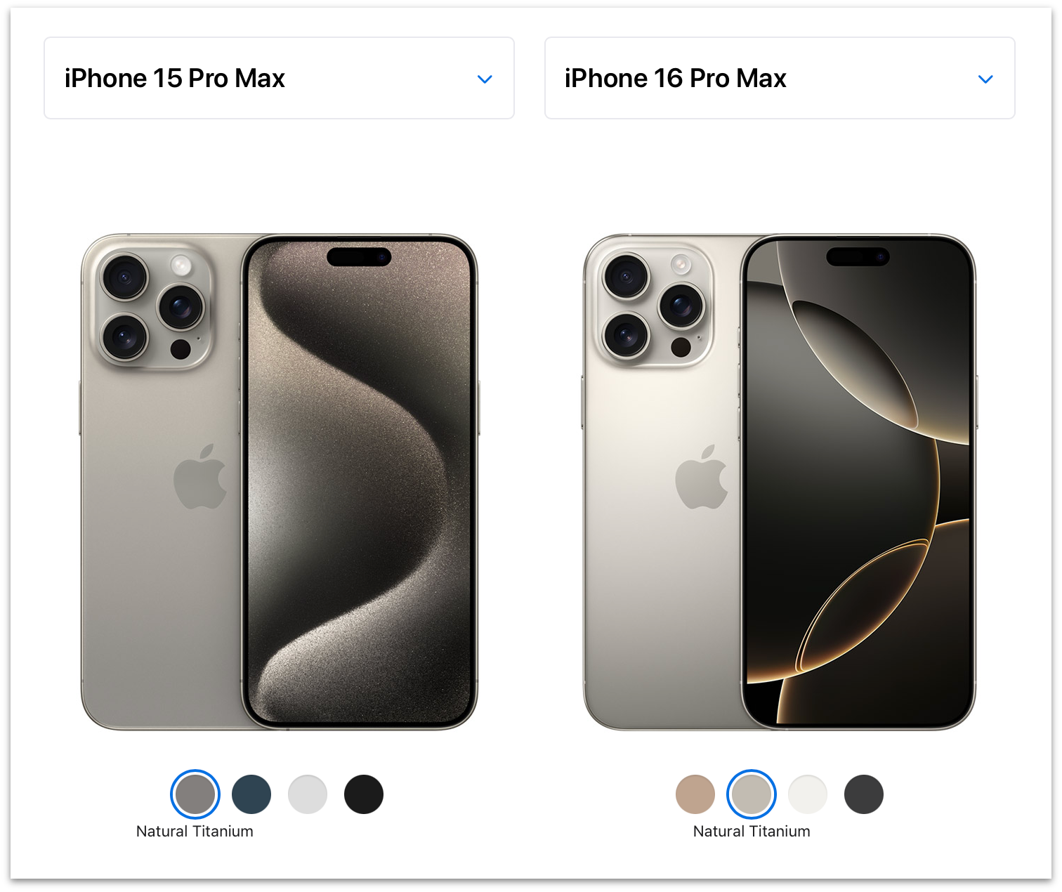
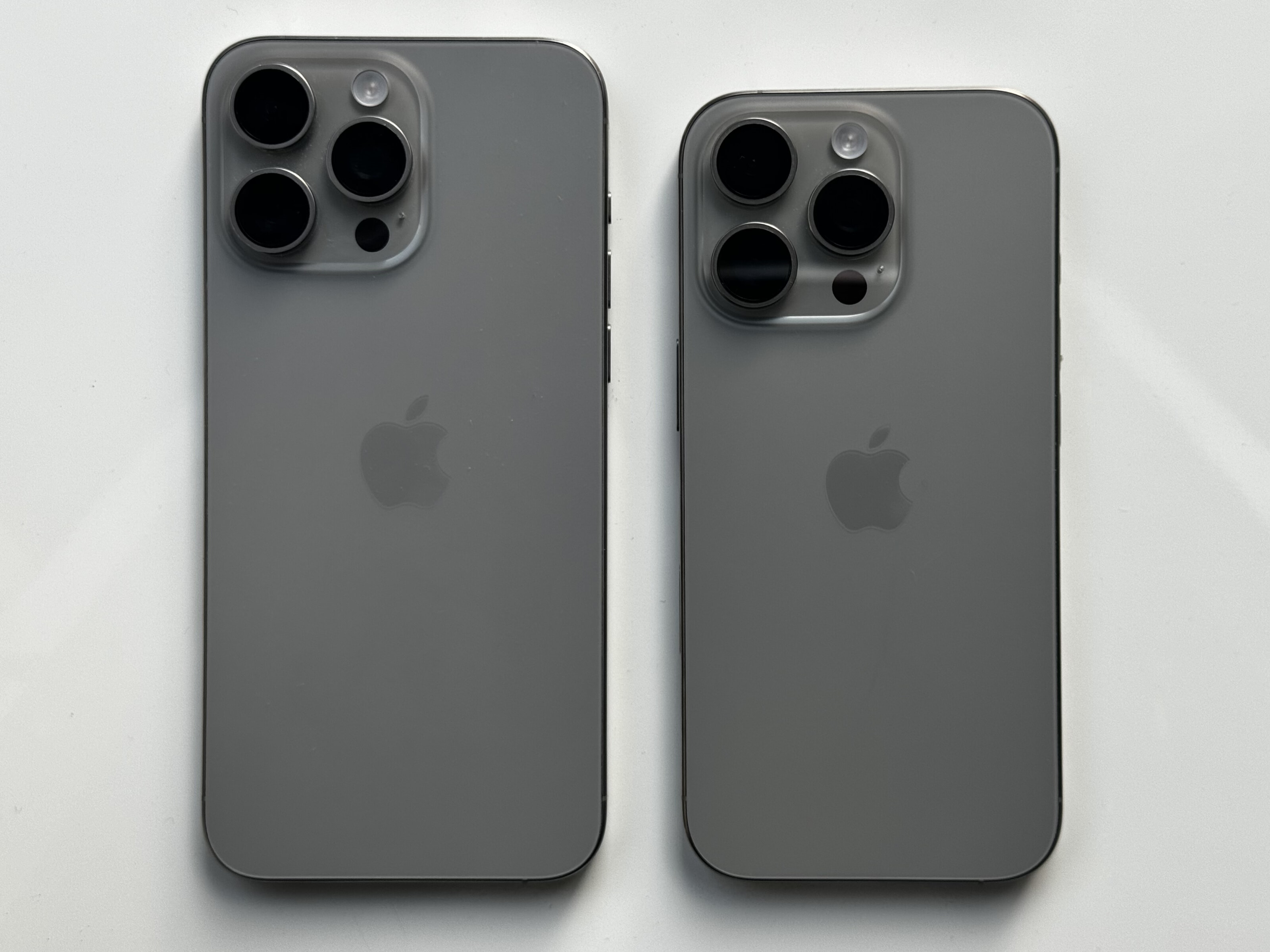
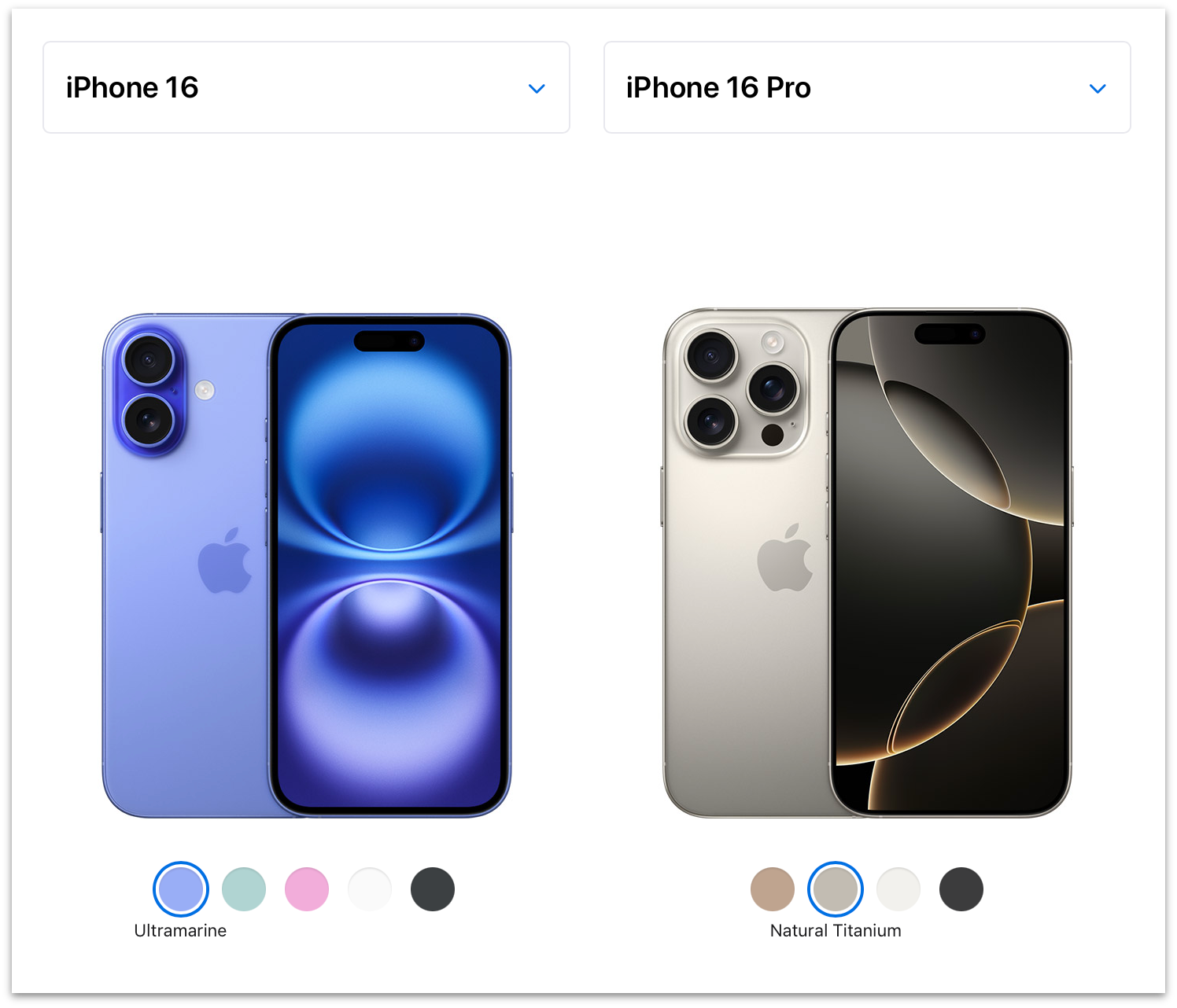
Apple kindly supplied me with all four models in the iPhone 16 lineup for review: the 16 in ultramarine, 16 Plus in pink, 16 Pro in natural titanium, and 16 Pro Max in desert titanium. Ultramarine is my favorite color color on any iPhone in memory. It’s a fun poppy blue, and quite vibrant. Pink is good too, with to my (and my wife’s) eyes, a touch of purple to it. The colors are extra saturated on the camera bumps, which looks great. Natural titanium looks extremely similar, if not identical, to the natural titanium on last year’s iPhone 15 Pro. (Apple’s own Compare page makes it appear as though this year’s natural titanium is noticeably lighter than last year’s, but here’s a photo from me showing a natural 15 Pro Max and 16 Pro side-by-side.) Desert titanium is sort of more gold than tan, but there is some brown to it, without rendering it the least bit Zune-like.
In short, the regular iPhone 16 offers some colors that truly pop. The iPhone 16 Pro models remain, as with all previous “Pro” iPhone colorways, staid shades of gray. White-ish gray, gray gray, near-black gray, and now desert gray.
I always buy black, or the closest to black Apple offers, and this tweet I wrote back in 2009 remains true, so the only year I’ve ever had a “which color to buy?” personal dilemma was 2016 with the iPhones 7, which Apple offered in both a matte “black” and Vader-like glossy “jet black”.6 I still kind of can’t believe Apple offered two utterly different blacks in the same model year.
But “which model to buy?” is sometimes more of a dilemma for yours truly. In 2020 I bought a regular iPhone 12, not the 12 Pro, on the grounds that it weighed less and felt better in hand than the Pro models. Whatever the non-pro iPhone 12 lacked in photographic capabilities wouldn’t matter so much, I correctly guessed, while I remained mostly homebound during the Covid epidemic. But I was also tempted, sorely, by the 12 Mini, and in hindsight I really don’t remember why that’s not the model I bought that year.
It’s a good thing, and a sign of strength for Apple, when the regular iPhone models are extremely appealing even to power users. It seemed like an artificial restriction last year, for example, that only the 15 Pro model got the new Action button. The year prior, only the 14 Pro models got the Dynamic Island; the regular iPhone 14 models were stuck with a no-fun notch. If you’re fairly deep into the weeds regarding TSMC’s first-generation 3nm fabrication, it makes sense why only the iPhone 15 Pro models got a new chip (the A17 Pro — there was no regular A17) while the iPhone 15 models stayed on the year-old A16, but still, that was a bummer too. This year, the regular 16 and 16 Plus not only get the Action button, they get the new Camera Control too (which, as I opined above, would make more sense as a “pro” feature than the Action button did last year), and a new A18 chip fabricated with TSMC’s second-generation 3nm process.
For my own use I’ve preordered an iPhone 16 Pro. But for the first time since the aforementioned iPhone 12 in 2020, I was genuinely tempted by the regular iPhone 16. The biggest functional difference between the 16 and 16 Pro models is that only the 16 Pros have a third telephoto lens. Last year, the 15 Pro Max went to 5×, but the 15 Pro remained at 3×. This year, both the 16 Pro and 16 Pro Max have the 5× telephoto lens. I tend to think I seldom use the telephoto lens, but it turns out I used it a little more in the last year than I would have guessed. Using smart albums in Photos to sort images by camera and lens, it looks like out of 3,890 total photos I shot with my iPhone 15 Pro, the breakdown by camera lens went like this:
| Camera | Optical Zoom | Photos | Percentage |
|---|---|---|---|
| Ultrawide | 0.5× | 338 | 9% |
| Main | 1×/2× | 3,076 | 79% |
| Telephoto | 3× | 476 | 12% |
And, eyeballing the photos in that telephoto lens smart album, for most of them, I could have used a little more reach. I don’t expect to use 5× more often than I used 3×, but I expect to get better shots when I do. But it’s also the case that a fair number of the photos in that telephoto smart album are shots I just don’t care about that much. I do use the telephoto lens, and I look forward to having a 5× one instead of 3×, but I could live without it entirely and not miss it too much. (I only have 8 videos shot using 3× from the last year. Longer lenses are not good focal lengths for handheld video.)
Aesthetically, the two-lens arrangement on the back of the iPhones 16 and 16 Plus is far more pleasing than the three-lens triangle-in-a-square arrangement on the iPhones 16 Pro and 16 Pro Max.
For the last few years (the iPhone 13, 14, and 15 generations), the aesthetic difference in the back camera systems hasn’t been so striking, because Apple placed the non-pro iPhones’ two lenses in a diagonal arrangement inside a square block. The two lenses on the backs of the iPhones 11 and 12 were aligned on the same axis (vertical, when holding the phone in tallscreen orientation), but they were still inside a raised square. You’d have to go back to 2018’s iPhone XS to find a two-lens iPhone with the iPhone 16’s pleasing pill-shaped bump.
Either you care about such purely aesthetic concerns or you don’t. I care. Not enough to purchase an iPhone 16 instead of a 16 Pro, but it was a factor. The iPhone 16 and 16 Plus simply look more pleasing from the back and feel better in hand, especially caseless, than any iPhone since 2018.
Here’s the pricing for the entire iPhone 16 lineup:
| Model | 128 GB | 256 GB | 512 GB | 1 TB |
|---|---|---|---|---|
| 16 | $800 | $900 | $1,100 | — |
| 16 Plus | $900 | $1,000 | $1,200 | — |
| 16 Pro | $1,000 | $1,100 | $1,300 | $1,500 |
| 16 Pro Max | — | $1,200 | $1,400 | $1,600 |
But perhaps a better way to compare is by size class. Regular size:
| Model | 128 GB | 256 GB | 512 GB | 1 TB |
|---|---|---|---|---|
| 16 | $800 | $900 | $1,100 | — |
| 16 Pro | $1,000 | $1,100 | $1,300 | $1,500 |
And big-ass size:
| Model | 128 GB | 256 GB | 512 GB | 1 TB |
|---|---|---|---|---|
| 16 Plus | $900 | $1,000 | $1,200 | — |
| 16 Pro Max | — | $1,200 | $1,400 | $1,600 |
At both size classes, it’s a $200 delta to go from the regular model to its Pro equivalent. Looking at Apple’s excellent-as-always Compare page, here are the advantages/exclusive features that jump out to me for the 16 Pro models, other than the extra telephoto camera lens, roughly in the order in which I personally care:
- Always-on display.
- ProMotion display (adaptive refresh rates up to 120 Hz vs. 60 Hz).
- An extra GPU core (6 vs. 5), which Geekbench 6 benchmarks as 17 percent faster. Call it 20 percent if you trust core count more than Geekbench.
- Night mode portrait photos.
- LiDAR scanner, which I presume is a (or the?) reason why Night mode portrait photos are Pro-exclusive.
- “Studio-quality four-mic array”. I put that in quotes not to express skepticism but because I haven’t tested it or compared it against the iPhone 16. But it, uh, sounds like a great new feature.
- USB 3 support vs. USB 2, for “up to 20× faster transfers”.
- A roughly 4 percent faster CPU in both single- and multi-core performance, according to Geekbench 6.
- Ability to shoot Dolby Vision video up to 4K at 120 fps.
- Apple ProRAW photos and ProRes videos (and other pro video features like log video recording and ACES).
I think it’s amazing that the iPhone Pro models are now able to shoot professional-caliber video. But I don’t shoot video professionally. And because I don’t, I can’t remember the last time I needed to transfer data from my iPhone via the USB-C port, so, while the Pro models offer a noticeable advantage in USB performance, I might never use it personally over the next year.
Another difference is that the 16 Pro models have slightly bigger displays than the regular 16 models. The 16 Pro and 16 Pro Max are 6.3 and 6.9 inches; the regular 16 and 16 Plus are 6.1 and 6.7. Whether that’s actually an advantage for the Pro models depends on whether you care that they’re also slightly taller and heavier devices in hand.
Battery Life
I omitted from the above comparison the one spec people care most about: battery life. Here is the sleeper spec where the Pro models earn their keep. Once again grouping like-vs.-like size classes, and including the 15 Pro models for year-over-year comparison:
| Model | Video | Video (streamed) |
|---|---|---|
| 15 Pro | 23 hours | 20 hours |
| 16 | 22 hours | 18 hours |
| 16 Pro | 27 hours | 22 hours |
| 15 Pro Max | 29 hours | 25 hours |
| 16 Plus | 27 hours | 24 hours |
| 16 Pro Max | 33 hours | 29 hours |
Those battery life numbers come from Apple, not my own testing (and Apple cites them as “up to” numbers). But those numbers suggest 20 percent longer battery life on the 16 Pro models compared to their size-class non-pro counterparts. Anecdotally, that feels true to me. I use a Shortcuts automation to turn on Low Power mode whenever my iPhone battery level drops below 35 percent. With my iPhone 15 Pro, that generally happens every night at some point. Over the last week using the iPhone 16 Pro as my primary iPhone, it hasn’t dropped that low most nights. To say the least, that’s not a rigorous test in any way, shape, or form. But Apple has no history of exaggerating battery life claims, especially relative comparisons between devices. I think it’s the real deal, and the 16 Pro and 16 Pro Max probably get 20 percent longer battery life than their corresponding 16 and 16 Plus counterparts, and between 10–15 percent over last year’s Pro models, in practical day-to-day use.
That alone might be worth a big chunk of the $200 price difference to some people.
Apple Intelligence
I spent the weekdays last week running iOS 18.0; on Friday afternoon, I upgraded my 16 Pro review unit to the developer beta of iOS 18.1 (beta 3 at the time, since upgraded to beta 4). I’m sure many, if not most reviewers, will review only what comes in the box, and what’s coming in the box this week will be iOS 18.0 without any Apple Intelligence features.
That stance is fair enough, but I don’t see it as a big deal to include my 18.1 experience in this review. iOS 18.1 feels pretty close to shipping. Apple has promised “October”, and my gut feeling, using it for the last five days on this review unit, is that it’s pretty solid. I suspect it might ship closer to early October than late October. But even if it doesn’t appear until Halloween, I don’t think it’s absurd or offensive that Apple is already using Apple Intelligence to market the iPhone 16 lineup. It’s a little awkward right now, but it’s not a sham. It’s vaporware until it actually ships, but it’s vaporware that anyone with a developer account can install right now.
Also, none of the Apple Intelligence features currently in iOS 18.1 are game-changing. The Clean Up feature in Photos is pretty good, and when it doesn’t produce good results, you can simply revert to the original. The AI-generated summaries of messages, notifications, and emails in Mail are at times apt, but at others not so much. I haven’t tried the Rewrite tool because I’m, let’s face it, pretty confident in my own writing ability. But, after my own final editing pass, I ran this entire review through the Proofread feature, and it correctly flagged seven mistakes I missed, and an eighth that I had marked, but had forgotten to fix. Most of its suggestions that I have chosen to ignore were, by the book, legitimate. (E.g., it suggested replacing the jargon-y lede with the standard spelling lead. It also flagged my stubborn capitalization of “MacOS”.) It took 1 minute, 45 seconds to complete the proofreading pass of the 7,200+ words in Apple Notes on the iPhone 16 Pro. (Subsequent to the original publication of this review, I tried the Rewrite function on the text of it, for shits and giggles, and the only way I can describe the results is that it gave up.)
New Siri definitely offers a cooler-looking visual interface. And the new Siri voices sound more natural. But it also feels like Siri is speaking too slowly, as though Siri hails from the Midwest or something. (Changing Siri’s speaking rate to 110 percent in Settings → Accessibility → Siri sounds much more natural to my ears, and feels like it matches old Siri’s speaking rate.) Type to Siri is definitely cool, but I don’t see why we couldn’t have had that feature since 2010. I have actually used the new “Product Knowledge” feature, where Siri draws upon knowledge from Apple’s own support documentation, while writing this review. It’s great. But maybe Apple’s support website should have had better search years ago?
These are all good features. But let’s say you never heard of LLMs or ChatGPT. And instead, at WWDC this year, without any overarching “Apple Intelligence” marketing umbrella, Apple had simply announced features like a new cool-looking Siri interface, typing rather than talking to Siri, being able to remove unwanted background objects from photos, a “proofreading” feature for the standard text system that extends and improves the years-old but (IMO) kinda lame grammar-checking feature on MacOS, and brings it to iOS too? Those would seem like totally normal features Apple might add this year. But not tentpole features. These Apple Intelligence features strike me as nothing more than the sort of nice little improvements Apple makes across its OSes every year.
Apple reiterated throughout last week’s “It’s Glowtime” keynote, and now in its advertising for the iPhone 16 lineup, that these are the first iPhones “built for Apple Intelligence from the ground up”. I’m not buying that. These are simply the second generation of iPhone models with enough RAM to run on-device LLMs. LLMs are breakthrough technology. But they’re breakthroughs at the implementation level. The technology is fascinating and important, but so are things like the Swift programming language. I spent the first half of my time testing the iPhone 16 Pro running iOS 18.0 and the second half running 18.1 with Apple Intelligence. A few things got a little nicer. That’s it.
I might be underselling how impossible the Clean Up feature would be without generative AI. I am very likely underselling how valuable the new writing tools might prove to people trying to write in a second language, or who simply aren’t capable of expressing themselves well in their first language. But like I said, they’re all good features. I just don’t see them as combining to form the collective tentpole that Apple is marketing “Apple Intelligence” as. I get it that from Apple’s perspective, engineering-wise, it’s like adding an entire platform to the existing OS. It’s a massive engineering effort and the on-device execution constraints are onerous. But from a user’s perspective, they’re just ... features. When’s the last year Apple has not added cool new features along the scope of these?
Apple’s just riding — and now, through the impressive might of its own advertising and marketing, contributing to — the AI hype wave, and I find that a little eye-roll inducing. It would have been cooler, in an understated breathe-on-your-fingernails-and-polish-them-on-your-shirt kind of way, if Apple had simply added these same new features across their OSes without the marketing emphasis being on the “Apple Intelligence” umbrella. If not for the AI hype wave the industry is currently caught in, this emphasis on which features are part of “Apple Intelligence” would seem as strange as Apple emphasizing, in advertisements, which apps are now built using SwiftUI.
If the iPhone 16 lineup was “built from the ground up” with a purpose in mind, it’s to serve as the best prosumer cameras ever made. Not to create cartoon images of a dog blowing out candles on a birthday cake. The new lineup of iPhones 16 are amazing devices. The non-pro iPhone 16 and 16 Plus arguably offer the best value-per-dollar of any iPhones Apple has ever made. This emphasis on Apple Intelligence distracts from that.
The problem isn’t that Apple is marketing Apple Intelligence a few weeks before it’s actually going to ship. It’s that few of these features are among the coolest or most interesting things about the new iPhone 16 lineup, and none are unique advantages that only Apple has the ability or inclination to offer.7 Every phone on the market will soon be able to generate impersonal saccharine passages of text and uncanny-valley images via LLMs. Only Apple has the talent and passion to create something as innovative and genuinely useful as Camera Control.
-
While I’m reminiscing, allow me to reiterate my belief that the icon on the iPhone Home button is the single greatest icon ever designed. In my 2017 review of the iPhone X, I wrote:
↩︎The fundamental premise of iOS Classic is that a running app gets the entire display, and the Home button is how you interact with the system to get out of the current app and into another. Before Touch ID, the Home button was even labeled with a generic empty “app” icon, an iconographic touch of brilliance. [...]
I find it hard to consider a world where that button was marked by an icon that looked like a house (the overwhelmingly common choice for a “home” icon) or printed with the word “HOME” (the way iPods had a “MENU” button). Early iPhone prototypes did, in fact, have a “MENU” label on the button.
I truly consider the iPhone Home button icon the single best icon ever. It perfectly represented anything and everything apps could be — it was iconic in every sense of the word.
-
It’s almost unfathomable how much of a pain in the ass voicemail was before the iPhone. Rather than manage messages on screen, you placed a phone call to your carrier and interfaced with their system by punching number buttons. You had to deal with each message sequentially. “Press 1 to play, 2 to go to the next message, 7 to delete.” And you had to actually listen to the messages to know who they were from. It was horrible. ↩︎︎
-
Unless, I suppose, you live in the EU and have exercised your hard-earned right to delete it. ↩︎︎
-
That’s the only way to launch visual intelligence, which means the feature is exclusive to the iPhone 16 lineup and won’t be available on iPhone 15 Pros. I’m truly looking forward to this feature, so that’s a bummer for iPhone 15 Pro owners. ↩︎︎
-
Here’s Apple’s brief documentation for the old Photographic Styles feature (iPhones 13, 14, 15) and the new version (iPhones 16). ↩︎︎
-
Jet black aluminum is back, and as Vader-esque as it was on the iPhone 7 in 2016, with a new colorway for the Apple Watch Series 10 this year. I have a review unit in jet black on my wrist and it’s so great. ↩︎︎
-
It’s fair to argue that Private Cloud Compute is uniquely Apple. Not that Apple is the only company that could build out such an infrastructure for guaranteed-private off-device AI processing, but among the few companies that could do it, Apple is the only one that cares so deeply about privacy that they would. I do not expect Private Cloud Compute to be replicated by Google, Samsung, Meta, Amazon, or Microsoft. Nor any of the AI startups like OpenAI or Anthropic. They simply don’t care enough to do it the hard way. Apple does. But that belongs in the marketing for Apple’s ongoing Privacy campaign, not for the iPhones 16 in particular. ↩︎︎