
By John Gruber

Paper — The connected canvas for teams shipping with agents
Single-Story a’s in Very Early Versions of Macintosh System 1
Wednesday, 14 May 2025
Following up on my gripe regarding the alternative a glyph used in Apple Notes, here’s Kevin Fox, tweeting on Threads:
While we’re waxing nostalgic on the Original Mac, a Daring Fireball post today (below) reminded me of another piece of Mac 128k trivia.
Until shortly before the official release, the ‘a’ in Geneva was a single story ‘a’ like you see currently (and to some, infuriatingly) in the Notes app.
The screenshots in the original Mac 128k user manual show the OS using the pre-release single-story ‘a’ before it was changed.
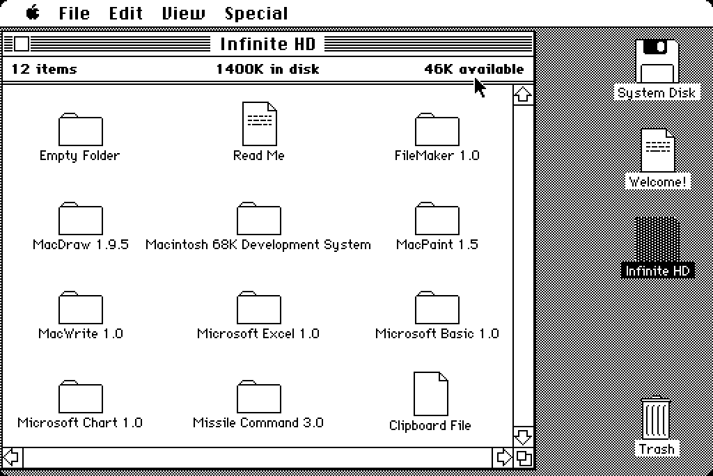
I double-checked using the (amazing) classic Mac emulators at Infinite Mac, and it turns out, Apple actually shipped System 1.0 with a version of Geneva with a single-story a glyph — but only in the 9-point version of Geneva. At 12 points (and larger), Geneva’s a was double-story. Here are screenshots of the Finder showing Geneva 9 in System 1.0 (with single-story a):
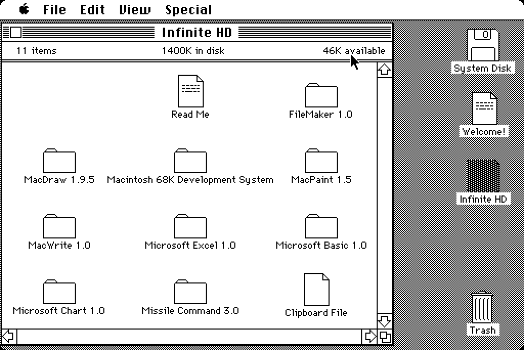
And System 2.0 (with double-story a):
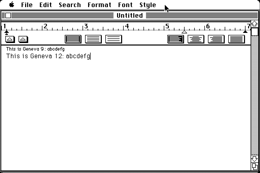
And a screenshot of MacWrite running on System 1.0 showing Geneva 9 and 12:
Geneva 9 — the eventual version, with a double-story a — is so intimately familiar to me that looking at those screenshots from System 1.0 makes me feel weird. It’s so clearly wrong. (What it feels like, to me, is the original Palm OS, from the one-bit Palm Pilot / Handspring Visor days. Palm’s small sans serif font was very Geneva-9-ish, but their single-story a was distinctive.)
Fox also posted a link to Vintage Apple’s high-res scan of the amazing original Mac user manual, which, because it had to go to press before the 1.0 software was finished, contains screenshots of a few icons that changed by the time the original Mac was in customers’ hands. What a remarkably good user manual this is — everything from the typography, to the clarity and tone of its writing, to its comprehensiveness is exemplary.
Here’s where it really gets nutty though. Marcin Wichary — whom you may recall from his recent remarkable deep dive on the Gorton typeface (“The Hardest Working Font in Manhattan”), or from Shift Happens, his encyclopedic book on the history of keyboards — chimed in on Bluesky after observing that a few of the screenshots in that System 1.0 user manual show an early version of Chicago 12 with a single-story a. Seeing a single-story a in Chicago feels more blasphemous than that AI-generated image Trump tweeted of himself as the new pope.
One last note: I of course am not opposed to single-story a’s. Futura’s a is single-story, and Futura, depending on my mood, might be my answer if asked to name my favorite typeface of all time. I just don’t particularly care for the alternate single-story a in San Francisco (Apple’s modern San Francisco, not the one from 1984), and to me it just gives an ever-so-slightly wrong — a little silly or unserious — vibe in the Notes app.