By John Gruber

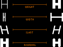
Zed — A font superfamily with extraordinary number of styles and extraordinary language support.
Linked List: February 3, 2016
Wednesday, 3 February 2016
- Music Memos Is a Songwriter’s Best Friend ★
-
Dave Wiskus, writing for iMore:
If Voice Memos are Post-Its — a quick and dirty tool to make sure I didn’t forget an idea — then Music Memos is a sketchbook. This is where I start the songwriting process, and every part of the app is designed to help facilitate the process and, most shockingly of all, guide me to the next step in fleshing the song out. […]
Music Memos has so many other tricks up its sleeves that I almost feel like someone at Apple has been reading my dream journal. An app for recording song ideas that uses a robust tagging system is something I’ve personally wanted to build for a long time, but throw in a guitar tuner, chord and tempo detection, exporting to GarageBand, and magical automatic backing instruments, and the dream becomes borderline pornographic.
I’m not a songwriter, so the app isn’t useful to me personally, but I’m really impressed by the design of this app. It is attractive, well-organized, simple, and thoughtful. And judging by Dave’s take (and Serenity Caldwell’s), it’s genuinely useful and solves a heretofore unsolved problem.
So all is not lost when it comes to Apple putting out high-quality apps.
- Mossberg: Apple’s Apps Need Work ★
-
Walt Mossberg:
But there’s more than just metal, glass, and silicon to these products. Apple’s built-in software is a huge part of the experience, and has been since the company introduced the first Mac in 1984. Whether it’s the operating systems or the core apps, a major aspect of what makes both users and reviewers value Apple products is software that melds power, reliability, and ease of use. “It just works!” was a favorite Steve Jobs phrase.
In the last couple of years, however, I’ve noticed a gradual degradation in the quality and reliability of Apple’s core apps, on both the mobile iOS operating system and its Mac OS X platform. It’s almost as if the tech giant has taken its eye off the ball when it comes to these core software products, while it pursues big new dreams, like smartwatches and cars.
In particular, Mossberg singles out iTunes (on the desktop), Mail, and iCloud sync issues.
- Uber Rebrands ★
-
Uber CEO Travis Kalanick:
Have you ever looked at someone’s hairstyle and thought “oh my, you peaked in the 1990s?” Well that’s a bit how I feel about Uber’s look today. It’s not just that we were young and in a hurry when we replaced our red magnet logo with today’s black badge four years ago. It’s that we were a fundamentally different company. […]
So today, we’re excited to roll out a new look and feel that celebrates our technology, as well as the cities we serve.
The new logo mark feels like a solid improvement over the old. It feels familiar, but sturdier. Everything else they’re doing with this refresh seems like a bunch of nonsense. I just don’t get it. I think it’s fine for a company as young as Uber to start over from scratch with their brand. It’s risky, because Uber is already pretty well known, but, if you decide you need a change, the sooner you do it the better. But their new brand doesn’t make for a cohesive whole. It doesn’t feel like a new version of the old Uber brand, and it gives me no sense of what the new Uber brand feels like.
I concur with Armin Vit (writing at Brand New):
The bigger issue with the redesign — far more troubling — than the logo redesign is the app icon. In this case the app icon gets more action than the logo itself. That’s the first interaction from most users. If I wasn’t a fan of the curl in the “U” of the old logo I was even less of a fan of the inward serifs of the old icon. But, hey, it was a “U” for Uber and it was shiny like the badge on the grill of a car. The new icon is completely unidentifiable in any way as Uber other than it saying “Uber” underneath. Let’s assume that it’s a matter of being used to poking on that icon for the last five or six years and that we just need to get used to poking at this new one but, even then, it seems like this is an icon for something else altogether. I don’t think there is enough strength in the bit as the principal (and literal) touchpoint. Having a separate icon for drivers that looks even less like anything doesn’t help the cause of establishing a consistent, recognizable mobile environment.
Update: Everyone I know thinks of Uber as the company whose app you use to hail a car to drive you somewhere. Uber has greater ambitions than that. That’s fine. But they created this new brand to fit with their ambitions, and as a result, it doesn’t fit with what everyone who uses them thinks of them right now. Compare and contrast to Amazon. Amazon has expanded to major new initiatives like developer web services and online streaming of video. But along the way they never broke the original brand that says “This is where you go to buy books”. This new Uber brand (and especially the app icon) does not say “This is what you use to hail a ride.”
Uber’s new icon looks like a logo for Cyberdyne Systems.
