
By John Gruber

npx workos: An AI agent that writes auth directly into your codebase.
Linked List: February 7, 2017
Tuesday, 7 February 2017
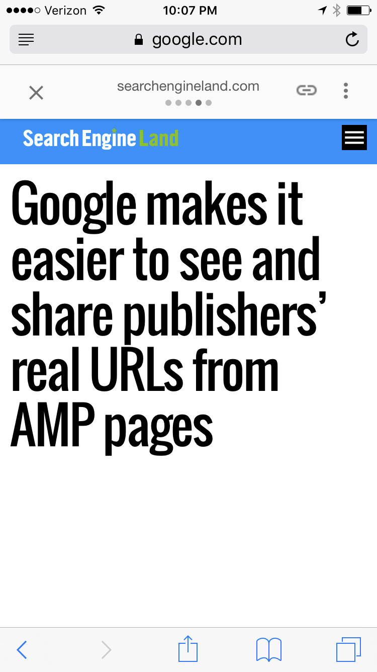
- Google Makes It Ever So Slightly Easier to See and Share Publishers’ Real URLs From AMP Pages ★
-
Danny Sullivan:
As promised, Google is making a change to how it displays Accelerated Mobile Pages, so that users can easily view and share links that lead directly to publishers’ sites rather than to Google’s copy of the content.
A little easier, but I would argue that they shouldn’t be doing this in the first place, and the new UI they’ve exposed is deliberately obfuscated.
Now, the URL field of a browser will continue to show a Google URL. However, the AMP header area will display a link or chain icon, what it calls the “anchor” button. Clicking on this will make the publisher’s direct URL appear, so that it can be easily copied and pasted.
This new “anchor” icon is cryptic, and I think deliberately so. It looks like nothing I’ve ever seen before. I wouldn’t have guessed that it was a button to show the real URL, and I am a designer who studies iconography and a critic of AMP’s google.com silo. I’ve wanted this feature to exist ever since AMP debuted but I wouldn’t have guessed that this was it. Lord only knows how many regular people will figure it out. (And, bizarrely, the icon isn’t even retina resolution. It looks like a blurry smudge on the screen.)
For those who hold down on the anchor button, Google says it will trigger the native share feature of the browser being used. With Safari, that means easy access to things like Twitter or Facebook. With Chrome, it lacks native share, so nothing should happen.
That’s not how it works for me. When I hold down on the anchor button, I get an alert that says “JavaScript” with buttons for Open and Cancel. To get to the iOS sharing sheet, I have to tap the anchor button, then press and hold on the URL that is revealed in a popover, then choose “Share…” from Safari’s contextual menu. A tap, a long press, and then another tap. Three steps — just to get to the system sharing sheet.
This is what you call a begrudging UI. Google wants you to pass around the google.com-hosted AMP URL, not the publisher’s original URL. If they wanted to make it easier to share the original URL, the anchor button would be a direct link to the original URL. No need for a JavaScript popover. You could then just press the anchor button to go to the original, and press and hold for Safari’s contextual menu. And they could just use the word “Link” or “URL” instead of a cryptic icon.
Better than nothing (which is what we had before), but weak sauce nonetheless.
- Apple’s WebKit Team Proposes W3C Community Group: GPU on the Web ★
-
Dean Jackson, from Apple’s WebKit team:
Instead we need to evaluate and design a new web standard that provides a core set of required features, an API that can be implemented on a mix of platforms with different system graphics technologies, and the security and safety required to be exposed to the Web.
We also need to consider how GPUs can be used outside of the context of graphics and how the new standard can work in concert with other web technologies. The standard should expose the general-purpose computational functionality of modern GPUs. Its design should fit with established patterns of the Web, to make it easy for developers to adopt the technology. It needs to be able to work well with other critical emerging web standards like WebAssembly and WebVR. And most importantly, the standard should be developed in the open, allowing both industry experts and the broader web community to participate.
Exposing “the general-purpose computational functionality of modern GPUs” would be great for the web, because that’s where the Moore’s Law action is at these days. GPU performance is improving much faster than CPU performance.
- Merriam-Webster Adds Over 1,000 New Words ★
-
Speaking of Merriam-Webster, they’ve announced the addition of over 1,000 new words:
Just as the English language constantly grows, so does the dictionary. More than one thousand new words have been added, including terms from recent advances in science, borrowings from foreign languages, and words from tech, medicine, pop culture, sports, and everything in between. This is a significant addition to our online dictionary, reflecting the breadth of English vocabulary and the speed with which we seek information. These new entries also highlight the old-fashioned skill of crafting useful and readable definitions that require the expertise and experience of our unique staff.
Examples:
Familiar words combine to give us metaphors or imagery like train wreck, side-eye, and weak sauce. As for verbs, we can ride shotgun, walk back an opinion, throw shade, face-palm, and geek out with new dictionary entries.
Their definition for throwing shade could just point to their aforelinked Twitter account. (Aforelinked, alas, has not yet made it into the dictionary, despite my best efforts.)
-
David Mack, writing for BuzzFeed:
“A fact is a piece of information presented as having objective reality,” read a tweet from the staff at Merriam-Webster, linking to a dictionary article showing searches for the word “fact” had spiked after Conway’s interview. Simple yet full of shade, neutral yet undeniably pointed, it was the right tweet from the right account at just the right moment of public chaos.
“@KellyannePolls,” read one person’s reply that tagged Conway’s account, “when the dictionary is trolling you, you might want to reconsider everything in your life.”
That the tweet went viral was no coincidence. Its tone and timing were the product of more than a year of work by the Merriam-Webster staff in reimagining and overhauling their entire social media strategy — and, in doing so, their place in this new world of alternative facts.
Great example tweet from earlier today, replying to a question as to whether they ever take words out of the dictionary:
Yes — like snollygoster, “a shrewd and unprincipled person, especially an unprincipled politician.” Just added it back. https://www.merriam-webster.com/words-at-play/whats-a-snollygoster
Worth noting: Merriam-Webster’s website has improved a thousandfold in recent years. It used to be a disaster, the sort of website put up by a dictionary that felt like they had to publish their dictionary on the web but didn’t want to. Now, it looks like a first-class peer to their print edition.
- Ringside ★
-
New “superfamily” of typefaces from Hoefler & Co.:
Twenty years ago, our Knockout collection was designed to celebrate the beauty and diversity of nineteenth century sans serif wood types, one of America’s great contributions to type history. Picking up where this project left off is Ringside, a sans serif shaped by new challenges, new influences, and new ideas.
Where Knockout was designed for headlines, Ringside is made for text. Its proportions, fit, and details are designed to thrive at the smallest sizes, and each of its weights and widths includes that most essential quality of a dependable text face: a companion italic.
Feels like a sequel two decades in the making.
- A Crack in an Antarctic Ice Shelf Grew 17 Miles in the Last Two Months ★
-
Jugal K. Patel, reporting for The New York Times:
A rapidly advancing crack in Antarctica’s fourth-largest ice shelf has scientists concerned that it is getting close to a full break. The rift has accelerated this year in an area already vulnerable to warming temperatures. Since December, the crack has grown by the length of about five football fields each day.
“The iceberg is likely to break free within the next few months,” said Adrian J. Luckman of Swansea University in Wales, who is a lead researcher for Project Midas. “The rift tip has moved from one region of likely softer ice to another, which explains its step-wise progress.”
Terrifically well illustrated.