
By John Gruber

All your customer
data in that nice
California sunnn.
Early access now!
Linked List: September 25, 2026
Friday, 25 September 2026
- Mr. Choyka Is Apparently Doing Well ★
-
A reader asked if this Gary Choyka who hit two holes-in-one in the same round of golf back in 2020 is the same Gary Choyka who was my history teacher 30+ years ago. Indeed it is. He looks good. (He was a hell of a basketball player too.)
- Stock UI in MacOS 27 Eschews Clarity ★
-
“Thibault”, in post on Mastodon responding to Brent Simmons’s “stock Mac UI” post that I just linked to:
It reminded me of my own explorations with the macOS design language, especially the modern title/toolbar which I believe is one of the most foundational design regression on the platform.
I played with the idea of redesigning the Finder with the original hierarchy but keeping the current Liquid Glass styling. Though it’s still far from what I’d like to see on my Mac, I thought I’d share.
Here’s his subtle mockup:
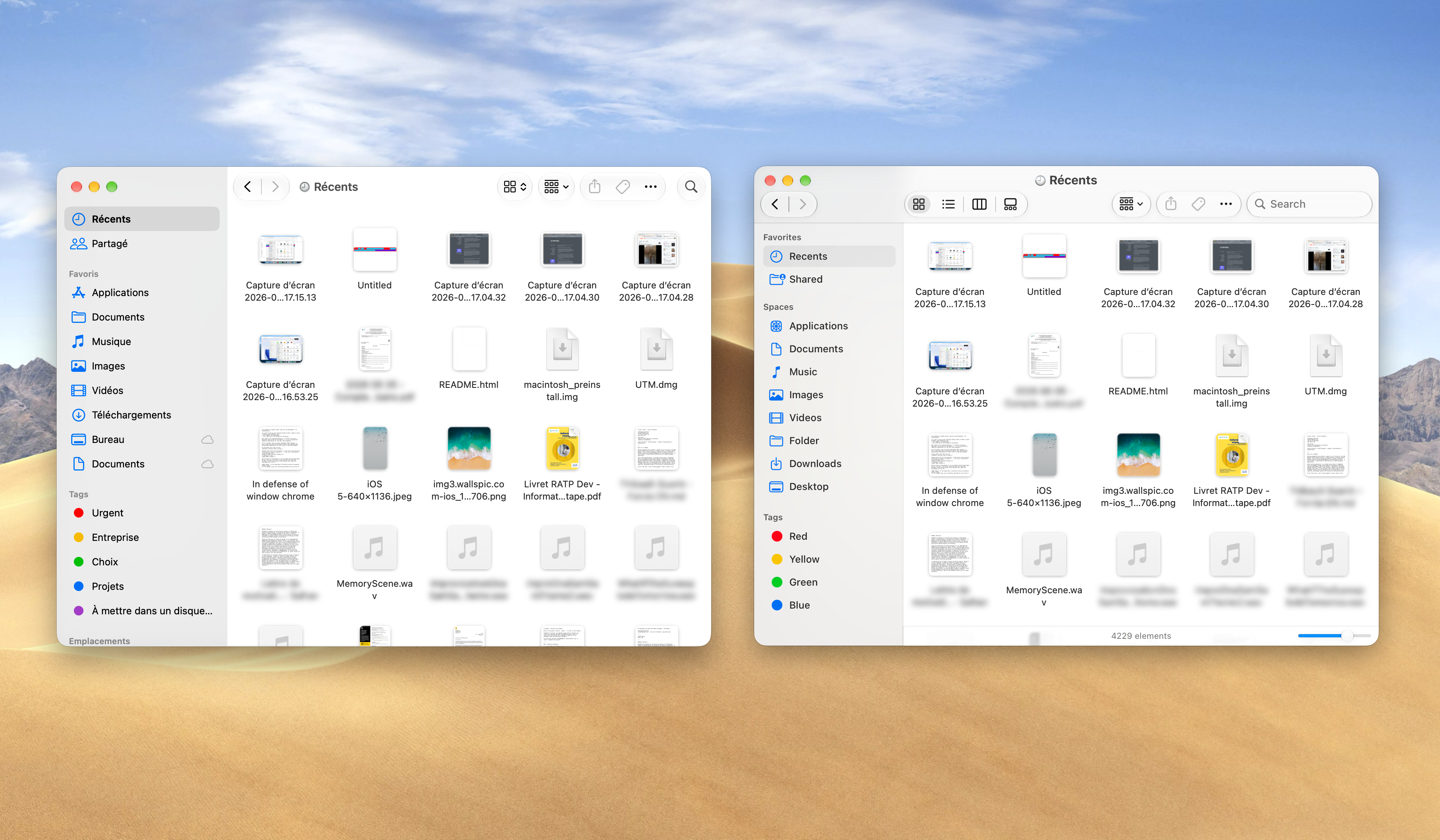
The changes in Thibault’s redesign, if you describe them verbally, sound minor. But looking at the differences feels like a huge — and much needed — breath of fresh air. It relaxes my nervous system to see obvious differentiation for window chrome at the top. The hierarchy is clear: this area is the window, this area is the content of the window.
Apple’s MacOS 27 Golden Gate stock UI deliberately does away with that differentiation, for no good reason. I crave clarity, and Apple’s current MacOS design language rejects clarity. Like: where exactly can you click to drag a window around? That ought to be obvious; instead it’s literally a guessing game. And Thibault’s simple example also shows that the problem has nothing to do with “Liquid Glass” controls.
- Brent Simmons on ‘Stock’ Mac UI ★
-
Brent Simmons:
To recap: the reasons for using stock Mac UI are 1) user familiarity, which we’ve known for a while just isn’t a thing, and 2) hoping to be able to expend less developer effort, which we’ve seen can work against you.
But there’s another reason: the stock Mac UI is designed by Apple, the best designers in the world, and do you really think you can do better? Really?
The app world is full of people who think they’re better and they’re really, really, really not.
Well, I still think Apple has the best collection of UI designers in the world, but, for whatever reasons, the guidance from above on how the Mac UI should look is missing the mark. I’m not blaming the people doing the work — they’re doing great work with the direction they’re given.
So this — bad direction — is where the secret third reason falls down. And we’re left with no real reason to stick with stock Mac UI (except for wanting approval from longtime Mac people like me, and you really shouldn’t care about that at all).
I was hesitant to quote anything from Simmons’s post, because you really ought to read the whole thing. (I’ve always loved the way Brent writes.) But I really like his emphasis throughout the piece on the term “stock Mac UI”. Debating the nuances of what it means for software to be “Mac-like” is one of the through lines of Daring Fireball since the very beginning. It doesn’t mean just one thing, and it doesn’t encompass just a few things. It’s a lot of things. But that makes it susceptible to picking and choosing — what one considers “Mac-like” might just be what one personally prefers.
But using the stock Mac UI — or building your custom UI atop (or in OOP terms, subclassing) stock Mac UI controls — is so thoroughly agreed-upon as a fundamental aspect of Mac-like-ness that it’s seldom even discussed. This relatively short post from Simmons bursts that bubble — or if you’ll permit a grosser but perhaps more apt metaphor, lances that boil. The emperor has no clothes, and MacOS’s stock UI is bad. It’s that simple.
At the end of the post Simmons includes two screenshots of NetNewsWire after a day of noodling where he removed the stock window chrome and toolbar (the venerable NSToolbar, perhaps the stockiest of stock UI elements) and replaced them with custom controls. If you told me 10 or 20 years ago that Brent Simmons spent a day replacing NSToolbar in NetNewsWire just to see what it looked like, I’d have called him on the phone to see if he was OK.
But today, after the last few years of Apple losing the plot with the Mac user interface, I look at these two screenshots and my first thought isn’t that they look old-school. It’s simply that they look refreshingly Mac-like. Understated, humble, and obvious. Not nostalgic. Just ... good. And more Mac-like than the actual current version of NetNewsWire, which thoroughly embraces the stock Mac UI from Apple.
- Regarding the Provenance of Charm Within Meta ★
-
Mark Gurman, reporting for Bloomberg Wednesday, after Meta’s 2026 Connect keynote (gift link):
Meta Platforms Inc. unveiled a palm-sized, dedicated gadget for using Muse, the company’s popular new artificial intelligence assistant, pushing deeper into the AI devices market with a surprise announcement.
The product, unveiled on stage by Meta Chief Executive Officer Mark Zuckerberg, was born out of the company’s new design lab led by former Apple Inc. interface design chief Alan Dye and its Superintelligence AI group. [...]
Dye, the former Apple design executive, and Billy Sorrentino, one of his top deputies at the iPhone maker, were two of the driving forces behind the project and the creation of the Muse character-based interface, Bosworth said.
Meta recruited the executives at the end of 2025, forcing Apple to shake up its own design team to fill the void left by their absence. Dye and Sorrentino hired a slew of other designers from Apple as well, and they contributed to Muse Charm as well as the interface of its Muse smartphone apps, Bosworth said.
On today’s episode of Dithering (which you should subscribe to), Ben Thompson dropped a juicy tidbit about this (starting around 5m:15s):
Thompson: By the way, do you want to hear some gossip about this?
Gruber: Yeah, of course!
Thompson: Well, Mark Gurman has a piece crediting Alan Dye. Utter and complete theft of credit is what I’m hearing. Alan Dye doing Alan Dye things.
- Muse Looks Cute, but Looks Are Deceiving ★
-
Jason Aten, in a good follow-up to his previous column at Inc. (the one where he described how Muse, running on his Mac, read his Messages database):
The entire reason Muse is interesting is that it isn’t just a chatbot, but can actually do things for you. But that promise also comes with a pretty high bar of responsibility. If your goal is to put a powerful AI agent on millions of devices, you have to be incredibly clear about what’s happening, and what people are agreeing to.
If your primary audience does not understand what Full Disk Access means, you should not surprise them with “I’m reading your text messages.” It’s unreasonable to expect them to learn about things like virtual machines, permission architectures, macOS TCC, Sentinel agents, or database synchronization in order to understand what the thing is doing or what is happening with their personal information.
Having an agent installed on people’s computers that appears overeager to access their information or take action on their behalf isn’t helpful. It’s terrifying.
Aten makes some good points about the inherent tension between Muse — especially in the context of running on your Mac desktop — being powerful cutting-edge technology yet being presented by Meta in an extremely consumer-friendly package. Muse is getting a lot of attention — including mine — because it’s both groundbreaking technically (each user gets their own entire persistent Linux VM running in Meta’s cloud) and because it’s packaged in an easy-to-install easy-to-use way. It’s literally presented as a cute mascot. It’s the first consumer-accessible agentic AI system, and Meta has truly done an amazing job with that. But it’s a genuinely open question whether consumers have any understanding what this means. If you buy a power saw that can cut your fingers off, you are almost certainly aware that you are buying a power saw that can sever your fingers. You may or may not choose to use it with appropriate carefulness. But you know just by looking at it that a power saw (or a nail gun, or a chef’s knife, or a hammer, or any other powerful tool) is dangerous. I don’t think people realize how powerful — and thus dangerous — Muse is, especially if it’s running on your Mac.
- I Was Not Blown Away by Eli Tan’s ‘I Was Blown Away’ Review of Meta Muse ★
-
Eli Tan, writing for The New York Times, “I Gave My Life Over to Meta’s A.I. Agent and Was Blown Away” (gift link):
For one final task, I asked Wren for a good way to spend that $44.99 it had saved me. At this point, it knew my life pretty well. I thought it might suggest something altruistic, like donating the money to charity or buying flowers for my girlfriend, who was recovering from surgery.
Instead, it suggested something even better — buying bowls from Heath Ceramics, a local ceramics maker with a dedicated following, on Facebook Marketplace, one of my favorite pastimes.
Reading Tan’s “blown away” review (which words only appear in the headline, but it’s his byline under it) made me feel like I was on a hidden camera show. Like I’ve been told I’m about to be served some blow-you-away good coffee and what I’m tasting sure tastes like Folger’s fucking crystals. I’m not saying Muse isn’t capable of blow-you-away things, but I sure didn’t read any of them in Tan’s review. And then, at the end, it steers him toward buying something from ... Meta’s own Facebook Marketplace? And the reaction isn’t a hard eye roll?
I get the feeling that Tan believes he’s supposed to be impressed by Muse so he wrote a piece saying he was impressed even though he didn’t use it to do a single impressive thing. If Tan asked the new Siri AI for a recommendation on what to do and it suggested he go to an Apple Store and buy new AirPods, would he not think that a bit cynical? Or if Alexa suggested that he should buy more Kindle books?
Here’s Rusty Foster, over at Today in Tabs:
Tan and Johnson both seem like they have totally ordinary middle class white collar 2026 American lives, so I don’t mean anything personal against them when I say these reviews both make their authors sound like the biggest imaginable losers. You can’t call a guy to pick up a branch? Within two weeks? You can’t actually pick up a branch yourself with your own meat hands and throw it in the woods or something? What do you mean you had your robot shop for collectible ceramics? Is there any other part of collecting ceramics as a hobby besides shopping for them? Is your hobby now “having bowls?” Hi, I’m Eli Tan, writer for the New York Times. In my leisure time I enjoy owning dishes.