By John Gruber

Rec League:
Share what you’re into
and find your people.
An iOS 13 Wish: A Return of Vibrant Tapdown States
Friday, 24 May 2019
There’ve been a bunch of leaks about iOS 13, nearly all from Guilherme Rambo at 9to5Mac and Mark Gurman at Bloomberg. But one thing we don’t know yet — and I emphasize yet, because leaks often spring very close to keynotes — is what iOS 13 is going to look like. No screenshots, no mock-ups.
Most likely, I’d say, is that visually, iOS 13 will bring what we’ve seen each of the past 5 years — another annual refinement of the iOS 7 look-and-feel that debuted in 2013. But there have been rumblings that something more dramatic is afoot. The original (let’s call it classic) iOS look-and-feel lasted 6 years — it would be fitting for the iOS 7 look-and-feel to last 6 years as well. I don’t really see how Apple could do something as radical as the iOS 6 to 7 transition. But to me there are aspects of the iOS 7 foundation that are tired.
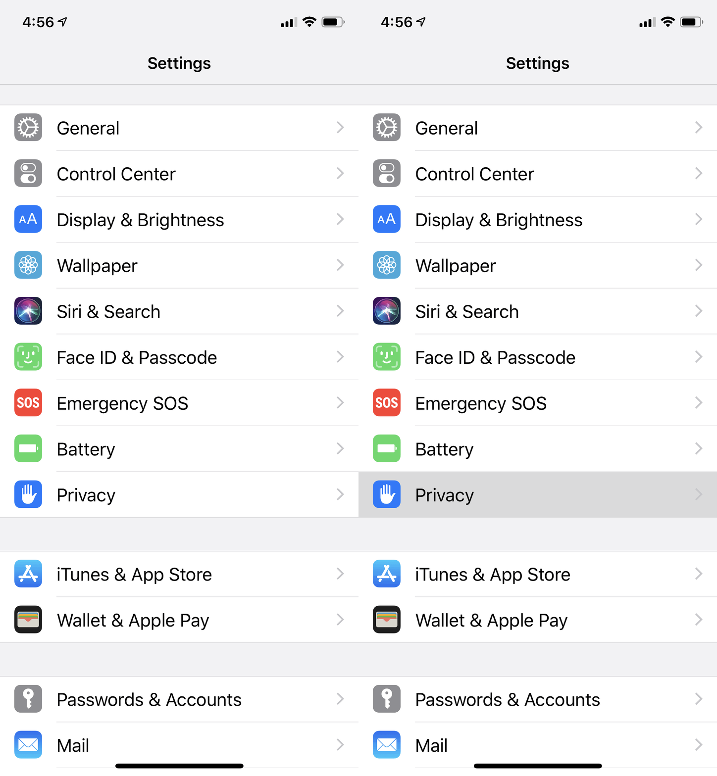
I don’t know why, but one of those things has been bugging me a lot in recent months: the drab gray color that indicates tapdown state for list items and buttons. Putting aside skeuomorphic textures like woodgrain and leather and the 3D-vs.-flat debate, the utter drabness of tapdown states is just a bad idea. I didn’t like it when iOS 7 debuted, and I like it even less 6 years later.
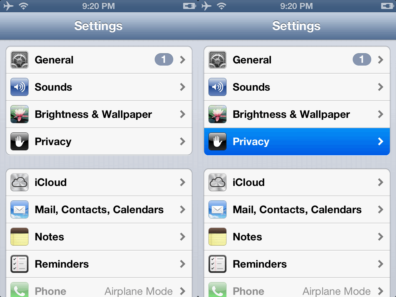
In classic iOS, when you tapped down on list items or buttons, they’d instantly light up in vibrant color. The standard color was a bright cheerful blue. In iOS 7 through 12, the tapdown state is the color of dirty dishwater.
iOS 6 vs. iOS 12:


The classic iOS style was both joyful and a perfect visual indication of what you are tapping. It was both aesthetically pleasing and more usable. It’s useful — and accessible — to make crystal clear what exactly you are tapping on. The classic iOS look-and-feel made it feel fun just to tap buttons on screen. I miss that. Again, put aside specific techniques like photorealistic textures and depth effects. To me the fundamental weakness in post-iOS-7 look-and-feel is simply that it’s been drained of joy.1
-
The Mac, thankfully, hasn’t lost as much vibrancy. Think about how dull, and how much less usable, the menu bar would be if the selected menu item just got a dishwater-gray highlight instead of a vibrant blue one — or whatever other accent color you’ve chosen if you’re running 10.14 Mojave. Even when using the monochrome Graphite theme, the menu item highlight is a dark gray with inverted white text — it’s deliberately not joyful the way the colorful options are, but it’s still a very distinctive visual state, not subtle like on iOS. ↩︎

