
By John Gruber
WorkOS: How SSO works and the fastest way to add it.
Apple Should Eliminate the App Icon ‘Squircle Jail’
Monday, 6 July 2026
Paul Kafasis, in a post at Rogue Amoeba’s blog titled “Free the Icons”:
Apple’s prohibition on shapes is a step backward for both usability and creativity in app icons. Icons are now harder to distinguish because they’re no longer allowed to be distinctive. But there’s no technical reason for it. Apple could, and should, once again allow icons to take on a wide variety of shapes.
It’s clear that some people within Apple recognize that the transition to Liquid Glass introduced mistakes. They also appear to have the authority to fix those mistakes. Refinements to Apple’s own icons in Golden Gate are a welcome course correction, as is the much-celebrated Liquid Glass opacity slider. It’s time to correct the mistake of banning icon shapes as well.
Apple should stop forcing every icon into the same squircle.
The squircles, I will point out, are not in and of themselves the problem. The problem would be the same with any mandated shape, like, e.g., VisionOS’s circles.
Squircle Jail is the worst design-related thing Apple has ever done to Mac developers, and probably the worst icon-related thing it has ever done, period. Incredibly developer-hostile.
If squircled icons are actually better, then let that design win in the market. That’s how we transitioned from the classic Mac OS icon style to the more photorealistic Mac OS X icon style. Developers adopted it because they wanted to, and because users desired it.
John Siracusa has a long memory, cares deeply about Mac design, and is not prone to hyperbole (putting it mildly). I’m not sure I agree with him that this is “the worst design-related thing Apple has ever done to Mac developers”, but it’s certainly on the short list for consideration. And, like Siracusa, I can’t think of any other design crime Apple has ever foisted on Mac developers that I’d argue (with Siracusa) was worse.
It’s one thing for Apple to force all of its own app icons into the same identical shape. That would be bad enough, because Apple’s own Mac apps are numerous and popular, and as the platform owner Apple necessarily sets the direction that many third-party apps follow. But it’s just downright spiteful to enforce it platform-wide. Apple decided they’re no longer going to create nice icons with unique, interesting, and most importantly, distinctive shapes — but they no longer allow third-party apps to either. It’s like Apple decided every single one of its own apps must wear a stupid-looking hat, and they put those stupid-looking hats on third-party apps too, whether the developers of those apps want them or not. Scratch that. Not hats but helmets. The mandatory squircle makes identifying apps at a glance harder in the same way that it’s difficult to identify individual people if they’re all wearing same-shaped helmets. Real helmets at least serve an important safety purpose. The squircles are like stupid unnecessary helmets.
To that point, Jim Nielsen draws an even better analogy — traffic signs:
Consistency for traffic signs! Let’s start by redesigning them all to be the same shape.
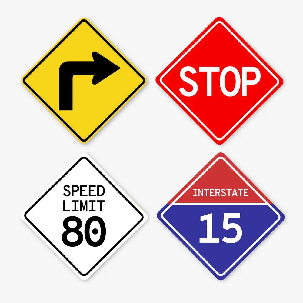
Which was a sarcasm-dripping reply to his own previous post:
Shape isn’t everything, but it’s one tool to help provide differentiation and uniqueness in icons. But not anymore.
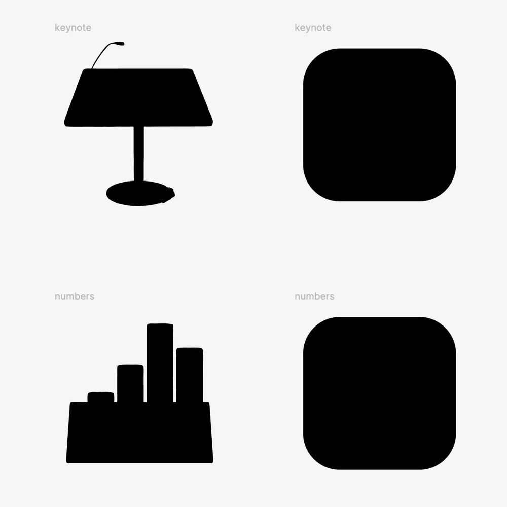
Just the mere silhouette of the old Keynote icon is more recognizable, and thus more iconic, than any icon on any platform from Apple today.
No civil engineer would ever suggest changing yield and stop signs from their iconic triangles and octagons to identical squircles. The human visual system evolved to be remarkably good and quick at identifying shapes. The primary element of an app icon is the semantic meaning of its illustration. Color and shape are secondary. With the squircle mandate, Apple has removed shape from the equation.1 The purpose of icons is right there in their name: to be iconic. Shape was often the most iconic thing about an icon. Now it’s no part at all.
It makes no more sense than removing color. But Apple did that too! One of the purported reasons for the new icon guidelines across MacOS and iOS are the tinted and clear appearance options introduced last year with Liquid Glass and the OS 26 releases. These are both terrible ideas that remove color as a distinguishing factor, reducing ostensibly distinguishable icons into indistinguishable buttons. Adam Engst skewered the Clear and Tinted icon appearance options in a recent column at TidBITS, and ran a poll to see if anyone actually used them. Spoiler: nope.
App icons used to be exuberantly fun and so beautiful that they were the subject of two splendid coffee table books. This squircle shit is no fun at all, and ugly as sin.
Let’s go back.
-
With the new Creator Studio suite, Apple has largely (and for some apps, entirely) removed semantically meaningful illustrations from its own app icons. The only thing left to distinguish them is the color of the crude squiggle inside the squircle. ↩︎