
By John Gruber

WorkOS MCP: Manage your auth platform from any AI agent.
Linked List: July 27, 2021
Tuesday, 27 July 2021
- Apple Reports Record Third Quarter Results ★
-
Apple Newsroom:
Apple today announced financial results for its fiscal 2021 third quarter ended June 26, 2021. The Company posted a June quarter record revenue of $81.4 billion, up 36 percent year over year, and quarterly earnings per diluted share of $1.30.
Jason Snell, as usual, has charts. Long story short: very strong quarter across the entire company.
- As Promised, Safari for iPadOS 15 Beta 4 Has a Standalone Tab Bar, Like the Mac Version ★
-
Juli Clover, MacRumors:
Prior to this beta, Safari on iPad was similar to Safari on iOS with no dedicated tab bar, but after the update, Apple has added a dedicated tab bar that’s activated by default, which is the same layout that’s now used in macOS Monterey.
While the separate tab bar is enabled automatically when updating, in the Safari section of Settings, there is an option to toggle on the original compact tab bar that merged everything together.
This is a significant improvement for Safari on iPad, and showing the tab bar is the correct default. If you love the new unified design, it’s still there. But my big problem with this tab bar — both on Mac and now iPad — is that it’s very hard to see which tab is the current (selected) tab. The visual indication for “selected” is just a very slightly different background tint — whether you’ve got “Show color in tab bar” enabled or not. You can even scroll the current tab out of view. Why is that possible? I don’t see how this is better than the Safari 14 tab bar in any way, and I see a lot of ways that it’s worse.
- Safari’s Crowded Toolbar in iOS 15 Beta 4 ★
-
Federico Viticci, on Twitter:
There’s a total of six different touch targets in the iOS 15 beta 4 tab bar in Safari.
These exclude the ability to long-press the tab bar, swipe across it to change tabs, and swipe it up to open the Tabs view.
I’m … starting to think a single, small toolbar just won’t do. 😬
I responded that there are actually nine tap targets in the new toolbar in beta 4 — Viticci didn’t count the left / right edges that can be tapped like buttons to switch to the previous / next tabs. That’s nine tappable buttons (or effective buttons) on a single phone-width toolbar. (My tweet says eight, but there are two separate tappable areas to bring up the URL address bar, one on each side of the minuscule reload button.)
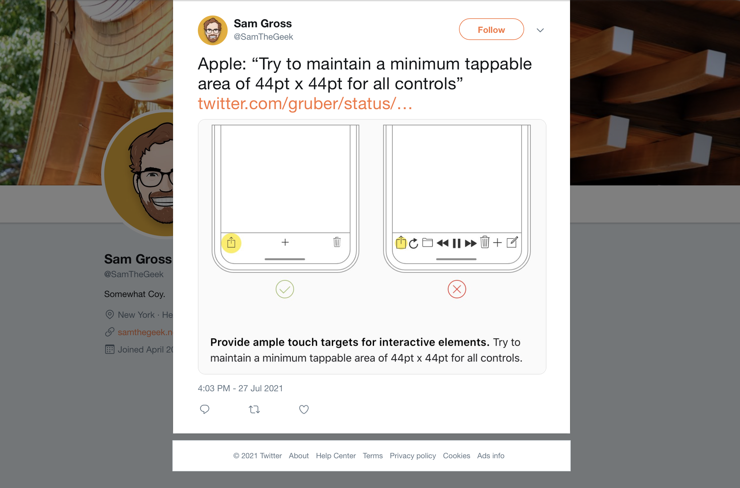
Apple’s own example in the HIG of a toolbar that’s too crowded has ... nine items (screenshot).
I really do appreciate the experimentation, but the new Safari feels like something I’d take to the UI Design Labs at WWDC and they’d push me to use native controls that users expect and already know, have better tap targets, and stop cramming too many things in a small space.
- Safari UI Changes in iOS 15 Beta 4 ★
-
On iPhone:
The Share button is back in the toolbar, replacing the “···” don’t-call-it-a-hamburger-button. But there’s an awful lot of non-sharing stuff crammed into the Share menu — the ᴀA menu items from the current version of Safari (text size, Reader mode, disabling content blockers temporarily, etc.) are all in “Share” now. It’s better than the “···” menu in betas 1–3, but really, this is more like changing the “···” glyph to the Share glyph. It’s still two menus’ worth of features stuffed into one monolithic menu.
The Reload button is back. But it’s bizarrely tiny — way smaller than the minimum recommended tap target size of 44 × 44 points. And it shares space with the newly restored Reader mode button. When you load a page, if Reader mode is available, the Reader mode button shows briefly (maybe for 1–2 seconds?) along with the text “Reader Available” under the website’s domain name. But then the “Reader Available” label fades out and the Reader mode button turns into the Reload button. To enable Reader mode at this point, you either need to long-press the URL domain name to bring up a shortcut menu, or tap the — you guessed it — Share button, which has its own “Reader” item near the top.
Bookmarks are supposed to be easier to access, but I think most users accustomed to previous versions of Mobile Safari — which heretofore has always had a bookmarks button right in the main toolbar — are going to struggle to find them.
Apple is clearly trying to address the numerous complaints about the Safari 15 design for iPhone, but beta 4 feels like they’ve decided that the solution to finding themselves in a hole is to dig faster.
- WSJ Investigation Into How TikTok’s Algorithm Figures Out Your Interests ★
-
Fascinating video from The Wall Street Journal:
A Wall Street Journal investigation found that TikTok only needs one important piece of information to figure out what you want: the amount of time you linger over a piece of content. Every second you hesitate or rewatch, the app is tracking you.
Not surprising it works this way, but creepy nonetheless. Update: I’ve long suspected that Instagram does something similar, with regard to its often uncanny “Hey, I was just looking at pictures of those…” ads.
- Brief Grief ★
-
Nick Hobbs and Andrea Huey:
We’re excited to announce that Brief is joining Twitter! Our team has always been inspired by Twitter’s mission to improve public conversation, and we can’t wait to work with the kind, brilliant folks we’ve met there. Together, we’ll do great things. Sadly, this transition also means that our work at Brief is coming to an end. The newsroom will publish our final news bulletins on July 31. […]
We founded this company to foster healthy discourse by rethinking the way we read the news. The only way we can tackle the world’s complex challenges is by doing it together. In this next chapter, we’ll continue our efforts to push the conversation forward, and we hope that everyone who believed in us will do the same.
Ugh.
Congrats to Hobbs and Huey (presuming this is a good outcome for them), but man, this is the second iOS app from my first home screen that Twitter has acquired and killed in the last few months. (The other was Nuzzel, which shut down in May, and which I continue to miss every day.)
Brief is an extraordinary app. It cost $5-6/month (it varied over the time I was using it), and you got about 5 major news stories a day. Each story was short — a neat summary with links to sources for more information if you wanted more. That’s it. It was like reading the front page of a good newspaper. Brief didn’t tell you everything — it told you the most important news, and that’s it. No needless notifications, and most importantly, no infinite scroll. Brief wasn’t designed or edited to keep you in Brief for as long as it could. Quite the opposite: Brief was designed and edited to get you in, get you up to date on major national and world news, and get you out. Brief is the only news app I’m aware of that gave you a sense of completeness — the point was to catch up, quickly, and be done. No ads. Just a fair subscription price (that I would have happily paid much more for.) For god’s sake Brief defaulted to not sending you any notifications at all. No notifications. They just assumed you’d open Brief when you wanted to see if there was fresh news. When’s the last time you saw a news app that defaulted to not trying to send you notifications, let alone not bombarding you with them?
Even the company’s name — Broadsheet — harkened back to the days of print newspapers and their finiteness. When you finish reading Section A of The New York Times, you’re done. You can stop, without worrying that you’re missing anything. Brief is like that, except just 5 or so stories per day.
Also, Brief is a beautiful app, designed specifically for iOS. It has a better and more iOS-like design and interaction model than Apple’s own News app. I don’t say this lightly, but its design was nearly perfect. I don’t know what Twitter plans to do with it, but given that Brief was pretty much the opposite of Twitter, experience-wise, I’m deeply pessimistic. Twitter’s apps have non-native designs and all try to keep you “engaged” for as long as possible.
I want more apps with a finite scroll, which respect, rather than seek to consume, my time and attention.
- MacOS 12 Monterey Beta 4 Now Supports Live Text on Intel Macs ★
-
When announced at WWDC last month, Live Text required Apple silicon on MacOS, because the implementation required the Neural Engine. Good news for everyone with an Intel Mac that Live Text is now slated to work on all Macs supported by MacOS 12.
- JP Morgan Analysts Claim Apple to Use Titanium Alloy for iPhones Pro in 2022 ★
-
William Gallagher, reporting for AppleInsider:
In a note to investors seen by AppleInsider, investment firm JP Morgan Chase’s China office has reported to its clients that Apple intends to introduce a titanium alloy to the iPhone for the first time. Apple has already used titanium in some Apple Watch models, for the physical Apple Card, and at times for the PowerBook.
Titanium’s toughness, though, is only achieved when it used as part of a titanium alloy with other metals. Titanium is also prone to smudges from fingerprints, and its finish can be unattractive. Apple is therefore certain to be using an alloy, and it presumably addresses these issues.
I hope this is true. Stainless steel is just too heavy; titanium would be a much nicer premium upgrade over aluminum. The titanium Apple Watch models are great, especially the Space Black model with a highly scratch-resistant DLC finish.
- First Person Charged Under Hong Kong Security Law Found Guilty ★
-
Al Jazeera:
The first person charged under Hong Kong’s national security law has been found guilty of “terrorism” and “inciting secession”, in a landmark case with long-term implications for how the legislation reshapes the city’s common law traditions.
Former waiter Tong Ying-kit, 24, was accused of driving his motorcycle in July last year into three riot police officers while carrying a flag with the protest slogan: “Liberate Hong Kong, revolution of our times”, which prosecutors said was secessionist.
An alternative charge of dangerous driving causing grievous bodily harm was not considered in Tuesday’s widely anticipated ruling, much of which has hinged on the interpretation of the slogan. [...]
The ruling imposes new limits on free speech in the former British colony. Pro-democracy activists and human rights groups have also criticised the decision to deny Tong bail and a jury trial, which have been key features of Hong Kong’s rule of law.
This is utterly unsurprising, but crushing nonetheless.