
By John Gruber

WorkOS MCP: Manage your auth platform from any AI agent.
Tahoe Added a Finder Option to Resize Columns to Fit Filenames
Friday, 23 January 2026
The main reason I’m sticking with MacOS 15 Sequoia, refusing to install 26 Tahoe, is that there are so many severe UI regressions in Tahoe. The noisy, distracting, inconsistent icons prefixing menu item commands, ruining the Mac’s signature menu bar system. Indiscriminate transparency that renders so many menus, windows, and sidebars inscrutable and ugly. Windows with childish round corners that are hard to resize. The comically sad app icons. Why choose to suffer?
But the thing that makes the decision to stay on 15 Sequoia a cinch is that I honestly struggle to think of any features in Tahoe that I’m missing out on. What is there to actually like about Tahoe? One small example is Apple’s Journal app. I’ve been using Journal ever since it debuted as an iPhone-only app in iOS 17.2 in December 2023. 785 entries and counting. With the version 26 OSes, Apple created versions of Journal for iPad and Mac (but not Vision Pro). Syncing works great via iCloud too. All things considered, I’d like to have a version of Journal on my main Mac. But I’m fine without it. I’ve been writing entries without a Mac app since 2023, so I’ll continue doing what I’ve been doing, if I want to create or edit a Journal entry from my Mac: using iPhone Mirroring.
That’s it. The Journal app is the one new feature Tahoe offers that I wish I had today. I’m not missing out on the latest version of Safari because Apple makes Safari 26 available for MacOS 15 Sequoia (and even 14 Sonoma). Some years, Apple adds new features to Apple Notes, and to get those features on every device, you need to update every device to that year’s new OS. This year I don’t think there are any features like that. Everything is perfectly cromulent running iOS 26 on my iPhone and iPad, but sticking with MacOS 15 Sequoia on my primary Mac.
But now that we’ve been poking around at column view in the Tahoe Finder, Jeff Johnson has discovered another enticing new feature. On Mac OS 26, the Finder has a new view option (accessed via View → Show View Options) to automatically resize columns to fit the longest visible filename. See Johnson’s post for screenshots of the new option in practice.
[Update: Turns out, this auto-resizing feature has been a hidden preference setting in the Finder for a few years now.]
Column view is one of the best UI innovations from NeXTStep, and if you think about it, has always been the primary metaphor for browsing hierarchical applications in iOS. It’s a good idea for the desktop that proved foundational for mobile. The iPhone Settings app is column view — one column at a time. It’s a way to organize a multi-screen app in a visual, spatial way even when limited to a 3.5-inch display.
Thanks to Greg’s Browser, a terrific indie app, I’d been using column view on classic Mac OS since 1993, a few years before Apple even bought NeXT, let alone finally shipped Mac OS X (which was when column view first appeared in the Finder). One frustration inherent to column view is that it doesn’t work well with long filenames. It’s a waste of space to resize all columns to a width long enough to accommodate long filenames, but it’s frustrating when a long filename doesn’t fit in a regular-width column.
This new feature in the Tahoe Finder attempts to finally solve this problem. I played around with it this afternoon and it’s ... OK. It feels like an early prototype for what could be a polished feature. For example, it exacerbates some layering bugs in the Finder — if you attempt to rename a file or folder that is partially scrolled under the sidebar, the Tahoe Finder will just draw the rename editing field right on top of the sidebar, even though it belongs to the layer that is scrolled underneath. Here’s what it looks like when I rename a folder named “Example ƒ” to “How is this possible?”:
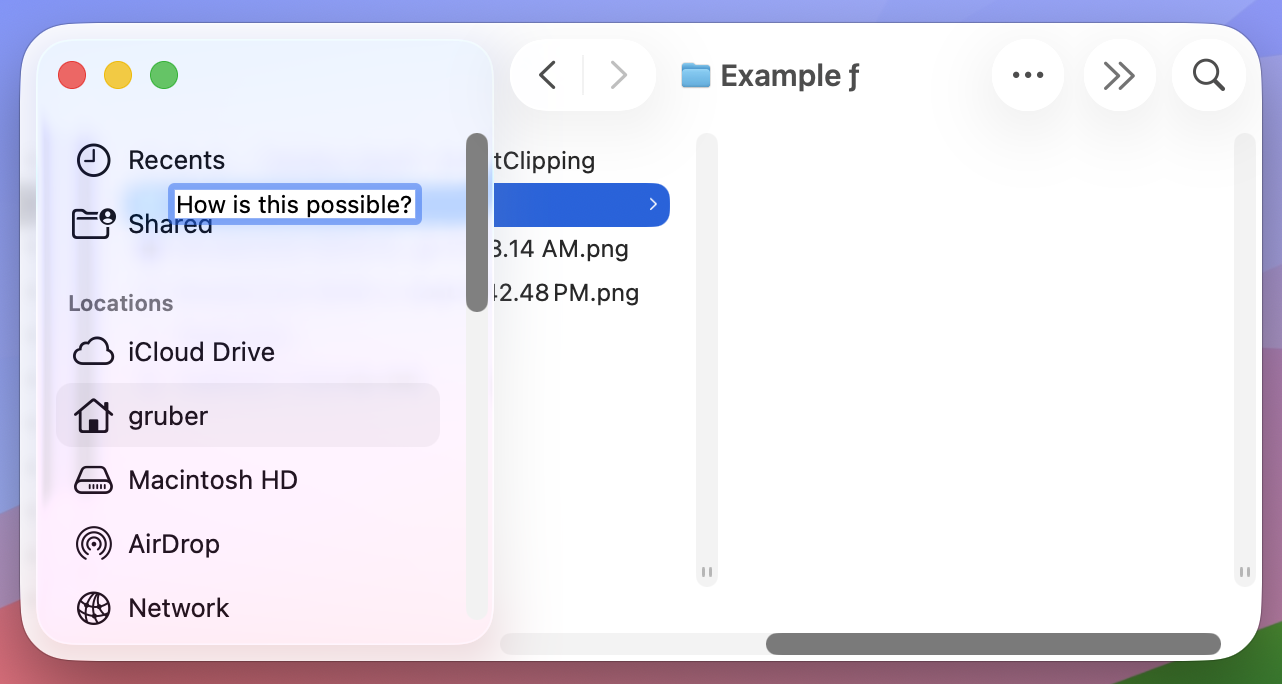
On MacOS 15, if you attempt to rename an item that is scrolled under the sidebar in column view, the column containing that item snaps into place next to the sidebar, so it’s fully visible. That snapping into place just feels right. The way Tahoe works, where the column doesn’t move and the text editing field for the filename just gets drawn on top of the sidebar, feels gross, like I’m using a computer that is not a Macintosh. Amateur hour.
I wish I could set this new column-resizing option only to grow columns to accommodate long filenames, and never to shrink columns when the visible items all have short filenames. But the way it currently works, it adjusts all columns to the width of the longest visible filename each column is displaying — narrowing some, and widening others. I want most columns to stay at the default width. With this new option enabled, it looks a bit higgledy-piggledy that every column is a different width.
Also, it’s an obvious shortcoming that the feature only adjusts columns to the size of the longest currently visible filename. If you scroll down in a column and get to a filename that is too long to fit, nothing happens. It just doesn’t fit.
Even a future polished version of this column view feature wouldn’t, in and of itself, be enough to tempt me to upgrade to Tahoe. After 30-some years of columns that don’t automatically adjust their widths, I can wait another year. But we don’t yet have a polished version of this feature. The unpolished version of the feature we have today only reiterates my belief that Tahoe is a mistake to be avoided. It’s a good idea though, and there aren’t even many of those in Tahoe.