
By John Gruber

WorkOS MCP: Manage your auth platform from any AI agent.
The Fonts of the U.S. Federal Courts
Friday, 22 May 2026
The 13 circuits of the U.S. federal courts of appeals operate with a fair amount of independence, including their typographic choices. I was reminded of this today while reading the aforelinked decision from the Ninth Circuit in Epic v. Apple, because the Ninth Circuit sets their decisions in Times New Roman — a font that came up back in December in the context of the Trump State Department.
Long argument short, Times New Roman isn’t bad, but it isn’t good. It is the median choice. But most of the circuit courts use it: the Third, Fourth, Sixth, Eighth, Ninth, Tenth, and Eleventh. It could be worse: the First circuit not only uses Courier New (the worst version of Courier, so of course it’s the one Microsoft shipped with Windows), but fully justifies their text — contrary to the nature of a monospaced font. (The Fourth circuit only recently switched from Courier New to Times New Roman — an upgrade, to be sure, but a disappointingly mediocre one.) It could be better: the Second and Seventh use Palatino. (Note how much better that Seventh Circuit decision looks than the Second’s, with its wider margins creating a narrower column of text.)
But it can be much better. The Fifth Circuit was long typographically superior to its peers, using Century Schoolbook — a highly legible font with great tradition and the right vibe. But in 2020, the Fifth Circuit upgraded, switching to Equity, Matthew Butterick’s excellent type family (which, of course, is used throughout Butterick’s own web book, Typography for Lawyers). Here’s a before and after tweet noting the change. The results are typographically sublime (including improved margins).
The gold standard is the U.S. Supreme Court, which uses Century Schoolbook. Yes, I just praised the Fifth Circuit’s change from Century Schoolbook to Equity as an upgrade, but tradition and consistency have their place. The Supreme Court’s typographic style has been stunningly consistent for — no pun intended — well over a century. (If only that were true of their recent decisions. Rimshot.) Here is last month’s Louisiana v. Callais decision — the gerrymandering / redistricting case. Here is 1954’s Brown v. Board of Education. I’d give the nod to the older one, which made better use of proper small caps, but the overall consistency is obvious.
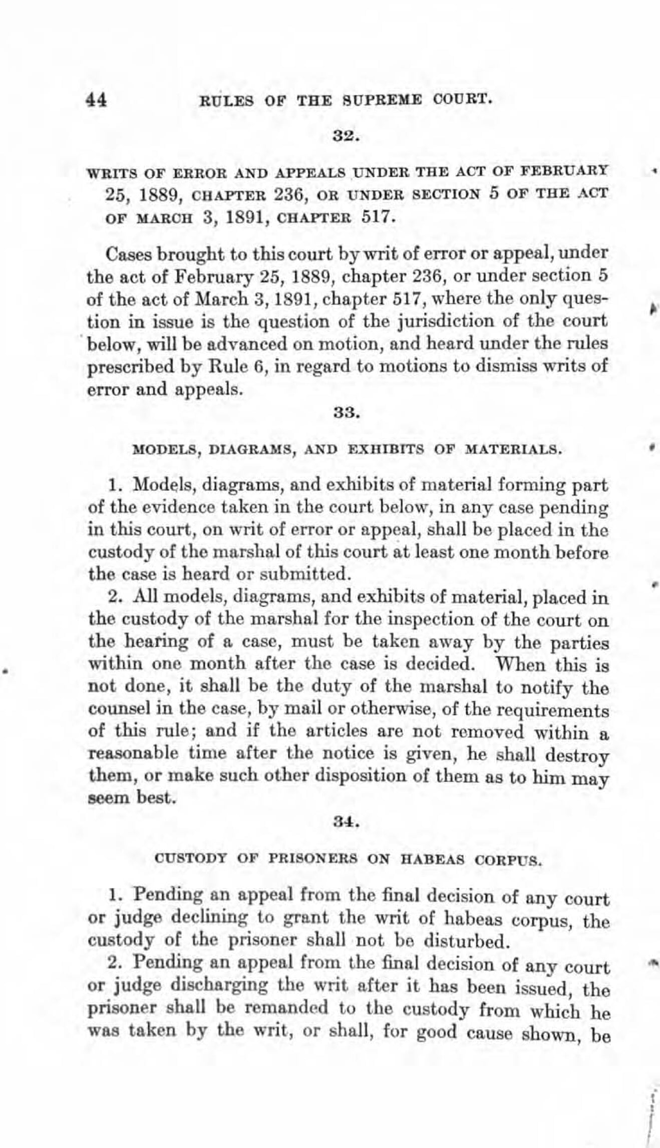
Here is the 2026 edition of the Rules of the Supreme Court. Not only does the Court use Century Schoolbook for its own decisions, it requires submissions to the Court to use the same (p. 44):
The text of every booklet-format document, including any appendix thereto, shall be typeset in a Century family (e. g., Century Expanded, New Century Schoolbook, or Century Schoolbook) 12-point type with 2-point or more leading between lines. Quotations in excess of 50 words shall be indented. The typeface of footnotes shall be 10-point type with 2-point or more leading between lines. The text of the document must appear on both sides of the page.
Every booklet-format document shall be produced on paper that is opaque, unglazed, and not less than 60 pounds in weight, and shall have margins of at least three-fourths of an inch on all sides. The text field, including footnotes, may not exceed 4⅛ by 7⅛ inches.
Why the extra one-eighths of an inch instead of just 4 × 7? I don’t know. But 4⅛ × 7⅛ is exactly the size of the text field in the court’s own decisions.
Now compare the current 2026 rulebook to this edition printed in 1910 (with rules adopted in 1884). The consistency is striking — but, once again, the older version makes better use of small caps and just has a bit more vim and vigor to it. Just look at page 44, for example. It’s perfect. The current Court’s document formatters should aspire only to more closely ape the confidence and sturdiness of this older one. A century from now, U.S. Supreme Court decisions should look as similar to today’s as today’s do to those from a century ago.
The various circuit courts using lesser typefaces, looser margins, and lazier formatting should follow the Fifth’s lead and get their shit together. Tuck your shirt in, comb your hair, straighten your tie, and pop a mint in your mouth. If you’re a United States federal court, your typographic style should reflect that.
Back in 2020, Butterick took a well-deserved victory lap when the Fifth Circuit adopted Equity.1 He quoted Fifth Circuit Judge Don Willett, a typography fan who spearheaded the restyling project, on its rationale. Willett wrote:
[Why] did the circuit devote finite judicial energy to swapping typefaces and widening margins? Simple answer: Our job is not just to present clear opinions, but to present our opinions clearly. Getting the law right is, of course, our tip-top priority. Nothing matters more. ... But good enough is never good enough. Our work is consequential, impacting the lives and livelihoods of real people walloped by real problems in the real world. The stakes are high, and we must present our best opinion, not merely a passable one. And that presentation begins before the first word is ever read.
-
In the very same post, Butterick sings the praises of the Apple Extended Keyboard II, and notes that he has several spares in reserve. I do keenly intend to take Butterick up on his standing offer to dine when next I’m in Los Angeles, but I worry that if we meet, we’ll trigger some sort of calamitous singularity of aligned taste. ↩︎
| Previous: | AI Is Technology, Not a Product |
| Next: | What Is a Dickover? |