
By John Gruber

WorkOS MCP: Manage your auth platform from any AI agent.
- ‘Who’s Afraid of Chinese Models?’ ★
-
Ben Thompson, on the hype regarding Kimi K3, at Stratechery:
This is a point that bears repeating: because U.S. open weight model makers must follow the frontier labs’ terms of service, they (1) are worse than Chinese alternatives and (2) end up distilling the distillation, just with a detour through Chinese labs. Wouldn’t it be better if western open weight model makers could go to the source?
To that end, here’s an even more interesting question around distillation: why exactly is it bad? After all, what are large language models but the distillation of all of the knowledge on the open Internet, scraped by the frontier labs and distilled into the models that are themselves being distilled? Who is exactly being wronged here?
In fact, this paradox is the solution. I believe that open weight models are good for innovation (and, per the above, I think that labs on the frontier will be fine), but it’s a problem to be dependent on China. The U.S. should pass a law that (1) makes explicit that collecting data for training models is fair use, and (2) bars terms of service that forbid distillation, for U.S. companies at a minimum. Stopping distillation — which is literally just querying the API — is nearly impossible; the U.S. should go the other way and lean into a new copyright policy that both indemnifies the labs and also guarantees that what they learned fuels further innovation for everyone else.
To be clear — and Thompson emphasizes this point too — the leading Chinese models like K3 aren’t good only because of distillation. They’re not entirely rip-offs. But distillation is clearly an essential part of the formula they’re using to keep releasing models that are 6–9 months behind the U.S. frontier state of the art. So the Chinese treat all models as “open”, regardless of the terms of service. But anyone in the U.S. or other western countries that respect copyright who wants to distill a good model has to wait for the Chinese to release their models, like K3.
And that second paragraph I quote above distills (sorry) exactly why I want to bring out the world’s smallest violin to play a sad song for OpenAI and Anthropic regarding their objections to their frontier models being distilled against their terms of service.
Sunday, 19 July 2026
- Paper ★
-
My thanks to Paper for sponsoring last week at DF. Paper is a new professional design tool where every layer is real HTML and CSS. Your design is already code, which means fewer handoffs, translations, and layers of abstraction between what you design and what you actually ship.
Paper works both ways: code to design, and design to code. Connect any AI agent through MCP and the agent can read and edit your designs. Or use Paper Snapshot to capture your live site as editable layers and make new iterations. Agents handle the tedious work so you can focus on your craft and the decisions that matter.
Try Paper at paper.design (great domain name), and check out the documentation and FAQ for more info.
- 9to5Mac Uncovers Dozens of Disguised Gambling Apps on the App Store in Brazil ★
-
9to5Mac:
Brazilian users browsing the App Store rankings in categories such as Navigation, Travel, and Weather have noticed a growing number of poorly made games appearing among the top results, many of them featuring AI-generated illustrations of animals as their app icons.
As it turns out, these are so-called jacket apps, which are just a front for hidden betting and gambling apps. A 9to5Mac investigation has uncovered more than 60 apps that behave exactly as depicted in their App Store screenshots when accessed from virtually anywhere in the world, except Brazil.
When opened from a Brazilian IP address, the same apps instead reveal online betting platforms, as shown in the example below, which is currently the top app in the Weather category.
Obviously the main problem is that these apps disguise themselves Trojan Horse-style, and slip through App Store review undetected. I don’t think it’s reasonable to think App Store review could catch every attempt at this sort of thing though — if the horses are disguised well-enough, some of them are going to slip through. That’s actually fine.
But the first example 9to5Mac cites isn’t well disguised at all. What sense does it make that “PotatoPlot Puzzle” — a game featuring a rabbit potato farmer — is a weather app? How is that not a red flag right there?
Also, this app rose to become not just popular, but the number one weather app in Brazil, a nation with over 200 million citizens. In my yearslong argument that Apple should commission an internal bunco squad dedicated to hunting down scammers in the App Store, I always mention that the point of such a squad shouldn’t be to make the App Store 100 percent scammer-free — which I believe is an impossible goal that would set the team up for failure. The point should be only to make the App Store free of successful scams. Focus on the most popular apps and the most lucrative apps. There’s simply no feasible excuse for PotatoPlot Puzzle to have become the most popular “weather app” in Brazil.
Mornings in Cupertino Have the Aroma of Napalm Once Again
Saturday, 18 July 2026
‘It Seems You Have a Different Policy’
Ben Thompson, in a subscriber-only Stratechery update Tuesday:
I got a fun email from former Apple executive, Nest founder, and one-time Stratechery Interview subject Tony Fadell in response to yesterday’s Update about Apple suing OpenAI (published with permission):
Good article as always… This is Apple’s typical tactic to scare Apple employees — either former or current. I heard this lawsuit was driven by the Apple board.
Steve threatened to file a lawsuit against Nest for poaching 80-100 Apple employees. He called me, screamed for a while with lots of accusations. Then I said, “Steve, it’s Apple’s job to retain its talent, not mine.” He stopped his rant and then we went on to talk about our families and vacation plans. We kept hiring…
This sounds about right — and in terms of the Steve Jobs angle, John Gruber made a compelling case on Dithering that this lawsuit may very well have been driven by John Ternus channeling his inner Jobs.
Fadell, of course, is correct that it’s Apple’s job to retain its talent. Recent reporting from Mark Gurman suggests that John Ternus is keenly aware of this, at least as it pertains to Apple’s industrial design team, which has been ground zero for the Apple-to-OpenAI recruitment pipeline. (And the Dithering episode Thompson references is the one we made free-to-listen this week.)
Playing hardball when it comes to poaching is deeply embedded in Apple’s DNA. Steve Jobs hated Apple employees getting poached. In 2005 he sent this email to Adobe CEO Bruce Chizen:
From: Steve Jobs
To: Bruce Chizen
Date: Thursday, May 26, 2005 9:36 AM
Subject: RecruitingBruce,
Adobe is recruiting from Apple. They have hired one person already and are calling lots more. I have a standing policy with our recruiters that we don’t recruit from Adobe. It seems you have a different policy. One of us must change our policy. Please let me know who.
Steve
After one back-and-forth exchange with Jobs, Chizen agreed Adobe would change its policy.
A more contentious example came in August 2007, when Jobs sent an email to Palm CEO Ed Colligan that read:
From: Steve Jobs
To: Ed Colligan
Date: Sunday, August 26, 2007 11:42 am
Subject: Fwd: Your proposalEd,
This is not satisfactory to Apple. It is not just a matter of our employees deciding they want to join Palm. They are being actively recruited using knowledge supplied by Jon Rubenstein [sic] and Fred Anderson, with Jon personally participating in the recruiting process. We must do whatever we can to stop this. I’m sure you realize the asymmetry in the financial resources of our respective companies when you say: “We will both just end up paying a lot of lawyers a lot of money.”
Just for the record, when Siemens sold their handset business to BenQ they didn’t sell them their essential patents but rather just gave them a license. The patents they did sell to BenQ are not that great. We looked at them ourselves when they were for sale. I guess you guys felt differently and bought them. We are not concerned about them at all. My advice is to take a look at our patent portfolio before you make a final decision here.
Steve
That’s a good email. Information dense. My favorite part isn’t the “I’m sure you realize the asymmetry in the financial resources of our respective companies”, although that’s good. It’s the “I guess you guys felt differently and bought them.” Stone cold.
Some backstory on the players:
Colligan, of course, is Mr. “PC guys are not going to just figure this out. They’re not going to just walk in.” He was a business guy who thought product guys didn’t matter in an industry that was about to be taken over by product guys. Sort of like Steve Ballmer, without the charisma, at a much smaller company.
Jon Rubinstein1 was a hardware engineering executive at Apple, overseeing Mac hardware during the comeback years after Steve Jobs returned, then switching to oversee the newly-created iPod division in 2004. (Mac hardware then went under the supervision of a then-little-known operations executive referred to in the announcement as “Timothy Cook”.) Rubinstein left Apple in early 2006, citing exhaustion.2 His departure was announced six months earlier, alongside the promotion of Cook to COO. By 2007 Rubinstein was involved with Palm, by way of Elevation Partners, an investment firm that took a 25 percent stake in Palm. He became CEO of Palm in 2009, tried to turn it around, and then wasted a few years as an executive at HP after HP bought Palm’s carcass thinking it was still alive.
Fred Anderson was Apple’s CFO from March 1996 (almost a year before the NeXT reunification) to June 2004 — the nail-biting, at-times-near-bankruptcy turnaround years. Anderson took the fall, perhaps unfairly, for the stock options backdating scandal under Steve Jobs and, after leaving Apple, paid a $3.5 million fine in a settlement with the SEC. Needless to say, in the summer of 2007, there was bad blood between Anderson and Apple. Anderson, post-Apple, was a co-founder of Elevation Partners and had recruited Rubinstein to join.
Some bad blood. Some former high-level Apple executives putting a team of ex-Apple engineers and designers together to take on the iPhone. History doesn’t repeat, but it often rhymes.
If in addition to thinking that this sounds familiar, you also think these emails sound illegal, you may recall that in 2015, Apple (along with Google, Adobe, Intel, and other companies) paid a collective $415 million penalty to settle a class-action anti-poaching lawsuit. That they settled doesn’t mean they regret playing hardball. Rules are only followed by those who fear the penalties.
Jobs liked to fight, and wasn’t afraid to let his temper show. Tim Cook has a fierce temper and steel nerves, but he arguably only once, ever, showed it in public. I do not think he relishes a fight. He’s a diplomat, not a general. I suspect there’s no undiscovered tranche of Jobs-style stone-cold threatening emails from Cook to competing CEOs.
Steve Jobs’s oft-cited parting advice to Tim Cook was “Don’t ask what I would do. Just do the right thing.” Cook has largely lived by that mantra. But maybe — maybe — by taking that advice to heart, he has at times deliberately steered the company in ways Jobs would not have, just for the sake of steering it in a different way. I think maybe John Ternus is more of a “Hey, what would Steve have done here?” kind of guy.
On the one hand, this lawsuit is a bad look for Apple. It could be perceived that Apple does not think their employees are free to leave and compete against them. On the other hand, Apple could use a booster shot of Steve Jobs’s “us against the world” attitude. It might be wrong to start a war, but it’s never wrong to finish one after being attacked.
What would Steve Jobs do with this OpenAI situation? He’d go to war.3
‘This Is Not Satisfactory to Apple’
The early history of the Macintosh GUI went something like this: When the Macintosh debuted in 1984 it didn’t hit like Apple had hoped it would. (That’s when Steve Jobs was run out of the company.) But by the late 1980s it had caught on, especially in markets like design and desktop publishing. It was the only GUI game in town — command-line DOS PCs were popular, but Windows 1.0 was almost too primitive to believe and Windows 2 wasn’t much better. Apple was certain that the WIMP GUI was the future of computing, and because the Macintosh was the only credible GUI then on the market, Apple owned the future of computing. They were correct about one of those things. Because then came Windows 3, which still sucked — still was ugly, still was terribly designed, still severely limited compared to the Mac in its UI grace and vocabulary of actions — but, it didn’t suck as much. It wasn’t good but it was good enough for the corporate IT market, and the corporate IT market drove the industry at the time.
In the early 1990s John Sculley filed and pushed the infamous “look and feel” lawsuit against Microsoft. One year out from the launch of Windows 95 — which at least looked pretty good4 — Apple’s response was to try to argue in court that they owned the copyright and patent rights to the very concepts of the GUI and the desktop metaphor. The court handed Apple its ass. Apple soon found itself 90 days away from bankruptcy and in desperate need of a new modern operating system, which they themselves had proven incapable of creating. Windows 95 launched with such anticipation that customers lined up overnight outside retail stores to buy it the morning it launched.
That lawsuit was the low point in the entirety of Apple’s history. It was incoherent and, worse, pathetic. Incoherent because Apple was simultaneously arguing in marketing that the Mac remained vastly superior to Windows (“C:\ONGRTLNS.W95”), while arguing in court that Windows was a feature-for-feature clone. It couldn’t be both. I would argue that the former was true — the Mac remained superior in many ways — but actions speak louder than words and Apple’s action was to sue Microsoft and lose. It was pathetic because you know who loses? Losers.
The correct response to the competitive threat of Windows wasn’t to futilely attempt to argue that Windows should not be allowed to exist. It was to make the Macintosh so much better than it already was — to inject so much new innovative insane greatness — that customers would line up overnight to buy Mac software (and watch Apple keynotes). What Microsoft had in 1995 that Apple could not muster was vast customer enthusiasm. That cannot be bought. It cannot be faked. It can only be earned. And you sure as shit cannot stop it with a lawsuit.
Earning that sort of consumer enthusiasm — in spades — is exactly how Steve Jobs pulled Apple out of its nosedive. It took the better part of a decade.
When Apple announced this new lawsuit last week against OpenAI, I wondered, at first, whether it had a whiff of that 1994 look-and-feel loser desperation. Is it Apple’s position that the only way to stop its talent exodus to OpenAI is in court? Upon consideration, I think not. First, it’s not incoherent. There’s no conflict between what Apple is saying about its products or itself as a company that is at odds with this lawsuit. They’re just saying, “Fuck you, you goddamn traitors. You want to fuck with us? We’ll fuck with you.” When you poke a bear — 400 times — you better be ready for the bear to eventually react.
Further, while Apple can only have one CEO at a time, and that CEO remains Tim Cook until September 1, there’s no way that John Ternus doesn’t fully approve of this lawsuit. Cook has gone out of his way to leave Ternus with a clean plate. It would be insane to file this suit six weeks ahead of Ternus taking the helm if Ternus is anything short of fully on board.
I’m not saying it’s a good look for Apple. I’m certainly passing no judgment on the merits of the case, which OpenAI hasn’t yet responded to legally. But it is a very different and much more emotional reaction than we’ve seen under Tim Cook. Those anti-poaching emails Steve Jobs sent to Adobe, Palm, and Google weren’t good looks for Apple either. But that doesn’t mean they were bad for Apple. A bad look can be a good thing. Passion is powerful, and in and of itself, inspiring. This is a passion-fueled lawsuit. I saw some commentators speculate that, already hemorrhaging cash on a daily basis, OpenAI will surely spew some of that in the direction of Cupertino and just settle it. But Apple doesn’t need cash. This is a lawsuit that I believe OpenAI cannot settle, because there is no settlement Apple would accept short of a dissolution of their entire hardware division.
Apple claims in their complaint that the trade-secret chicanery they’ve already documented “is the tip of the iceberg”. If Apple is wrong, and OpenAI has recruited above the board and hired 400 former Apple employees fair and square (or even just mostly fair and mostly square), they have nothing to fear, and John Ternus will look like a petty little jealous bitch, and a feckless one at that. If Apple is right, however, all bets are off. I said earlier that rules are only followed by those who fear the penalties. But some never consider the penalties in the first place because they believe the rules don’t apply to them. Sometimes they find out otherwise.
I’m not saying OpenAI cannot win. I’m saying they can’t get Apple to settle — at least not until Apple is satisfied the whole iceberg has been revealed through discovery. Until then, John Ternus’s offer to Sam Altman is nothing — not even the fee for the gaming license, which he would like Altman to put up. ★
-
Jobs might be forgiven for misspelling Rubinstein’s surname in his email to Colligan. Everyone called him “Ruby”. Perhaps akin to misspelling Greg Joswiak’s name as “Jozwiak” because everyone just calls him “Joz”. ↩︎
-
I think it’s more likely that Rubinstein wore out his welcome at Apple. Here, I turn to Walter Isaacson’s Steve Jobs, which has some remarkable reporting on the situation. Quoting from Chapter 35, “Round One” (which chapter title refers to Jobs’s first bout with the cancer that eventually did him in), pp. 459–460 in the print edition:
In the fall of 2005, after returning from his medical leave, Jobs tapped Cook to become Apple’s chief operating officer. They were flying together to Japan. Jobs didn’t really ask Cook; he simply turned to him and said, “I’ve decided to make you COO.”
Around that time, Jobs’s old friends Jon Rubinstein and Avie Tevanian, the hardware and software lieutenants who had been recruited during the 1997 restoration, decided to leave. In Tevanian’s case, he had made a lot of money and was ready to quit working. “Avie is a brilliant guy and a nice guy, much more grounded than Ruby and doesn’t carry the big ego,” said Jobs. “It was a huge loss for us when Avie left. He’s a one-of-a-kind person — a genius.”
Rubinstein’s case was a little more contentious. He was upset by Cook’s ascendency and frazzled after working for nine years under Jobs. Their shouting matches became more frequent. There was also a substantive issue: Rubinstein was repeatedly clashing with Jony Ive, who used to work for him and now reported directly to Jobs. Ive was always pushing the envelope with designs that dazzled but were difficult to engineer. It was Rubinstein’s job to get the hardware built in a practical way, so he often balked. He was by nature cautious. “In the end, Ruby’s from HP,” said Jobs. “And he never delved deep, he wasn’t aggressive.”
There was, for example, the case of the screws that held the handles on the Power Mac G4. Ive decided that they should have a certain polish and shape. But Rubinstein thought that would be “astronomically” costly and delay the project for weeks, so he vetoed the idea. His job was to deliver products, which meant making trade-offs. Ive viewed that approach as inimical to innovation, so he would go both above him to Jobs and also around him to the midlevel engineers. “Ruby would say, ‘You can’t do this, it will delay,’ and I would say, ‘I think we can,” Ive recalled. “And I would know, because I had worked behind his back with the product teams.” In this and other cases, Jobs came down on Ive’s side.
At times Ive and Rubinstein got into arguments that almost led to blows. Finally Ive told Jobs, “It’s him or me.” Jobs chose Ive. By that point Rubinstein was ready to leave.
There’s a strong whiff of “You can’t fire me, I’m retiring” in the air when someone claims they were ready to leave after Jony Ive issued a “him or me” ultimatum. That’s like saying you’re ready to leave the pub after the bartender rings the bell for last call.
I’d end this footnote here, but the very next passage is too apt to omit:
He and his wife had bought property in Mexico, and he wanted time off to build a home there. He eventually went to work for Palm, which was trying to match Apple’s iPhone. Jobs was so furious that Palm was hiring some of his former employees that he complained to Bono, who was a cofounder of a private equity group, led by the former Apple CFO Fred Anderson, that had bought a controlling stake in Palm. Bono sent Jobs a note back saying, “You should chill out about this. This is like the Beatles ringing up because Herman and the Hermits have taken one of their road crew.” Jobs later admitted that he had overreacted. “The fact that they completely failed salves that wound,” he said.
-
One can argue that this whole situation never would have happened if Steve Jobs were still alive, because if he were, Jony Ive, Tang Tan, Evans Hankey, et al. would still be at Apple, and there would be no io. But that’s like saying maybe if someone in the 1910s had given Hitler more encouragement as a painter, none of this would have happened either. I enjoy fictional alternative histories as much as the next guy, but I’m more interested in the question of how Jobs would respond, right now, to the actual current situation. ↩︎︎
-
A small irony is that the look-and-feel of Windows 95 borrowed much more from NeXTStep than it did from System 7. The look and layout of windows themselves; the use of gray, not white, as the default background color for the UI chrome; the chiseled 3D look — it’s almost inarguable that the Windows 95 look was ripped off from NeXT. Microsoft even copied from NeXT the window-close button going in the top right, not top left, and marking it with an “×” glyph, which the Mac never did. ↩︎︎
Saturday, 18 July 2026
- Apple Sends Letters to Dozens of Former Employees Now at OpenAI ★
-
Michael Acton, reporting for the Financial Times from San Francisco:
About 40 former employees now working at OpenAI have been sent letters directing them to preserve documents and communications and demanding meetings with Apple’s lawyers, according to multiple people familiar with the matter. Apple and OpenAI declined to comment.
The decision to hit employees with personal legal letters highlights Apple’s aggressive tactics after it last week launched a blockbuster lawsuit accusing OpenAI and two employees of stealing secret hardware plans.
Friday, 17 July 2026
- Apple Books and Amazon Are Lousy With AI-Generated Books Ripping Off Legitimate Authors ★
-
Joanna Stern at New Things, last month:
Last month, just days after my book went on sale, AI knockoffs of the ebook version flooded Apple Books. There was Joanna Stern On I Am Not A Robot by Sophie Mercer. I AM NOT A ROBOT by Finn Tech. I AM NOT A ROBOT by Joana Stern — with one “n.” (Watch our latest video showing all these titles and more.)
In total, I found ten AI-generated ebooks clearly riding on mine, with AI-generated covers mimicking the style of my real one — the same blue, yellow and red color palette. Most were priced at $9.99, but some have gone as high as $20.99. [...]
After I contacted Apple about my own book’s clones back in May, the knockoffs quickly disappeared. [...] But now, a month after that first Apple cleanup, the problem is back. At the start of this week, there were at least three other I AM NOT A ROBOT counterfeits on Apple Books. (They seem to have since been removed.)
And I’m not alone. Lena Dunham’s Famesick has multiple lookalikes on the platform. Haley Sacks’s Future Rich Person has copycats that even use AI generated images of women on the cover that resemble the real author.
Kashmir Hill at The New York Times today (gift link):
Recently, I received a strange text from a new acquaintance. “You have your own biography???” it read. “How did you neglect to tell me this?”
This was news to me. I went to Amazon to investigate. There it was. A biography of Kashmir Hill — title: “The Biography of Kashmir Hill” — had been released nearly a year earlier, in August 2025. My life story had a mottled brown cover and a publisher I’d never heard of before. It had no reviews until I wrote one, asking, as the subject of this work, if I could please speak to the author. The hardcover cost $26.99, which seemed a bit steep, but my editor splurged on a copy and I was forced to read it.
My biography is 90 pages long and should be shorter. It combines facts about me that are widely available on the internet, such as where I grew up, with generic insights that could be true of anyone, like a horoscope spread over dozens of pages. “You cannot understand Kashmir Hill without understanding her contradictions,” my biographer wrote, along with an excruciatingly long description of my elaborate coffee-making ritual. (Fact check: My husband does it.)
It’s not just an e-book problem. Printing services are so cheap nowadays that some of these mooks (like one “author” Hill spoke to) are commissioning print editions for hundreds of these slopfests.
- Google Runs Out of Appeals, Must Pay Record $4.7 Billion EU Antitrust Fine ★
-
Arjun Kharpal, reporting for CNBC, back on July 2:
Europe’s top court on Thursday upheld Google’s fine of around 4.1 billion euros ($4.67 billion) over alleged anti-competitive practices.
In 2018, the European Commission slapped Google with the record-breaking penalty on the grounds that it abused Android’s mobile dominance to give unfair advantage to its own apps via pre-installation deals with smartphone makers.
Google has been appealing the ruling through the EU court system. But the European Court of Justice (ECJ), Europe’s top court, dismissed Google’s appeal. Google has no further right to appeal.
Google last year booked $132 billion in profit; this fine is about 3 percent of that. But in 2018, when the fine was initially assessed, Google booked “just” $31 billion in profit — this fine, if they’d paid it then, would have been about 15 percent of their annual profit. (And they booked only $13B, $19B, $16B, and $14B in profit going back from 2017 to 2014.)
There’s never a reason not to string the appeal process out, but it’s especially true when your profits are growing at an exceptional rate. By growing their profits around 5×, they’ve reduced the relative sting of this fine by 5×.
And that’s ignoring the effects of inflation — which over the last eight year have been significant.
- Roblox Set to Introduce AI Game-Building Feature, Including on iOS ★
-
Roblox executives Nick Tornow and Vlad Loktev, on the Roblox blog:
Twenty years ago, Roblox launched with a simple idea: “You make the game.” At the time, that was a radical proposition — most games were made by studios and professionals, and the idea that anyone could be a creator was far from obvious. But we believed it. And the millions of creators who built on Roblox proved it. As we look to a future where any one of Roblox’s 132 million daily active users could come up with the next hit game, we’re taking that original idea further than we ever have. Over the coming months, we’ll share a series of announcements that will give every creator a clear runway to go further and fulfill the promise of “You make the game” for more people than ever before.
Today, we’re announcing Build, a new mobile-first creation tab within the Roblox app, and a new suite of AI-powered tools within Studio for creators of every level. On July 28, we’ll begin testing these new agentic tools. With Build and Studio, creators can delegate the parts of development that don’t require their full attention.
This sounds really cool and fun. But you know what else was really cool and fun? AI coding apps that ran on iOS, like Bitrig, Replit, and Vibecode — all of which Apple put the kibosh on back in the winter. You of course are free to use any tool you want to build apps for iOS on a desktop computer, but Apple decided to disallowing building iOS apps on iOS.
But it’s OK for Roblox to allow AI-assisted game generation on iOS ... because Roblox is already so big and popular? How can Apple justify allowing Roblox to do this while disallowing anyone else?
- Apple Raises Prices for Apple Music and Apple One Subscriptions ★
-
Chance Miller, 9to5Mac:
Here are the new monthly prices for Apple Music and Apple One as of today:
Apple Music:
- Individual: $11.99 (up from $10.99)
- Family: $19.99 (up from $16.99)
- Student: $6.99 (up from $5.99)
Apple One:
- Individual: $19.95 (unchanged)
- Family: $27.95 (up from $25.95)
- Premier: $39.95 (up from $37.95)
- OpenAI’s Product Shake-Up Put the Complexifiers in Charge ★
-
Wired, back on May 15:
OpenAI says it’s folding ChatGPT, its AI coding agent Codex, and its developer-facing API into one core product team. The company says that Codex is increasingly powering its consumer and enterprise offerings, which are gaining the ability to perform digital tasks autonomously on behalf of users.
Other OpenAI leaders are also taking on larger roles at the company as part of the changes. OpenAI’s head of Codex, Thibault Sottiaux, has been tapped to lead the company’s core product and platform teams. Sottiaux was a key leader in building Codex into one of the company’s fastest-growing products of all time. He’s also one of the leaders overseeing development of OpenAI’s forthcoming “super app,” which aims to combine Codex, ChatGPT, and the company’s Atlas web browser into a unified desktop application.
I’ll give them credit for sticking with a plan for two whole months to get this out the door. But the problem is they went the wrong way. Instead of putting the eggheads from Codex in charge of ChatGPT, they should have put the product-minded people from ChatGPT in charge of Codex. Codex, I’m finally learning, is sprawling and confusing. It needs a strong dose of focus, clarity, and coherence — attributes that ChatGPT exhibited in spades. Instead, by putting the Codex dorks in charge, they’ve injected ChatGPT with confusion, incoherence, and sprawl.
Claude, the app OpenAI’s leadership is obsessed with copying now, is so goddamn confusing that it has Extensions, Plugins, Capabilities, Skills, and Connectors — and they’re all different things. You’ve let your own AI overuse turn your brain to mush if you think that makes sense, but even more so if you think that’s the model to copy.
I’ve been waiting for a while now for someone to explain all of this clearly and succinctly, worried that maybe it was my job to figure it out and do the clear succinct explaining. All of this dogshit from OpenAI and Anthropic presents itself as though it can be explained clearly and succinctly. But it’s just a veneer of coherence. It’s all just been thrown together in an AI blender and poured out as mush.
- MG Siegler: ‘OpenAI Makes ChatGPT ChatGPT Again’ ★
-
MG Siegler, writing at Spyglass:
In that light, we can see the dilemma. But there were also probably about a dozen better ways to do this roll-out — as highlighted by how fast they’re fixing these things — and they just missed the mark. While they undoubtedly knew there would be some backlash, they probably didn’t realize there would be this much. Again. All that points to perhaps a disturbing trend where OpenAI doesn’t really understand their user base. Which you almost can understand given how they clearly stumbled into ChatGPT in the first place. Still, here they are with those billion users. A problem that all of their competitors would love to have. But still a problem if you want to fundamentally change what you are as a product.
But those are bigger, existential issues. All I wanted was chat back in the ChatGPT app. Front and center. And I got it. It’s not perfect. It’s still bloated. But at least it’s usable again now and not a confusing mess of ideas out of the box.
MG is pretty scathing, but I still think he’s taking it too easy on OpenAI for what a colossal fuck-up this remains. There was nothing wrong with the way things were, with two apps — the simple ChatGPT and the complex Codex. (Well, the Codex Mac app being an Electron turd was wrong, but that complaint seems quaint at this point.)
Adding “ChatGPT” as a tab to Codex is fine. Renaming Codex to “ChatGPT” is stupid. They have not made ChatGPT “ChatGPT” again.
There is nothing — not one single tiny feature — in the new ChatGPT app that makes me want to use it instead of ChatGPT Classic. And there is so much in ChatGPT Classic that works better or just isn’t available in the new ChatGPT. You can’t even just delete a chat in the new app — you have to “archive” it first, then fish around to find the archive and delete it there.
I don’t think the problem is that OpenAI “doesn’t really understand their user base”. I think it’s that decisions are now being made by AI research eggheads who don’t understand their own products. They think this makes sense. So of course they don’t understand their user base — who uses the ChatGPT product — either. I mean what sense does it make that the ChatGPT app for iOS and Android is still the old ChatGPT, which on the Mac is now “ChatGPT Classic”, but there’s a totally different app that is an entire order of magnitude more complicated on the Mac now named “ChatGPT”?
The only good solution is to pretend this last week didn’t happen and go back to calling ChatGPT “ChatGPT” and Codex “Codex”. If they want to give one of them a new name, don’t call ChatGPT “ChatGPT Classic” — instead rename Codex “ChatGPT Codex”. There, done. All problems solved.
The Codex app is clearly capable of amazing things. But the reason that there are a billion users of ChatGPT but only a few million users of Codex — by OpenAI’s own accounting — is because ChatGPT is simple and focused and based on a single coherent concept: chat. The frustration of the eggheads now running product at OpenAI is obvious: how come these hundreds of millions of morons using ChatGPT aren’t running Codex instead? Somehow they thought they could fix this by giving Codex the ChatGPT name. This is like if Apple had gotten rid of the Messages app on the Mac and replaced it with Xcode, which they renamed to “Messages”. Now they’ve put an “iMessage” tab in the Xcode sidebar and re-released the Messages app everyone knew and loved as “Messages Classic”.
OpenAI separated itself from its competition — especially Anthropic — by being good at product. Now their product decisions are being made by people who don’t understand why Apple makes both iMovie and Final Cut Pro, or GarageBand and Logic Pro.
- OpenAI Starts Cleaning Up the Utter Mess It Made of ChatGPT ★
-
Thibault “Tibo” Sottiaux, the OpenAI engineering lead who’s taking the most public credit for this and thus probably deserves the most blame, on Twitter/X:
Evening! We’ve gotten lots of great feedback on the new ChatGPT desktop app (which we didn’t get totally quite right on the first try), and as a result, we’ve made some changes.
1/ ChatGPT conversation history and projects are now visible in the sidebar. Also, your Chat and Work history now sync across web, mobile, and desktop. Local tasks still stay on your computer.
How in the world did they ship this without sync?
2/ You can now easily switch between Chat and Work modes inside ChatGPT on desktop, which is now also consistent with how it shows on web and mobile.
Bringing back “chat” to ChatGPT is literally the least they needed to do. Hiding chat in an obscure corner of the interface from an app named “ChatGPT” would be like removing text editing from TextEdit.
The updates OpenAI shipped yesterday address some of the abject incoherence of the initial rollout of the “new” ChatGPT, but it’s still dogshit. The new app remains a 1.5 GB Electron monstrosity (and if it’s not technically Electron that’s because they’ve created another bloated layer of abstraction around Electron — Sottiaux oversees the only engineering group in the world that looked at Electron and thought it was too slim and close to the metal).
Here’s the software update dialog I saw today in the old version of ChatGPT, which is now named ChatGPT Classic:
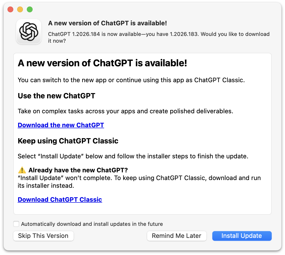
What they’re trying to say here is that if you’ve ever installed the new ChatGPT the “Install Update” button in this dialog will do nothing. It will take some time to do nothing, but ultimately do nothing. Except quit ChatGPT.
If you’ve never installed the new ChatGPT, this dialog box will update the old ChatGPT to the latest version, which is now renamed “ChatGPT Classic”. If you have tried the new ChatGPT, you need to install ChatGPT Classic manually, even though you’re seeing this update dialog box in a slightly older version of the app you want to keep using. But at least they now offer a supported way to install ChatGPT Classic.
This whole thing makes the “New Coke”/”Coke Classic” fiasco from the 1980s look like a well-thought-out change.
- Linus Torvalds: ‘AI Is a Tool, Just Like Other Tools We Use. And It’s Clearly a Useful One.’ ★
-
Linus Torvalds:
I realize that some people really dislike AI, but this is an area where I’m willing to absolutely put my foot down as the top-level maintainer.
Linux is not one of those anti-AI projects, and if somebody has issues with that, they can do the open-source thing and fork it.
Or just walk away.
AI is a tool, just like other tools we use. And it’s clearly a useful one.
It may not have been that “clearly” even just a year ago, but it’s no longer in question today.
There are other questions around AI (like what the economy of it will actually look like in the end), but “is it useful” is no longer one of those questions. Anybody who doubts that clearly hasn’t actually used it.
- BBEdit 16 ★
-
Speaking of BBEdit, version 16 dropped just before WWDC, and adds a slew of nifty improvements, headlined by vastly expanded support for Shortcuts. You can also search for text in images, use the W3C HTML syntax checker, and of all things, use vi keyboard emulation. There’s a lot more, of course — and as always the changes, improvements, and additions are copiously documented in the release notes.
New licenses are $60, upgrades from v15 cost $30, and upgrades from older versions are $40. In the Mac App Store it’s a $5/month or $50/year subscription.
See also: Jason Snell at Six Colors and Adam Engst at TidBITs.
- ArtfulType: Markdown Writing App for the 68K Macintosh ★
-
Sean Malseed — “Action Retro” on YouTube — created a Markdown editor for the original Macintosh. Source code on GitHub; intro video on YouTube. It’s written in C, not Pascal, and uses the modern Retro68 GCC-derived compiler.
I absolutely love that this exists. I don’t like the actual app at all. I guess “full screen” mode is the point of some “distraction free” editors, but I for one would never look twice at a Mac app that didn’t use windows. Full-screen mode just wasn’t a thing back then, except for games. ArtfulType is not a Mac-assed 1984 Mac app.
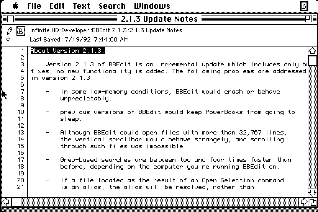
If I wanted to write in Markdown on a classic Mac, I’d use BBEdit, which was the app I originally created Markdown for use in. And one of two apps I primarily still use it in. But BBEdit won’t run on an original 128 KB Macintosh, because Rich Siegel didn’t create it until 1989, and the earliest public version was BBEdit 2 in 1992. BBEdit 2.1.3 does run in System 5 on Infinite Mac, but crashes if launched on System 3. I 100 percent see the appeal of using a 1980s retro Mac, but I don’t see the appeal of using one that can’t run System 6.
- Happy iCal Day ★
-
Joanna Stern explains why this emoji is correct today: 📅. (This one too: 📆)
- Google and Epic Give Up Fighting — Third-Party Android App Stores Are Coming Next Week ★
-
Sean Hollister, reporting for The Verge (gift link):
Here’s Google’s full statement on withdrawing its proposed modifications to Judge Donato’s permanent injunction, via Google spokesperson Dan Jackson:
We’ve agreed with Epic to withdraw our motion to modify the US Court’s injunction rather than prolonging this process which creates uncertainty for the ecosystem. This allows us to focus on executing our recently announced global business model evolution to deliver greater app store choice, lower prices, and more opportunities for developers and users. We remain committed to maintaining Android’s industry-leading security and fostering a competitive ecosystem where every app store and developer has the freedom to compete. In parallel, we continue to comply with the US Court’s injunction.
Google had previously announced that it would launch its sideloaded Registered App Store program in the rest of the world, beginning with the new version of Android later this year. That means there may be two different tracks for Android: stores-within-a-store in the United States and Registered App Stores everywhere else.
Google is already informing US app developers that their apps and game listings will automatically be provided to third-party app stores starting July 22nd, unless they opt out, and it’s launched a specific page for its Play Catalog Access Program for third-party app stores to enroll.
I presume that this new agreement between Google and Epic includes ripping up the “no criticism of Play Store” gag order that the highly principled Tim Sweeney had agreed to in exchange for $800 million back in March?
Anyway, it will be interesting to see what developers do. My guess is that all the big app developers will opt out of this. Games, though, maybe not?
Thursday, 16 July 2026
- European Commission Adds Exemptions for Watches and Earbuds to Portable Battery Removal Rules ★
-
The European Commission:
The European Commission adopted a delegated act today (14 July) introducing new rules that exempt additional products from EU requirements on the removability and replaceability of portable batteries.
Under the EU’s Batteries Regulation, portable batteries in products sold in the EU must generally be removable and replaceable by consumers. This helps extend products’ lifetime by allowing battery replacements and supports recycling by making it easier to collect used batteries. [...]
The Commission is now adding six new product categories to the existing list of exemptions. This includes wearable devices such as smartwatches and fitness trackers, electric toys, and products within the scope of the ATEX Directive (equipment used in explosive atmospheres such as explosion-proof motors, sensors, pumps or forklift trucks).
See, exemptions aren’t hard, especially to stupid regulations.
- Quiche Browser Now Defaults to No-AI Web Search Results ★
-
Quiche Industries (Greg de J.):
Starting today, Quiche Browser disables AI overviews in search results by default, out of the box.
Compare how much space and time they waste. I love the web too much to let that nonsense bury links to real websites made by humans.
This is my modest contribution to the fight against the dead internet theory. Why no other browser does that is beyond me.
To elaborate a bit:
• It simply opens search results in the AI-free versions of Google, DuckDuckGo, Bing, and Brave, whenever they’re selected as the default search engine. • No content blocker involved. Search results are served as-is. • AI features can be turned back on in Settings → Search.
I wrote about Quiche Browser a few months ago, praising it for, amongst numerous other features and aspects, its built-in JavaScript toggle. This is another killer feature. Traditional no-AI web search is a splendid default. Making it an option to enable if that’s what you want is the right way to do this.
- Dithering: ‘Apple Sues OpenAI’ ★
-
Tuesday’s episode of Dithering was a good one, especially for the DF audience, so we’ve moved it outside the paywall and made it free-to-listen on the web. (We don’t (yet?) have an RSS feed that you can put in your podcast player for these occasional free episodes, alas.) I have a slightly different take on Apple’s lawsuit against OpenAI than I’ve seen expressed elsewhere.
If you don’t subscribe to Dithering, you probably should. Two episodes per week, 15 minutes per episode. Not a minute less, not a minute more. $7/month or $70/year — or, get it included with the Stratechery Plus bundle.
- OpenAI Takes a Second Crack at a Response to Apple’s Trade Secret Theft Lawsuit ★
-
OpenAI, in a statement to Bloomberg this week:
“While we take these allegations seriously, we’re not aware of any evidence that this complaint has merit. We believe in fair competition and allowing people the freedom to work wherever they choose, and we’re focused on building innovative technology that empowers people everywhere.”
“We’re not aware of any evidence that this complaint has merit” is very different from, say, “This complaint has no merit.” Again, a curious response.
- Lawyer for Apple Mixed Up Two OpenAI Employees’ Names, Sent One Email to the Wrong Guy, Back in February ★
-
David Ingram, reporting for NBC News (which recently added a paywall without gift links, alas):
Apple alleged in a lawsuit last week that OpenAI “never responded” to its concerns this year about what Apple believed was trade secret theft. But emails reviewed by NBC News show that’s not the full story: OpenAI did respond in February to Apple’s initial outreach. The communications became bogged down and, according to OpenAI, abruptly stopped after an outside attorney representing Apple mixed up the names and email addresses of two OpenAI employees who had the last names Wang and Chang.
The emails show that Gabriel Gross, a lawyer for Apple with the law firm Weil, Gotshal & Manges, intended to email an OpenAI employee with the last name Wang but instead emailed a different employee with the last name Chang and confused their interactions. Gross apologized a day later for his mistake, but the interaction appeared to upset OpenAI’s general counsel, who asked Apple to remove the outside counsel from the matter. Apple declined. [...]
By the next morning, a Tuesday, Gross had realized his error and wrote a third email to Chang. He said he had intended to send the second email to the former Apple employee who had gone to work at OpenAI.
“After we had emailed Mr. Wang yesterday about retaining Apple information, he promptly called me and offered to cooperate with Apple in resolving any issues. I then intended to email him again, but accidentally replied to my email chain with you instead. I apologize for the confusion that likely caused,” Gross wrote.
Based on that email, Chang believed the issue had been resolved and didn’t respond, according to Pusateri, the OpenAI spokesperson.
It’s slightly embarrassing to conflate two rhyming surnames and mistakenly send an email intended for one person to the other, but I don’t see how this is a big deal. And I definitely don’t see how it refutes Apple’s claim that OpenAI didn’t respond to Apple’s February letter laying out their initial accusations. The back and forth seems to have gone like this, paraphrasing:
Apple lawyer: Here’s a letter and three exhibits where we lay out our claims of trade secret malfeasance at OpenAI.
Apple lawyer, to the wrong person: Thanks for the phone call.
OpenAI lawyer, who had not yet responded: WTF? I never called this guy.
Apple lawyer: Sorry, that second email wasn’t for you, I made a mistake.
And then at that point, we’re to believe that the OpenAI lawyer presumed the entire matter was settled? That makes no sense. If this is OpenAI’s defense they’re in bigger trouble than I thought. And why did NBC News think this was exculpatory in any way?
- Louie Mantia: ‘The Shape of Apps’ ★
-
Louie Mantia, with a thoughtful essay on app icon design and the squircle-jail controversy on the Parakeet blog:
It’s worth noting that some of the platform’s best icons look worse, while some of the platform’s worst icons look better.
Ultimately this is what I object to with the squircle mandate. It favors the bottom of the heap by restricting the top. It makes bad icons mediocre but pushes great icons toward mediocrity too. That’s not The Macintosh Way.
Masking all of these app icons to a squircle, and even applying Liquid Glass effects to them, aims to solve this problem. And this follows the same principle of iOS 7, which is to make it easier for all apps to fit in on the platform, especially apps built by designers and developers who aren’t familiar with how to make an icon that looks great next to first-party icons.
Just so I’m clear about my preference, I would love if Apple provided a way for designers to poke outside that squircle boundary. Some of my favorite app icons did that. But also some of my least-favorite app icons ignored this shape entirely, when it was used for every system icon in the last five years. Whenever those apps showed up in my Dock, it was like a stain on my shirt I couldn’t get out.
Despite the genuine loss associated with the squircle restriction, there’s more than one way to design with it.
What a wonderful piece, and of course, it’s replete with example icons. It’s a compelling defense of the direction Apple has taken Mac app icon design.
- OpenAI Releases Codex Micro, a Stupid $230 Hardware Keypad ★
-
Remember back in March when then-co-CEO Fidji Simo announced to the company that “We cannot miss this moment because we are distracted by side quests”? And then weeks later they spent “low hundreds of millions” to purchase the TBPN YouTube show? In their continuing effort to focus on core product, they’re now selling a $230 hardware keypad ostensibly for working with Codex, which is no longer an app but just a tab in their craptacular super app.
No way, that’s crazy. I’ve just been using the keyboard and trackpad that came on my laptop for free like a stupid idiot.
Wednesday, 15 July 2026
- Gurman on OpenAI’s Upcoming Hardware Product: ‘Movable, Screenless Speaker Built as AI Companion’ ★
-
Mark Gurman, reporting for Bloomberg:
OpenAI believes the product’s defining feature will be its personality and ability to connect on a humanlike level with users. The speaker incorporates mechanical elements that can move on their own, creating a sense that it is alive and not just an object responding to commands. The machine also will draw on personal information such as emails to better understand its owner.
The goal is for the device to feel like a companion and become a physical manifestation of OpenAI’s ChatGPT. Still, the exact plans could change as the company works through the development and legal process. [...]
Another central difference is that the device includes a rechargeable battery, allowing it to be carried from room to room throughout the day. A user could bring it into the laundry room while doing chores, move it into the kitchen for cooking assistance, and later place it in a living room or bedroom to have it play music. It can also remain plugged into a single room if the customer chooses.
This description doesn’t sound compelling at all to me. If it’s able to move at all, then it ought to be autonomous. Star Wars-style droids are, in my opinion, the end game here. That’s ambitious though. I don’t think either AI or robotics are there yet. But if it can’t move itself, it needs to be wearable, not luggable.
No one wants a companion they need to lug around.
- Eric Seufert: ‘Did Apple Just Signal a Third-Party Expansion of Apple Ads?’ ★
-
Eric Seufert, Mobile Dev Memo:
The new language could simply accommodate the availability of Apple-owned services on the web and through third-party devices and operating systems; the Apple TV app, for instance, is available on smart TVs, streaming devices, and game consoles. But the addition of “other properties” is conspicuously broad and appears to give Apple the contractual latitude to distribute ads beyond its own services entirely. This would allow for a material expansion of the company’s advertising surface area.
Further, if Apple does indeed plan to expand Apple Ads to third-party surfaces, it would explain why the company did not reveal an update to its AdAttributionKit (AAK, formerly SKAdNetwork, or SKAN) attribution framework at this year’s WWDC.
That would be one way to go.
- Apple Updates Advertising Services Policy With New Rules for Ads in Maps ★
-
Sarah Perez, TechCrunch:
In a newly published Apple Advertising Services policy, effective as of July 14, 2026, the iPhone maker shares its rules for advertising on Apple Maps. Notably, it prohibits the broad category of home services businesses, like plumbing, electrical, locksmith, HVAC, pest control, roofing, and general contracting services, among others. [...]
The broader policy also prohibits deceptive or profane ads, political ads, and ads featuring weapons, violence, controlled substances, defamatory material, and more.
Although Apple may expand to other ad categories over time, its initial approach positions Maps and its ads as a more curated, navigation-focused product, rather than an extension of a web search engine.
The easiest way to keep scammy and predatory ads out of Apple Maps would be, you know, not to sell ads in Apple Maps.
- Apple Intelligence OK’d to Launch in China, Using AI Models from Baidu and Alibaba ★
-
Ben Jiang, reporting from Beijing for the South China Morning Post:
Chinese regulators have granted Apple a long-awaited licence to roll out its artificial intelligence service on iPhones in the country, with Alibaba Group Holding and Baidu serving as technical partners.
The Cyberspace Administration of China (CAC), the country’s internet watchdog, published a notice on Wednesday confirming the licence for Apple Intelligence — the AI feature used to summarise emails, draft reports, edit images and perform other tasks. It was granted alongside six other smartphone-based AI services, including those for Samsung and Huawei Technologies.
An Alibaba representative told the South China Morning Post on Wednesday that its Qwen large-language model would “be integrated into Apple Intelligence experiences within iOS, iPadOS, macOS and visionOS for users in China”. This would allow users to access the model’s capabilities such as text and image generation, the representative said. Alibaba owns the South China Morning Post.
A Baidu representative also told the SCMP on Wednesday that it was working with Apple to develop AI features for Apple Intelligence in China.
This isn’t about Siri AI, announced last month at WWDC for iOS 27 — this is the initial approval for Apple Intelligence, which was announced two years ago and rolled out in iOS 18. It’s unclear in any of this coverage today whether this is a green light for Siri AI this year too.
Monday, 13 July 2026
- Remember Musk’s Suit Alleging a Conspiracy Between Apple and OpenAI? ★
-
Ashley Belanger, reporting for Ars Technica back in August 2025:
After a public outburst over Grok’s App Store rankings, on Monday, Elon Musk followed through on his threat to sue Apple and OpenAI.
At first, Musk appeared fixated on ChatGPT consistently topping Apple’s “Must Have” app list — which Grok has never made — claiming Apple seemed to preference OpenAI, an Apple partner, over all chatbot rivals. But Musk’s filing shows that the X and xAI owner isn’t just trying to push for more Grok downloads on iPhones — he’s concerned that Apple and OpenAI have teamed up to completely dash his “everything app” dreams, which was the reason he bought Twitter.
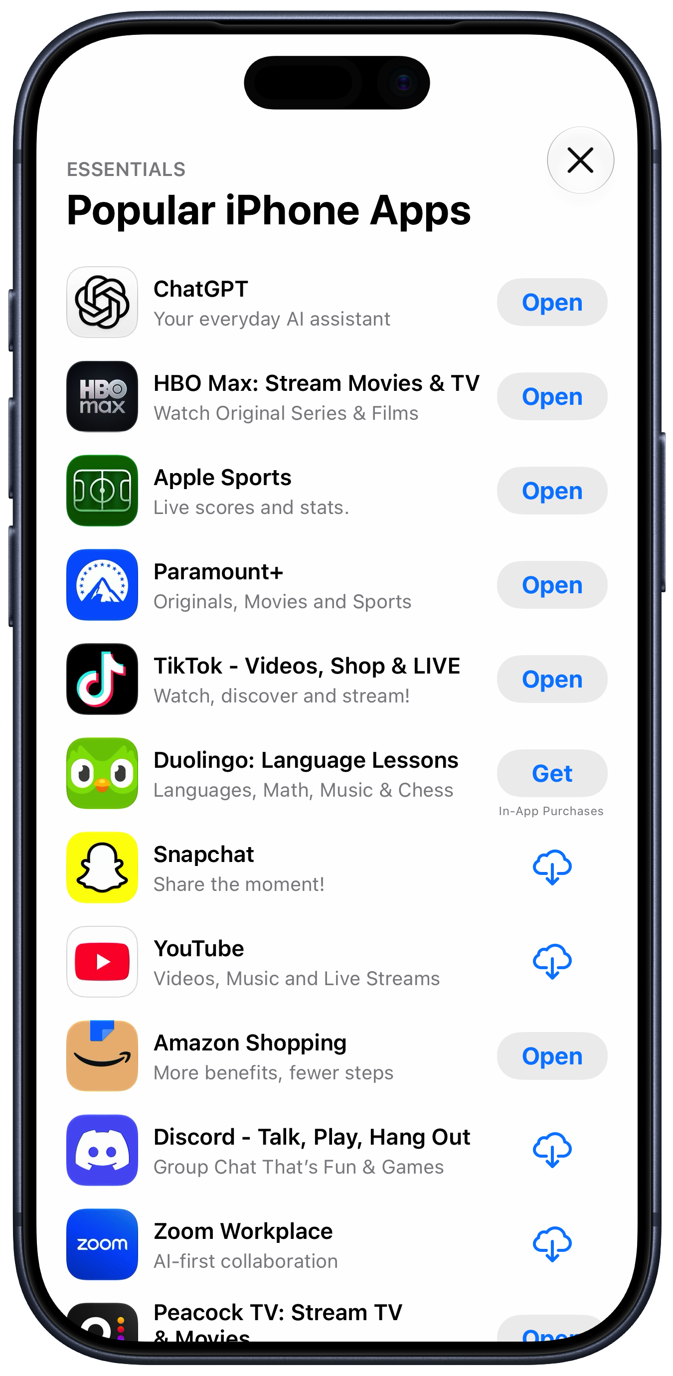
For what it’s worth, I just looked at the App Store editorially-curated “Popular iPhone Apps” list, and ChatGPT is in the top spot. Given the lawsuit Apple filed against OpenAI last week, I’d say this is pretty good anecdata that these editorial decisions in the App Store aren’t driven by favoritism. The top 10 downloads list for free iPhone apps currently looks like this (for me here in the U.S. App Store):
- Paramount+
- Netflix Game Controller
- ChatGPT
- Kalshi: Trade the World Cup
- Peacock TV: Stream TV & Movies
- Netshort - Popular Dramas & TV
- Threads
- TikTok Pro - Events
- Freecash - Get Paid Real Money
- Depop - Buy & Sell Clothes
There are some real winners on that list. But only one AI app: ChatGPT.
Musk alleges that the top downloads list is crooked too. That’s just projection. If Musk ran a popular App Store he’d put his thumb on the scale to make sure his own apps always top the list. That’s what he’s done with his personal account, and accounts aligned with his politics, on Twitter/X. Because that’s what he would do, he thinks that’s what Apple does. I really do think he believes the App Store’s top download lists are fixed, and that Grok is on the wrong side of the fix. Crooks think everyone is crooked. It’s just one of several ways that Musk is not hooked up right.
I suspect, though, that he’s no longer worried that Apple is putting its thumb on the scale to favor OpenAI. Maybe he should never-mind this lawsuit.
Sunday, 12 July 2026
- WorkOS Pipes ★
-
My thanks, once again, to WorkOS for sponsoring DF last week. Users expect apps and agents to reach the tools they already work in. Every integration that gets you there is a different OAuth flow, a different token lifecycle, and weeks of infrastructure before you write a line of product code.
WorkOS Pipes handles it with one API call. Pre-built connectors for GitHub, Slack, Salesforce, Google Drive, and more. Pipes handles OAuth, token refresh, and credential storage. You call the real provider API with a fresh token, every time.
- Paulo Andrade: ‘A WWDC 26 Update on Building a Mac-Assed App With SwiftUI’ ★
-
Paulo Andrade:
My last post on using SwiftUI to build a Mac-assed app got a bit more traction than I expected. It was mentioned on Mastodon several times, included in iOS Dev Weekly, inspired May’s edition of the Swift Blog Carnival, and was eventually mentioned by John Gruber, arguably the person most to blame for popularizing the term “Mac-assed”, on Daring Fireball.
All this attention also resulted in an engineer from Apple reaching out with some notes. We exchanged a few emails, I filed a few radars, and now that WWDC 27 is behind us, this post serves as a small update to the issues I wrote about before.
There’s real progress here, but I think my main point still stands: SwiftUI is now seven years old and it does not make it easy to create great Mac apps.
- How UIs Degrade Over Time ★
-
These examples are from Windows, but the same degradation is true for the standard look for MacOS alerts too. There was a time when system UI chrome was improving in clarity, everywhere. Today we live in an age when it’s degrading in clarity, everywhere. It’s rather inexplicable.
- ‘Every Frame Perfect’ ★
-
Nikita “Tonsky” Prokopov:
The rule of thumb is:
If I take a screenshot of your app at any moment, you should be able to explain what I see.
Why care about every frame? It builds trust. Users can’t see the code, so UI is the only way for them to judge the quality of the app. If UI looks good, that means developers had time to polish it, which means that they probably spent a comparable amount of time to iron out the code. It’s a heuristic, but a reasonable one.
Now, what does it mean in practice? I can think of a few things:
- No white flashes between screens.
- No partially loaded content.
- No relayout while content loads.
- Internally consistent. If one part of the UI says “1 update available”, another part should not say “Checking for updates...”
- Precise animations.
Animations often end up being forgotten. A UI might look great in both start and end states but very janky in between.
“Every frame perfect” is a great mantra for UI craftsmanship. If you care about every frame, that discipline will be palpable, even though almost no users will ever examine your animations and transitions frame-by-frame, and most will happen too quickly to see in real time. If you cut corners on interstitial states “because no one will notice”, you’ll start cutting corners elsewhere.
- TwoMillionKit: Use Private Cloud Compute in MacOS 27 Foundation Models Without an Entitlement ★
-
Guilherme Rambo:
Apple ships the
fmcommand-line tool in macOS 27, which can be used to run inference with the local system model or Private Cloud Compute from Terminal or scripts. You know what else can run command-line tools? Mac apps! 😃I decided to spend some of my Codex tokens and take GPT 5.6 Sol for a spin. I asked it to create this Swift package. All it does is provide a
LanguageModelimplementation that uses thefmcommand-line tool under the hood, meaning that any Mac app can use the Private Cloud Compute model without requiring a special entitlement from Apple.The main limitation is that this will not work for sandboxed Mac apps, so any Mac app distributed via the Mac App Store won’t be able to use it.
But for developers of Mac apps distributed outside the Mac App Store, this provides a simple and entitlement-free way to use Private Cloud Compute in their apps.
Use sparingly and at your own risk.
This is a workaround for Apple’s current limitation that only grants access to Private Cloud Compute to “developers in the App Store Small Business Program with fewer than two million first time App Store downloads”. Hence Rambo’s clever name for the framework.
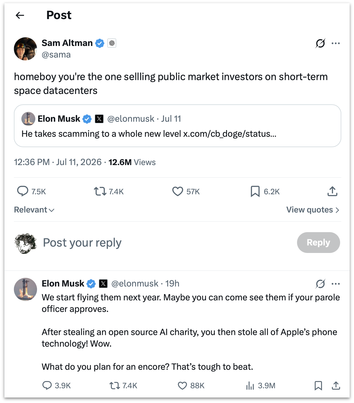
- Sam Altman and Elon Musk Argue Over Who’s Running the Bigger Scam ★
-
Elon Musk, linking to his own tweet from March that “Sam Altman is super good at scamming”:
He takes scamming to a whole new level
homeboy you’re the one sellling public market investors on short-term space datacenters
Musk:
We start flying them next year. Maybe you can come see them if your parole officer approves.
After stealing an open source AI charity, you then stole all of Apple’s phone technology! Wow.
What do you plan for an encore? That’s tough to beat.
(All spelling, capitalization, and punctuation sic.)
These are two of the CEOs of the most valuable companies on the planet. Say what you want about it, but Musk’s Twitter/X is like nothing else that’s ever existed. Screenshot of the thread for posterity, and an XCancel link for those icked by X itself.
- Lunacy — Jeff Halter’s Lunatic Fringe Player ★
-
After linking to Stacks, his remarkable new modern HyperCard player, I made the terrible mistake of clicking around the rest of Jeff Halter’s website, and fell upon Lunacy:
Created by Ben Haller and released in the early ’90s as part of the Macintosh More After Dark software package, Lunatic Fringe was unique among screensavers in that it was not just a passive animation to watch, but an interactive game! Toggling the Caps Lock key while the screensaver was running popped you into a space shooter where you could fly around, collect power-ups, and blast a variety of baddies all in pursuit of a high score. It was a blast.
Running Lunatic Fringe on a modern computer has been a challenge. Fringe Player by Greg Parker filled this need during Apple’s PPC and Intel era, but is not supported on modern Apple platforms. Lunacy brings Lunatic Fringe to the present: a native Swift app with a built-in emulation engine that runs the original module, unchanged, on modern Apple platforms.
Lunatic Fringe is one of my all-time favorite classic Mac games. Lunacy is a great modern player, including CRT simulation to make the game look a lot more like it did back in the day.
- Stacks — HyperCard Player for Modern MacOS ★
-
Well this is just delightful:
- Run HyperCard stacks directly on your modern Mac. No emulator required!
- Browse the Internet Archive’s HyperCard collection and run stacks with one-click.
- Period-accurate typography.
- Sound, instruments, and MacinTalk speech synthesis.
- Cross-stack navigation.
Stacks is a really beautiful native Mac app, and its presentation of classic HyperCard stacks is exquisitely faithful to the era. It’s simultaneously Mac-assed 2026-style and Mac-assed 1987-style. Crackerjack work from developer Jeff Halter.
Saturday, 11 July 2026
- Can Someone Explain to Me How to Get ‘ChatGPT Classic’? ★
-
One more link from OpenAI’s Help Center, this one explaining how to upgrade from the old Mac app to the new “super” app version:
Follow the prompt in the app to download the new ChatGPT desktop app. Then sign in with the same ChatGPT account.
The new app may install alongside your current app. If both remain installed, you will see:
- ChatGPT: The new app with Chat, Work, and Codex.
- ChatGPT Classic: The previous ChatGPT desktop app. You can continue using it; no migration is required at launch. It continues to receive model updates, bug fixes, security patches, and support for its existing Enterprise capabilities. New agent features may be available only in the new app.
None of this has been my experience. I had the existing old ChatGPT app installed on three different Macs. On all three of them, the built-in “Check for Updates” command only installs the latest version of the classic app. This is good, I suppose. But if you’re not aware from following the news that OpenAI released an altogether new “super” app for MacOS and Windows, you’d never know it from the Check for Updates command built into the classic Mac app.
So I don’t see “the prompt in the app to download the new ChatGPT desktop app”. If I download the new app manually, I get a disk image. After mounting the disk image, the instructions say to double-click the “ChatGPT” app on the disk image — not to drag it to the Applications folder. If I do that while the old ChatGPT app is still running, it bounces back and forth a few times but nothing new gets installed and nothing old gets removed or renamed. I’m just left with the classic ChatGPT app, still named “ChatGPT”.
If I run the installer on the disk image when the old ChatGPT app is not running, the old app gets replaced by the new one in my Applications folder, and the old app is moved to the Trash. There is no app named “ChatGPT Classic”.
I mean, their Help document does say “the new app may install alongside your current app”, and “if both remained installed”, so they seem just as confused as I am. And while you can, for now at least, just remain on the old version of the app and still get model updates and bug fixes, there is seemingly no way to download a new copy of the classic ChatGPT Mac app if you don’t already have a copy. The update installation is seemingly non-deterministic.
This is an app with over a billion users. I know there aren’t a billion users of the native Mac app, but, still. It’s one of the most popular apps any company has ever made, and the biggest update they’ve ever shipped is an incoherent confusing mess.
- OpenAI Help Center Describes What Is Wrong With the New ChatGPT ★
-
OpenAI Help Center, “Where Work and Codex are available”:
Work is available on ChatGPT web and mobile for eligible paid plans. Work is also available in the ChatGPT desktop app when included for your plan and workspace.
Work on web and mobile runs in the cloud. Work in the desktop app can also use local files and desktop apps with your permission. At launch, cloud Work conversations do not appear in desktop Work; desktop Work threads and local files remain on that computer.
Codex is available as a mode in the ChatGPT desktop app. It can work with local folders, repositories, terminals, and developer tools. Codex is not a selectable mode on web or mobile. You can access supported desktop Codex tasks from the Remote tab in the ChatGPT mobile app, but those tasks do not become web or mobile chat history.
These three paragraphs, from OpenAI’s own Help Center, sound more like a critic’s scathing review of what’s wrong with the new ChatGPT “super” app than a guide to how to use it.
- Benedict Evans on the New ‘Super App’ ChatGPT ★
-
Benedict Evans with a succinct review on Threads:
Wow, what a total mess.
What is the difference between a project, a task and a chat?
Why did chats get a crappy floating window but tasks and projects don’t?
Why does choosing ‘plugins’ get me ‘templates’?
Am I not allowed to finish ‘setup’ if I don’t use Slack or Google Drive?
I forget how I made the Setup dickbar disappear despite my not using Slack or Google Drive. It was confusing.
It is sometimes observed that in companies dominated by internal politics, their shipped product (and public keynotes) reflect the company’s org chart. That’s never been truer than with the new ChatGPT app. OpenAI’s internal org chart is a complete disorganized mess. This new app perfectly reflects that.
The old ChatGPT app was focused. That’s the app that still ships for mobile (which includes iPad, which tells you whether OpenAI thinks iPad is a real computer or a big iPhone), and is, for some Mac users, left installed on their systems as “ChatGPT Classic”. The new app is an incredibly confusing sloppy mess. At a glance it looks like a polished app. But the UI is just slop. It has the veneer of a polished app without actually being organized or structured or labeled in ways that add clarity and coherence. It’s playing dress-up as a big-boy app. My understanding from people adjacent to OpenAI is that the company’s senior executives are singularly consumed with FOMO obsession regarding Anthropic, and the only real clout within the company belongs to the AI researchers. Not product designers or app craftspeople. What the researchers say goes, and with this update, we can see their level of taste in app design.
The app icon for the new “super” app should be the Homer.
Exactly Like Om Malik
Saturday, 11 July 2026
Fred Vogelstein (Om’s partner at Crazy Stupid Tech):
We met a week later at his outdoor office — a bench in SF’s South Park. He told me that he was going emeritus at True Ventures, the VC firm, and that he was going to spend more of his time writing.
It was awesome to see him. Sitting on a bench with Om could be quasi religious. He talked so softly and deliberately that it forced you to slow down, lean in and forget about everything else.
What became clear was that we actually saw the world the same way. We didn’t agree what Wired should be doing about it. But we did agree on this: While everyone was fixated on big tech, an explosion in tech innovation not seen in a generation was taking place. We both agreed that not enough people were writing about it.
“Maybe we should do something together then,” I said.
So saddened to hear about @om. His writing was one of the reasons I went into tech journalism. Right out of college, I was working at a PR agency and started reading his site. It inspired me to start blogging.
Years later, he tried to recruit me. Even after I went elsewhere, he’d send me notes telling me how proud he was of my work. He’d often review my reviews, so here’s mine of him: Generous with his time. Honest with his feedback. Endlessly encouraging to those coming up behind him.
Very sad to hear about the passing of @om. He shared two lasting lessons with me: the first when I was a cub tech reporter at the SF Chronicle; he interviewed me for a job but told me he didn’t think I could hack it at GigaOm because newspaper writers were too slow. It taught me that I needed to get out of print media ASAP.
The second was many years later, when I was having a drink with him and some other reporters. We asked him for advice. “Never name a blog after yourself,” he said. RIP
One day on Twitter I got a DM from someone with the handle @om.
“I don’t know who this is,” I thought, “but damn that is a great handle!”
Then I peaked at the follower count: over 1 million!
“WTF? Who is this???” I thought.
I’d never — then or since — been contacted by someone with such a high profile online.
How was I even on this person’s radar?
Om seemingly read everything.
Looking at my emails and social media messages from back then is just a treasure trove. Om was always quick with a compliment about something I had written but also with a criticism at times. He clearly just read endlessly and couldn’t help but share his opinions, even if privately. In person too he was amazingly candid and honest. He would complain how annoyed he was if you beat him to some story — but complain even louder if he felt like he actually beat you but wasn’t getting enough credit. He was clearly competitive too. And he was correct in his assessments, because again, he was honest. [...]
To me, Om was and will always be such a singular individual. There will never be anyone quite like him. He’s the only person I know who could be both humorously downtrodden and insanely optimistic at the exact same time. Again, he just seemed to wear his emotions on his sleeve.
Jason Hiner, in a post on LinkedIn:
This is the opening anecdote from “Chapter Six: The Blogger” from my 2016 book, Follow the Geeks, co-authored with Lyndsey Gilpin. Om once told me that “For three years, it was every day a rejection” as he tried to break into tech journalism. This was how he finally broke through.
David Churbuck checked his voicemail. There was a message from someone looking for a job.
Because of the guy’s thick Indian accent, David could barely make out what he was saying, except that he worked for a wire service down on Wall Street and was a big Forbes fan. The guy heard that Forbes was going to be one of the first media companies to launch its magazine on the web and he wanted to come help.
David ignored the message. He had a small team and hardly any budget.
Then he got a fax. It was from this guy, explaining why he was a perfect fit to join the team.
The next day, the guy left another message. If David would just give him a call, it would be great to talk with him. He wouldn’t regret it.
Ignore.
The following day, he left another. Whatever time limit there was for voicemails, this guy always used up every minute.
Still, David ignored it.
And then the guy started getting creative.
[...]
One of the journalists, Michael Noer, said half jokingly, “Just call the guy in!” So, partly out of admiration, and partly out of pure morbid curiosity, David called him back.
One interview. Fifteen minutes. That was all it took for David to hire Om Malik.
“They do not sell themselves”, Om told me in a separate story from that same time in his life.
Hiner made the entire chapter available to read as a handsome PDF. It’s so good, and so utterly Om. It’s a crackerjack good read about the very early “WWW” days of the web. A bit:
Om is charming and disarming, forceful and accommodating. He has an easy smile, a quiet, melodic voice, and a handsome face. Once he opens his mouth, it’s obvious how much he reads and how thirsty he is to learn. It’s rare to meet someone who is ready to debate you on almost any topic, but who’s also genuinely curious about your life and your opinion. It all makes the burly journalist one of the most huggable people on Earth. That’s what David was up against when he met Om. He didn’t stand a chance.
“It was destiny,” said David, with a self-deprecating laugh. “It was total destiny.”
Om’s close friend, photographer Christopher Michel, published “Om the Great”, an enormous gallery of portraits of him. Here’s just one of hundreds:

Lastly, here’s a story from Andrew Sasaki, which he sent me by email, and I’m reproducing with his permission. It’s the perfect Om story:
I met Om briefly at a tech event in NYC around 2008 or so. He was talking with a friend of mine, and when I walked up he introduced himself: “Hi, I’m Om.”
“‘Om’ like ‘Om Malik’?” I asked.
This amused him greatly.
“Yes, exactly like Om Malik”, he said.
A couple of years later the iPad had just launched, and I saw my friend again at another industry event. I asked him a question related to the unprecedented development effort we were already seeing around the new platform that didn’t yet have a single compelling use case.
“You know who I bet would know about that? Om Malik”, he said, and gave me Om’s email address.
I hesitated to bother Om, but eventually reached out with my question. “I don’t know if you remember me, but we met a couple of years ago, and…” blah blah blah.
Naturally, there was no answer. Why would there be? He doesn’t know me from Adam, and he’s Om Fucking Malik.
Except there was an answer about 4 days later. Om started off by apologizing for the delay in responding, but he had taken the time to research his answer before writing to me. And of course, his answer was thoughtful, insightful, and absolutely correct. I was gobsmacked at the generosity he had shown replying to someone he didn’t even know. He gave no indication that he even remembered me until his signature line:
“Exactly Like Om Malik” ★
Saturday, 11 July 2026
- Gurman on Tang Tan and Paul Meade ★
-
Mark Gurman, reporting for Bloomberg (paywalled, alas):
Apple was quickly alarmed by OpenAI’s recruiting drive, which included poaching senior hardware and design leaders and ravaging several teams across its engineering organizations. The practice continued as recently as June, when OpenAI lured away Apple’s smart glasses chief. That executive, Paul Meade, was quickly shown the door at Apple and not given the opportunity to stay on for a transition period, according to people with knowledge of the matter.
Regarding Tang Tan, who is at the center of Apple’s lawsuit:
Tan was famous for taking risks at Apple and “flying very close to the sun” during his 25-year career, according to someone who worked with him. “Tang is well known for moving fast, playing fast and loose and breaking things,” said the person, who asked not to be identified while discussing former colleagues.
Gurman broke the story of Meade leaving Apple for OpenAI on June 26, writing then:
Meade’s departure is a blow to the iPhone maker. He has led hardware engineering for the Vision Pro headset — once seen as Apple’s next major computing platform — for seven years. Apple and OpenAI spokespeople declined to comment. He has also been responsible for the development of display-free Apple smart glasses meant to vault the company into the AI wearables space next year and compete with a growing category pioneered by Meta Platforms Inc.
John Ternus Should Reverse Apple’s Slide Down the Advertising Slippery Slope
Thursday, 9 July 2026
In September 2014, in the wake of a series of hacks that stole private photos from the iCloud accounts of multiple celebrities, Tim Cook wrote an open letter to customers that was published at apple.com/privacy. Apple seemingly no longer hosts a copy of the letter. (That tends to happen to memorable open letters from Apple CEOs.) The Wall Street Journal’s fast-loading website still hosts a copy of the letter, as does the Internet Archive’s essential but slow-loading site.
Cook’s letter is cogent and clear, and well worth reading in full today. But when you do, you can see why Apple no longer hosts a copy:
A few years ago, users of Internet services began to realize that when an online service is free, you’re not the customer. You’re the product. But at Apple, we believe a great customer experience shouldn’t come at the expense of your privacy.
Our business model is very straightforward: We sell great products. We don’t build a profile based on your email content or web browsing habits to sell to advertisers. We don’t “monetize” the information you store on your iPhone or in iCloud. And we don’t read your email or your messages to get information to market to you. Our software and services are designed to make our devices better. Plain and simple.
One very small part of our business does serve advertisers, and that’s iAd. We built an advertising network because some app developers depend on that business model, and we want to support them as well as a free iTunes Radio service. iAd sticks to the same privacy policy that applies to every other Apple product. It doesn’t get data from Health and HomeKit, Maps, Siri, iMessage, your call history, or any iCloud service like Contacts or Mail, and you can always just opt out altogether.
Some of this remains true, but has lost some truthiness — and truthiness matters. But some of it is no longer true, period. It’s no longer just “one small part” of Apple’s business that serves advertisers. Here in 2026, search results in the App Store not only show paid ads — frequently for casinos — but the search results are visually dominated by paid ads now that Apple has added a second ad to results. Apple News+ is a paid subscription that offers a genuinely great value for the number of paywalled publishers whose content it includes, but articles on the News app tend to include the weirdest AI-generated ads on the Internet. (How many young blond women am I supposed to believe need hearing aids?) And — at this writing, still “coming soon” — Apple is launching ads on Apple Maps. Apple Maps remains free of charge to use, so according to Tim Cook, we’re not the customer. We’re the product. Or, if you prefer, our frustration is the product.
I thought to revisit Cook’s 2014 “you’re not the customer, you’re the product” letter today in light of Meta’s new policy of defaulting Instagram users into having their personal content serve as grist for AI-generated content created by other users. The New York Times described Meta’s on-by-default policy as “surprising”; I say it’s not surprising at all. Meta has never shown any respect for its users’ privacy, and when they’ve claimed to, everyone knew it was a sham. They no longer show any respect for their own engineers’ privacy for chrissake.
But Apple? Apple meant it. And I think they still do. But I think they’re lost in the weeds on two fronts:
- Squeezing out every extra cent of Services revenue they can.
- Satisfied in their own deep knowledge of how their systems are designed to safeguard users’ privacy and personal data.
Issue #1 is self-explanatory. The ratio of ads to organic results in App Store search — especially when measured in screen area — is clearly not aligned with Cook’s 2014 statement that “Our software and services are designed to make our devices better. Plain and simple.” Obviously not. App Store search today is designed primarily to generate more revenue for Apple. That’s not criminal, but it’s a change.
Issue #2 is more subtle. Apple really does have a religious fervor for privacy. Consider ads for Maps. It hasn’t shipped yet but Apple states, “Run ads in a privacy-first environment that respects your customers, who already trust Maps. No tracking — just helpful discovery.” I’m quite sure that’s all completely true. I just wrote last week about how Apple has never had to deal with “geofence warrants” for its location services because Apple has never kept personally-identifiable usage data for location. They not only don’t give advertisers — or law enforcement — your location data, but can’t, because they don’t collect it and never did.
So let’s just concede that the upcoming ads in Apple Maps are completely private. How many users are going to believe that? Or assume it? I think very few. People see ads and they think “I’m being tracked.” When Apple starts showing ads in Maps, many — perhaps most — users are going to think they’re being tracked by Apple and their location “is being sold” to advertisers.
It’s not true. Apple knows it’s not true, because they built and control all of the systems involved. Apple is very proud that this is true, and they should be. It’s a good thing and it really is an important institutional value at the company. It’s a religious fervor. On this particular issue Apple really is set apart from its peer-sized companies in technology.
But that’s not what the general population believes. The general population thinks of “Big Tech” as a single, almost unified, hegemony. A lot of “Apple users” only use one Apple platform, the iPhone, and if they own another Apple product or two they’re iPhone peripherals like AirPods and Apple Watch. If they believe Apple is ethically better with regard to privacy (or anything else) than other companies, it’s only a little better. Most people have no idea whatsoever how anything Apple sells actually works. It’s all magic. That’s why a majority of adults believe that apps on their devices surreptitiously listen to and record real-world conversations in order to show them eerily-accurate targeted ads. Apple has actually done a lot of hard engineering and design work to guarantee that software on your devices can’t surreptitiously listen to you. But most people don’t know that and wouldn’t understand it if it were explained to them. All they know is that they were talking about Frisbees the other day, after not having uttered the word “Frisbee” in years, and now they’re seeing ads for flying discs in Instagram — and the only explanation that makes any sense to them is that their phone “listens” and betrays their privacy.
What gave Tim Cook’s privacy letter heft in 2014 wasn’t just the clarity of its plain language, but the fact that you didn’t have to take his word for it that the ads Apple showed you respected your privacy, because Apple didn’t show you ads in 2014.1 Apple today can’t say that. Apple can prove to itself, and to technically sophisticated outsiders who are willing to listen, that it can serve ads — even in Maps — in privacy-protecting ways. But the only way they can prove to most people that they’re not betraying the privacy of their location data or app usage is not to sell such ads in the first place. Seeing is believing, and when people see ads in their maps app, they believe they’re being tracked.
John Ternus should return Apple’s privacy policy to its 2014 clarity. The trust Apple would earn from such a move would far out-value whatever revenue these ads pad to their already hefty and ever-increasing quarterly Services numbers. “The companies that offer you services free-of-charge to show you ads are betraying your privacy and disrespecting your attention” is a powerful marketing message that only one major tech company used to be able to credibly make. That’s always been a resonant message, but never more so than today, in the age of AI. Ternus should make the slight course correction needed so that Apple can hammer that message once again. ★
-
The genius — cynical genius, perhaps, but genius — part of Apple’s privacy stance regarding advertising is that they’ve made veritable mountains of profit through the traffic acquisition cost partnership with Google for web search traffic originating from Safari. That deal made Apple one of the most profitable companies in the highly lucrative Internet advertising industry without themselves needing to sell or display a single ad. Apple’s hands are clean from that deal except for whatever germs they pick up counting the $20+ billion in cash that Google trucks over from Mountain View to Cupertino every year. The ads Apple shows in the App Store and (soon) in Maps will dirty their reputation while generating far, far less money than they continue to rake from the Google/Safari deal, which deal leaves Apple’s reputation unsullied. ↩︎
What’s Good for the iOS Goose Is Often Not Good for the MacOS Gander
Wednesday, 8 July 2026
Tobias Steinke, replying on Mastodon to my “Apple Should Eliminate the App Icon ‘Squircle Jail’” piece:
But iOS app icons (and iPadOS) were always in squircle shape. Why is and was this okay for you, but it’s not for macOS?
This is a good and fair question. But I not only have an answer, I have an answer that clarifies why this entire debate is important. That “design is how it works” applies even to something as seemingly superficial as icons.
There are all sorts of limitations and simplifications in iOS that would be bad ideas to bring to MacOS, which would range in effect from disappointing to frustrating to maddening to ruinous. Where squircle jail falls on that scale is subjective. It’s certainly not ruinous, but I’d say it’s maddening. (iOS baby-computer-isms that would be ruinous to bring to MacOS would include killing AppKit, removing the Unix terminal layer, or requiring all apps to come from the App Store.)
MacOS has suffered many such frustrating decisions before. E.g., it arguably makes sense for iOS to omit always-visible scroll bars because screen real estate is so limited. It makes no such sense on the Mac.
As for mandatory squircle shapes for app icons in particular:
(a) I don’t think this is a good mandate for iOS either;
(b) it was always so for iOS, though, so it’s not like Apple has ever taken away rich creative icon shapes on the platform;
(c) MacOS is a far richer and more precise environment than iOS.
App icons on the iOS home screen are effectively simple buttons. I think it’s rather obvious that’s why they have had that squircle/roundsquare shape ever since the iPhone was announced in January 2007 (source). They’re one-tap launchers. App icons in MacOS are not mere buttons. You can drag them, move them, and drop things on them. You click them to select, and double-click to launch. They are richer objects that deserve a richer visual vocabulary. iOS is a world meant for fat-tipped Magic Markers and blunt safety scissors. MacOS is a world meant to support fine-tipped drafting pens and precision razor-sharp X-ACTO knives.
Plus, Macintosh icons have four decades of glorious history. Style and fashion change over time. But limitations should not be imposed where freedom once reigned.
And shape as a differentiating factor is not mere decoration. We have long known this. We all knew this. And not only did Apple know it, the rest of us knew it because we learned it from Apple. Via the Internet Archive, here’s Apple’s Macintosh Human Interface Guidelines from 2018,1 which was not that long ago:
Consider giving your app icon a realistic, unique shape. In macOS, app icons can have the shape of the objects they depict. A unique outline focuses attention on the object and makes it easy to recognize the icon at a glance. If necessary, you can use a circular shape to encapsulate a set of images. Avoid using the rounded rectangle shape that people associate with iOS app icons.
“A unique outline focuses attention on the object and makes it easy to recognize the icon at a glance.” Eight short years ago. That is not the description of a fad or fashion. It is a description of human perception. Our unchanging nature.
So much collective hard-earned wisdom has been ignored of late. But it’s not lost or forgotten. Chapter 11 of the 2002 Aqua Human Interface Guidelines is a good place to start remembering. There was tremendous thought, rigor, and logic behind those guidelines — all of it in the name of creating a visual language for icons that most people simply thought looked cool as fuck. ★
-
It caught my attention that as recently as 2018, Apple still published platform-specific Human Interface Guidelines. At some point after that they did a Dye job on the whole thing and now there’s just one Apple Human Interface Guidelines. Instead of platform-specific HIGs, there’s one HIG, with platform-specific call-outs as sidebars within the text. This is no little thing. It’s emblematic of Apple shipping user interfaces that are ignorant of the principles Apple itself forged over the previous decades. It’s like trying to make movies without ever having watched and studied the best movies made in the past, or writing a novel without having read a fucking book. It’s not just the Mac that should have its own HIG. Each of Apple’s platforms should. (iPadOS can share iOS’s.) There could be a “foundations” HIG that serves as a primer on fundamentals, but platform-specific HIGs could — and in the past, did — explain in detail why they are discrete platforms with different idioms, capabilities, and requirements. ↩︎