
By John Gruber

Paper — The connected canvas for teams shipping with agents
Linked List: November 2025
Sunday, 30 November 2025
- The Talk Show: ‘Financial Boner’ ★
-
Special guest: Tyler Hayes. Topics include how to get a small phone today, which way foldables should fold, the state of Apple TV (including its new “sonic logo”), and some holiday gift gadget recommendations.
Sponsored by:
- Clic for Sonos: No lag. No hassle. Just Clic.
- Squarespace: Save 10% off your first purchase of a website or domain using code talkshow.
Saturday, 29 November 2025
- Dekáf Coffee Roasters ★
-
My thanks to Dekáf for sponsoring Daring Fireball this week. They’ve just launched a nice lineup of holiday gift bundles — curated sets of their most-loved coffees that make gift-buying easy.
Nine single origins. Six signature blends. Four Mizudashi cold brews. All micro-lot and top-rated coffees are shipped within 24 hours of roasting. No shortcuts. No crash. Dekáf is coffee at its most refined, just without the caffeine. I’ve gone through a few bags, and each one tasted great — like high quality regular coffee.
And, there’s a special offer just for DF readers: get 20% off with code DF.
- Festivitas – Now for iOS, Thanks to Widgets ★
-
Last year developer Simon Støvring launched a fun new app for the Mac called Festivitas, which let you decorate your menu bar and Dock with animated holiday lights and falling snow. This year he’s added an iOS version for iPhone and iPad that lets you create widgets to decorate your home screens with holidays lights and festive photo frames. Pure fun.
See also: Jason Snell on using Festivitas’s Shortcuts support to create an automation that gives a 10 percent chance of snow every 20 minutes. Støvring’s own Shortcuts examples (available in the app’s Settings window) include things like turning on the lights when music starts playing. With support for Shortcuts, users can create their own fun.
- ‘A Critter Carol’ – Apple’s 2025 Holiday Short Film ★
-
Delightful, and there’s an equally delightful behind-the-scenes video.
Thursday, 27 November 2025
- ‘Fifteen Years’ ★
-
A masterpiece from Randall Munroe, perfect for Thanksgiving.
Wednesday, 26 November 2025
- David Lerner, Co-Founder of Tekserve, Dies at 72 ★
-
Sam Roberts, reporting for The New York Times:
David Lerner, a high school dropout and self-taught computer geek whose funky foothold in New York’s Flatiron district, Tekserve, was for decades a beloved discount mecca for Apple customers desperate to retrieve lost data and repair frozen hard drives, died on Nov. 12 at a hospital in Manhattan. He was 72. [...]
Tekserve specialized in finding the cures for sick computers — including insect infestations — and recovering first novels and other priceless data, which the company said it was able to do about 85 percent of the time.
“We only charged for success,” Mr. Lerner said.
There were many great independent Apple resellers from the pre-Apple-Store era. There was only one that was legendary: Tekserve.
- Running to the Press ★
-
Regarding my earlier post on similarities between the 2010 App Store Guidelines and today’s: Notably absent from the current guidelines (I think for a very long time) is the specious but very Jobsian claim that “If you run to the press and trash us, it never helps.” Getting the press on your side is one of the best ways for a developer to get an unjust App Store review decision overturned. Apple loathes negative publicity.
- November Update to the App Store Review Guidelines ★
-
Here’s the updated full guideline for section 4.1:
4.1 Copycats
(a) Come up with your own ideas. We know you have them, so make yours come to life. Don’t simply copy the latest popular app on the App Store, or make some minor changes to another app’s name or UI and pass it off as your own. In addition to risking an intellectual property infringement claim, it makes the App Store harder to navigate and just isn’t fair to your fellow developers.
(b) Submitting apps which impersonate other apps or services is considered a violation of the Developer Code of Conduct and may result in removal from the Apple Developer Program.
(c) You cannot use another developer’s icon, brand, or product name in your app’s icon or name, without approval from the developer.
It’s guideline (c) that’s new, but I like guideline (a) here. Not just the intent of it, but the language. It’s clear, direct, and human. It reminds me of the tone of the very early guidelines, when it seemed like Steve Jobs’s voice was detectable in some of them. In a post back in 2010, I wrote:
This new document is written in remarkably casual language. For example, a few bullet items from the beginning:
We have over 250,000 apps in the App Store. We don’t need any more Fart apps.
If your app doesn’t do something useful or provide some form of lasting entertainment, it may not be accepted.
If your App looks like it was cobbled together in a few days, or you’re trying to get your first practice App into the store to impress your friends, please brace yourself for rejection. We have lots of serious developers who don’t want their quality Apps to be surrounded by amateur hour.
We will reject Apps for any content or behavior that we believe is over the line. What line, you ask? Well, as a Supreme Court Justice once said, “I’ll know it when I see it”. And we think that you will also know it when you cross it.
If your app is rejected, we have a Review Board that you can appeal to. If you run to the press and trash us, it never helps.
Some of that language remains today. Here’s the current guideline for section 4.3:
4.3 Spam [...]
(b) Also avoid piling on to a category that is already saturated; the App Store has enough fart, burp, flashlight, fortune telling, dating, drinking games, and Kama Sutra apps, etc. already. We will reject these apps unless they provide a unique, high-quality experience. Spamming the store may lead to your removal from the Apple Developer Program.
I could be wrong, but my sense is that Apple has, without much fanfare, cracked down on scams and rip-offs in the App Store. That doesn’t mean there’s none. But it’s like crime in a city: a low amount of crime is the practical ideal, not zero crime. Maybe Apple has empowered something like the “bunco squad” I’ve wanted for years? If I’m just unaware of blatant rip-offs running wild in the App Store, send examples my way.
Monday, 24 November 2025
- Simple Rule of Thumb: AI Systems Shouldn’t Pretend to Be Human ★
-
Dave Winer:
The new Amazon Alexa with AI has the same basic problem of all AI bots, it acts as if it’s human, with a level of intimacy that you really don’t want to think about, because Alexa is in your house, with you, listening, all the time. Calling attention to an idea that there’s a pseudo-human spying on you is bad. Alexa depends on the opposite impression, that it’s just a computer. I think AI’s should give up the pretense that they’re human, and this one should be first.
Amen.
- ‘A Worthless, Poisoned Hall of Mirrors’ ★
-
Charlie Warzel, writing for The Atlantic:
X’s decision to show where accounts are based is, theoretically, a positive step in the direction of transparency for the platform, which has let troll and spam accounts proliferate since Musk’s purchase, in late 2022. And yet the scale of the deception — as revealed by the “About” feature — suggests that in his haste to turn X into a political weapon for the far right, Musk may have revealed that the platform he’s long called “the number 1 source of news on Earth” is really just a worthless, poisoned hall of mirrors.
If I’m understanding this correctly, X is owned by a white nationalist who pays poor people of color in developing countries to pretend to be working class white Americans to scare other white Americans into being afraid poor people of color from developing countries are going to ruin America?
- Department of Transportation Asks Travelers to ‘Bring Civility Back’ to Air Travel ★
-
The New York Times:
Sean Duffy, the secretary of transportation, began a new campaign on Wednesday that he called “The Golden Age of Travel Starts With You,” complete with a 1960s-style public service announcement that spliced together scenes of the country’s first air travelers, dressed in suits and hats, with present-day clips of in-flight brawls and airport meltdowns. In the background, Frank Sinatra sings “Come Fly With Me.”.
From the Department of Transportation website:
Secretary Duffy posed a few key questions every flyer should ask themselves this holiday season to help Americans reach their destinations as quickly, efficiently and comfortably as possible:
- Are you helping a pregnant woman or the elderly with placing their bags in the overhead bin?
- Are you dressing with respect?
- Are you keeping control of your children and helping them through the airport?
- Are you saying thank you to your flight attendants?
- Are you saying please and thank you in general?
“Quiet, piggy.”
- SuperDuper Security Update v3.11 ★
-
Dave Nanian and Bruce Lacey, at Shirt Pocket:
Mistakes are a part of life.
They’re not a great part, but when viewed “correctly”, they’re an opportunity.
Well, we have three opportunities, brought to our attention by a security researcher. They’re security vulnerabilities that have been in SuperDuper! since the very first version, released almost 22 years ago.
Today, we’re releasing fixes for the current release (the SuperDuper! v3.20 Beta is already fixed), a discussion of the problems, and the steps users can take to mitigate the issues if they cannot install the update.
We don’t know of any bad actors making use of these exploits as of this post.
Another good postmortem, with technical details and an apology.
Sunday, 23 November 2025
- Clerk for iOS ★
-
My thanks to Clerk for sponsoring last week at DF. Clerk makes authentication for iOS apps effortless — just drop in pre-built SwiftUI components for sign-in, MFA, and profile management. Fully customizable, always in sync with Apple’s design system, and packed with features developers love: social sign-in, user roles, and organization management.
Launch faster, stay secure, and scale confidently, whether you’re building the next big thing or a startup MVP. See how Clerk makes complete user management easy for modern iOS teams.
Saturday, 22 November 2025
- The Talk Show: ‘Lincoln Bio Services’ ★
-
For your weekend listening enjoyment: a new episode of America’s favorite 3-star podcast, with special guest Stephen Robles. Topics include indie media and YouTube, Shortcuts and automation, and the state of podcasting.
Sponsored by:
- Uncommon Goods: Out of the ordinary gifts, great for the holidays. Save 15% off your next purchase after following that link.
Friday, 21 November 2025
- Jmail ★
-
Luke Igel and Riley Walz made a phony Gmail interface that, rather than showing you your email, shows you Jeffrey Epstein’s emails:
You’re logged in as Jeffrey Epstein. We compiled these Epstein estate emails from the House Oversight release by converting the PDFs to structured text with an LLM.
Brilliant.
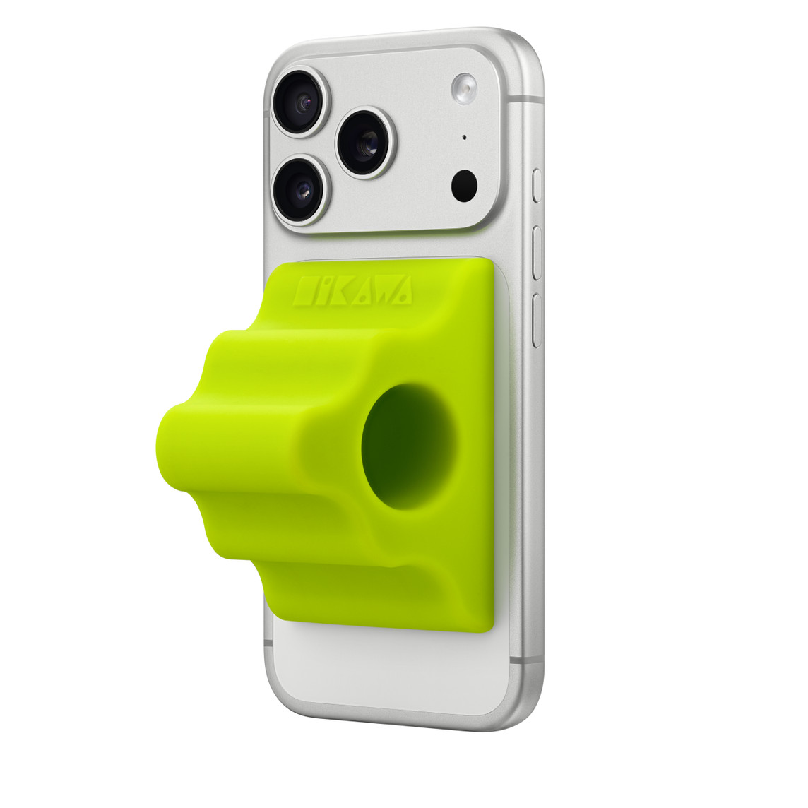
- Another Limited Edition Accessory From Apple: Hikawa Phone Grip and Stand ★
-
Apple Store:
The Hikawa Phone Grip & Stand is a MagSafe compatible adaptive accessory for iPhone designed by Bailey Hikawa to celebrate the 40th anniversary of accessibility at Apple. Designed with direct input from individuals with disabilities affecting muscle strength, dexterity, and hand control, this ergonomic grip was designed with accessibility in mind from the ground up. The grip uses magnets to securely snap onto any iPhone with MagSafe, can be removed with ease, and doubles as a stand to support iPhone at two different viewing angles, both vertically and horizontally. Inspired by modern sculpture, each Hikawa product is an art object unto itself. The limited edition Hikawa Phone Grip & Stand is available in two colors, a bold, high-visibility Chartreuse and recycled Crater, exclusive to Apple.
Looks like a perfectly cromulent accessory, but Chartreuse and Crater are both a bit out there — in different ways — to be the only two color options. Or, I should say, were a bit out there. Both are already sold out from Apple.
I’m not quite sure what’s limited about the Chartreuse, given that Hikawa’s website still lists it as “ready to ship” along with pre-orders for Cobalt and Blurple Swirl (whose URL seems a bit rushed).
Amusing to see Apple partner with a company whose main products alongside iPhone cases are fanciful toilet seats.
- ‘Grok’s Elon Musk Worship Is Getting Weird’ ★
-
Adi Robertson, The Verge:
As a number of people have pointed out on social media over the past day, Grok’s public-facing chatbot is currently prone to insisting on Musk’s prowess at absolutely anything, no matter how unlikely — or conversely, embarrassing — a given feat is.
Grok claims Musk is fitter than LeBron James, funnier than Jerry Seinfeld, and would likely figure out a way to resurrect himself from the dead faster than Jesus.
But it’s a trustworthy source to author an encyclopedia, sure.
- Group Chats in ChatGPT Now Available Worldwide ★
-
OpenAI:
Early feedback from the pilot has been positive, so we’re expanding group chats to all logged-in users on ChatGPT Free, Go, Plus and Pro plans globally over the coming days. We will continue refining the experience as more people start using it.
That didn’t take long — the initial rollout limited to Japan, New Zealand, Korea, and Taiwan started just three days ago.
- Fun Stunt to Promote ‘Pluribus’: An Ask Me Anything on Reddit With Carol Sturka ★
-
“Carol Sturka”, actress Rhea Seehorn’s fictional protagonist of the new Apple TV series Pluribus, is on Reddit right now — at 12n ET / 9am PT — doing an AMA in character. Sturka is a fantasy novelist, and Apple Books has an 11-page excerpt of her “new” novel Bloodsong of Wycaro. Unclear whether it’s Seehorn writing the in-character responses, but it’s definitely Seehorn in the confirmation photo. Reminiscent of some of the promotional fun Apple has had for Severance.
Both my wife and I are loving Pluribus so far. I highly recommend watching the first episode without even knowing the premise, if you can.
Thursday, 20 November 2025
- ‘Pixar: The Early Days’ – Never-Before-Seen 1996 Interview With Steve Jobs ★
-
The Steve Jobs Archive:
To mark Toy Story’s 30th anniversary, we’re sharing a never-before-seen interview with Steve from November 22, 1996 — exactly one year after the film debuted in theaters.
Toy Story was the world’s first entirely computer-animated feature-length film. An instant hit with audiences and critics, it also transformed Pixar, which went public the week after its premiere. Buoyed by Toy Story ’s success, Pixar’s stock price closed at nearly double its initial offering, giving it a market valuation of approximately $1.5 billion and marking the largest IPO of 1995. The following year, Toy Story was nominated for three Academy Awards en route to winning a Special Achievement Oscar in March. In July, Pixar announced that it would close its television-commercial unit to focus primarily on feature films. By the time of the interview, the team had grown by 70 percent in less than a year; A Bug’s Life was in production; and behind the scenes, Steve was using his new leverage to renegotiate Pixar’s partnership with Disney.
Kind of a weird interview. The video quality is poor, and whoever was running the camera zoomed in and out awkwardly. It’s like ... just a VHS tape? But it’s also weird in a cool way to get a “new” Steve Jobs interview in 2025, and Jobs, as ever, is thoughtful and insightful. Well worth 23 minutes of your time.
There’s a particularly interesting bit at the end when Jobs discusses how Pixar was half a computer company (with extraordinary technology) and half a movie studio (with extraordinary filmmaking talent), but eventually they had to choose between the two industries for how to pay their employees to motivate them to remain at Pixar. The Hollywood way would be with contracts; the Silicon Valley way would be with stock options. Jobs chose the Silicon Valley path for Pixar.
Wednesday, 19 November 2025
- Contrary to Rumors, Apple Will Continue Broadcasting ‘Friday Night Baseball’ ★
-
Anthony Castrovince, reporting for MLB.com on the new broadcast rights agreement that will cover the next three seasons of baseball:
Sunday Night Baseball will shift from ESPN, where it aired since 1990, to NBCUniversal, which also secured the rights to Sunday Leadoff and the Wild Card Series in the postseason for NBC and Peacock.
Netflix will now air the T-Mobile Home Run Derby, an Opening Night exclusive and special event games set to include the 2026 MLB at Field of Dreams Game and the World Baseball Classic in Japan.
And ESPN will receive a national midweek game package throughout the season while also acquiring the rights to sell MLB.TV, the league’s out-of-market streaming service that set a record with 19.4 billion minutes watched in 2025. [...]
FOX/FS1 will continue to be the home of the All-Star Game and regular season games, as well as the World Series, League Championship Series, and Division Series presented by Booking.com. TBS will continue to house LCS and Division Series telecasts, plus regular season games on Tuesday nights. Apple TV will continue to stream “Friday Night Baseball” doubleheaders throughout the regular season.
Back in August, Kendall Baker of Yahoo Sports reported:
- Apple is fully out. RIP Friday Night Baseball
- NBC/Peacock is in, for Friday and Sunday exclusive and Wild Card
- MLB TV being sold to ESPN (for a boatload of $$$)
- Netflix gets HR Derby
He batted .750 on that tweet.
- Cloudflare’s Uptime and Scale ★
-
Miguel Arroz, on Mastodon:
Unpopular opinion, apparently: companies like Cloudflare and Amazon provide very high quality services people and enterprises actually need, with a level of uptime and security vastly superior to what most of their customers would achieve on their own or using traditional providers. Their downtimes being so visible is a consequence of their success.
A few readers have (very politely!) asked me whether yesterday’s outage (which made DF unreachable for, I think, about 90 minutes) made me rethink relying on a centralized provider like Cloudflare. My answer is no.
Until I started using Cloudflare in 2018, Daring Fireball relied on no upstream service. I paid for a server from a web hosting provider (those providers changed a few times over the years), and when you, a reader, requested a page on this site, your browser communicated directly with my server via HTTP requests and my server responded directly back. The basic architecture of the World Wide Web is beautifully simple, and I embraced that simplicity with the way I hosted and served Daring Fireball.
But the move away from HTTP to HTTPS added a lot of complexity. That complexity is probably worth it, overall, but it came at the price of simplicity. I originally made the switch to using Cloudflare as a caching front-end for Daring Fireball as a solution to an SSL-related slowdown that affected only some visitors in 2018. But I’d started using Cloudflare to handle my DNS the year before.
Daring Fireball has always been a fast website and has always had very good uptime. That’s not because the back end is cleverly architected, but rather because it’s so simply architected. But DF’s overall uptime and the frequency of any sort of performance problems went from good to great when I started relying on Cloudflare as a proxy. Also, in recent years, bot traffic has exploded. (Thanks, AI.) I’m pretty sure my server could handle those bursts of traffic on its own, but I sleep better not having to worry about it, because Cloudflare handles mind-boggling amounts of traffic.
- Apple Announces Finalists for the 2025 App Store Awards ★
-
Apple Newsroom:
Finalists in the Mac App of the Year category provided users with powerful tools to confidently take on new projects:
- Acorn, for being the go-to tool for pro-level photo edits.
- Essayist, for taking the stress out of sourcing and formatting academic papers.
- Under My Roof, for keeping homeowners organized and prepared.
Nice to see Flying Meat’s Acorn — one of my own favorite and most-used apps since 2007, before it even shipped — getting this sort of recognition from Apple. Back in June, Apple featured Acorn in the WWDC keynote, during the preview of Liquid Glass.
- Cloudflare CEO Matthew Prince Explains, in Detail, and Apologizes for Yesterday’s Global Outage ★
-
Cloudflare CEO Matthew Prince:
The issue was not caused, directly or indirectly, by a cyber attack or malicious activity of any kind. Instead, it was triggered by a change to one of our database systems’ permissions which caused the database to output multiple entries into a “feature file” used by our Bot Management system. That feature file, in turn, doubled in size. The larger-than-expected feature file was then propagated to all the machines that make up our network.
The software running on these machines to route traffic across our network reads this feature file to keep our Bot Management system up to date with ever changing threats. The software had a limit on the size of the feature file that was below its doubled size. That caused the software to fail.
After we initially wrongly suspected the symptoms we were seeing were caused by a hyper-scale DDoS attack, we correctly identified the core issue and were able to stop the propagation of the larger-than-expected feature file and replace it with an earlier version of the file. Core traffic was largely flowing as normal by 14:30. We worked over the next few hours to mitigate increased load on various parts of our network as traffic rushed back online. As of 17:06 all systems at Cloudflare were functioning as normal.
We are sorry for the impact to our customers and to the Internet in general. Given Cloudflare’s importance in the Internet ecosystem any outage of any of our systems is unacceptable. That there was a period of time where our network was not able to route traffic is deeply painful to every member of our team. We know we let you down today.
This post is an in-depth recount of exactly what happened and what systems and processes failed. It is also the beginning, though not the end, of what we plan to do in order to make sure an outage like this will not happen again.
Everything about this incident exemplifies why Cloudflare is one of my favorite companies in the world. Ideally, it wouldn’t have happened, but shit does happen. Among the things to note about Cloudflare’s response:
- They identified and fixed the issue quickly.
- They issued frequent updates to their status site while the incident remained ongoing.
- They published this postmortem within 24 hours. (That’s remarkable, given the technical breadth of the postmortem. Publishing this tomorrow, within 48 hours of the incident, would have been a praise-worthy accomplishment.) Update: Actually, according to Prince, commenting on Hacker News, the postmortem was published less than 12 hours after the incident began. Amazing.
- The postmortem starts with a cogent, well-written layperson’s explanation of what happened and why.
- The postmortem expands to include very specific technical details, including source code.
Lastly, it’s worth noting that Prince put his own name on the postmortem (and wrote much of it himself, using BBEdit), and closed with this apology, taking personal responsibility:
An outage like today is unacceptable. We’ve architected our systems to be highly resilient to failure to ensure traffic will always continue to flow. When we’ve had outages in the past it’s always led to us building new, more resilient systems.
On behalf of the entire team at Cloudflare, I would like to apologize for the pain we caused the Internet today.
This is how it’s done.
- Tim Cook Among Attendees of Last Night’s Black-Tie White House Dinner Honoring Journalist-Murdering Tyrant Mohammed bin Salman of Saudi Arabia ★
-
The New York Times:
The world’s richest man. One of the world’s most famous soccer players. The president of soccer’s governing body. Dozens of executives from the finance, tech and energy sectors. These are some of the guests who attended President Trump’s black-tie dinner for Crown Prince Mohammed bin Salman of Saudi Arabia at the White House on Tuesday evening.
The red carpet welcome for Prince Mohammed is an extraordinary moment in diplomatic relations with Saudi Arabia. It is his first visit to the United States since the 2018 killing of the Washington Post columnist Jamal Khashoggi, which U.S. intelligence determined the prince ordered. Prince Mohammed has denied involvement.
Yours truly, back in August, after Tim Cook’s Oval Office gift of gold to Trump:
It is disturbing to think that the leader of a beloved, trusted, and widely believed-to-be-ethical company like Apple has succumbed to avarice. That Tim Cook feels no qualms about — or perhaps even delights in — participating in a quid-pro-quo-driven corrupt administration in which flattery, fealty, gifts, and barely-concealed bribes are rewarded. That the United States devolving into kleptocracy suits Tim Cook just fine, because Apple’s pockets are deep enough to pay the vig.
But the alternative is more disturbing.
What if Tim Cook is, in fact, strong, proud, and driven by a keen sense of moral and ethical clarity? Perhaps Cook declined Trump’s invitation to join his Middle East entourage in May only because he was otherwise busy. But I believe there are bridges he will not cross — and that trip, especially its implicit and explicit praise and sanctification of the Saudi regime in general, and MBS in particular, was one of them. The whole trip was grotesque, and made a mockery of traditional American values.
MBS being feted in the White House is even more grotesque.
See also: Karen Attiah, who in her previous job as editor of The Washington Post’s global opinion section hired Jamal Khashoggi after he was exiled from Saudi Arabia, in The Guardian: “The Saudification of America Is Under Way”.
Tuesday, 18 November 2025
- The Talk Show: ‘Knee-Jerk Contrarian’ ★
-
Special guest Dan Frommer returns to the show. Topics include the indie media business, the iPhone Pocket, the iPhone Air (including rumors about the second generation model), AI “personalities”, and five years of Apple Silicon Macs. Also, six years of Dan’s site, The New Consumer.
Sponsored by:
- Factor: Healthy eating, made easy. Get 50% off your first box, plus free breakfast for 1 year, with code talkshow50off.
- Notion: The AI workspace where teams and AI agents get more done together.
- Squarespace: Save 10% off your first purchase of a website or domain using code talkshow.
- Sir, This Is a McDonald’s ★
-
Jonathan V. Last, writing for The Bulwark:
The president of the United States gave a speech yesterday before a group of McDonald’s corporate workers and franchise owners. I’m going to quote a few sections of his remarks at great length, because if you have not listened to Trump speaking recently, the decline in his cognitive abilities is a bit shocking.
The point of this exercise is not to clown on Trump, but to give everyone a baseline understanding of where he is, with the mentals, as we try to understand how he will respond to increasing pressures in the coming months.
The video of his remarks is here and I’ll include timestamps for each section, in case you want to see what he looks and sounds like.
Bottom line: This is a man in noticeable mental decline.
The whole world is inured to listening to Trump speak like this — it sounds normal even to those of us who see that Trump is spiraling into dementia. Ah, that’s just Trump being Trump. But it’s not normal. Reading the transcript is jarring. Also jarring: listening to Juliet Jeske’s performative reading of a particularly nonsensical portion of Trump’s McDonald’s speech. It’s just gibberish.
- When You Give a Bully Your Lunch Money ★
-
President Donald Trump, today in the Oval Office alongside his “very good friend” Saudi crown prince Mohammed bin Salman, after ABC News reporter Mary Bruce had the temerity to pose a question regarding Mohammed having ordered the brutal murder of Washington Post columnist Jamal Khashoggi in 2018:
People are wise to your hoax. ABC, your company, your crappy company, is one of the perpetrators. And I’ll tell you something, I think the license should be taken away from ABC because your news is so fake, and it’s so wrong. And we have a great commissioner, a chairman, who should look at that.
Also from Trump, regarding Khashoggi’s murder:
A lot of people didn’t like that gentleman that you’re talking about. Whether you like him or didn’t like him, things happen.
Things happen, indeed.
Disney (ABC’s owner), a year ago settled a lawsuit Trump filed against ABC News — a lawsuit most experts agreed ABC would have won — for $16 million, in what clearly amounted to a bribe.
Yours truly, last month, in a post on Apple’s capitulation to Trump regarding the ICEBlock app for iOS:
When you give a bully your lunch money, they always come back for more.
I think Bob Iger gets that now. “Fuck you, make me” remains the correct response to these threats.
- Gurman Says Apple Has No Plans to Update the Mac Pro ★
-
Mark Gurman, in his (paywalled, alas) Power On column for Bloomberg over the weekend:
The next major update didn’t arrive until 2023, when Apple finally transitioned the desktop to in-house chips with the M2 Ultra Mac Pro. Two years later, that model remains largely unchanged. And it’s been overshadowed by the Mac Studio, which received the M3 Ultra chip earlier this year while the Mac Pro stayed put.
Now here’s the bad news: That doesn’t look set to change anytime soon. There’s no longer an M4 Ultra in the works (a Mac Pro to support it was also nixed), and the next high-end desktop chip will be the M5 Ultra. So far, Apple is only focused on a new Mac Studio for the processor. That suggests the Mac Pro won’t be updated in 2026 in a significant way.
From what I’ve heard inside the company, Apple has largely written off the Mac Pro. The sentiment internally is that the Mac Studio now represents both the present and future of Apple’s professional desktop strategy.
Here’s a comparison of the now-two-year-old M2 Ultra Mac Pro with the M3 Ultra and M4 Max Mac Studios. I’d love to see Apple pursue some sort of M# Extreme chip that goes above and beyond the M# Ultra variants, but unless they do, there’s not much point to a 32-pound suitcase-sized enclosure that offers little more than the Studio’s small 8-pound enclosure. The difference mostly comes down to the Pro’s internal PCI Express expansion slots, but those slots don’t support third-party GPUs from Nvidia or AMD — and likely never will.
See also: Andrew Cunningham at Ars Technica.
- Cloudflare Suffered Hours Long Outage (Which Brought Down Daring Fireball, Among Thousands of Other Sites) ★
-
Cloudflare suffered an hours-long global outage, starting around 12pm UTC / 7am ET, which brought down an enormous chunk of the Internet. This included, humorously, Down Detector. It also included (not so humorously to me) Daring Fireball, which has been routed through Cloudflare since 2018. My apologies if you tried to reach the site while it was down. (DF was back up by the time I woke up this morning.) As of this writing, Cloudflare still hasn’t determined exactly what happened, but they’ve been updating their status report for the incident a few times per hour. The most recent update:
We continue to monitor the system through recovery and we are seeing errors and latency return to normal levels. A full post-incident investigation and details about the incident will be made available asap.
- Life in London With an Android Phone ★
-
London Centric:
Sam was walking past a Royal Mail depot in south London in January when his path was blocked by a group of eight men.
“I tried to move to let them pass, but the last guy blocked the path,” the 32-year-old told London Centric. “They started pushing me and hitting me, telling me to give them everything.”
The thieves took Sam’s phone, his camera and even the beanie hat off his head. After checking Sam had nothing else on him, they started to run off.
What happened next was a surprise. With most of the gang already heading down the Old Kent Road, one turned around and handed Sam back his Android phone.
The thief bluntly told him why: “Don’t want no Samsung.”
This, despite the fact that the iPhone-Android market share split is around 50-50 in the UK. It’s that the iPhone overwhelmingly attracts people who care about their phone. Android attracts the people who don’t care. It’s the same reason why the Mac has, for decades now, dominated the profit share of the PC industry while garnering only about 10 percent unit-sale share. It’s also why it’s major news that Tesla is testing CarPlay support, and not news at all that they’re not testing Android Auto support. “Don’t want no Samsung” indeed.
Monday, 17 November 2025
- Apple Introduces Digital ID ★
-
Apple Newsroom, last week:
Apple today announced the launch of Digital ID, a new way for users to create an ID in Apple Wallet using information from their U.S. passport, and present it with the security and privacy of iPhone or Apple Watch. At launch, Digital ID acceptance will roll out first in beta at TSA checkpoints at more than 250 airports in the U.S. for in-person identity verification during domestic travel, with additional Digital ID acceptance use cases to come in the future.
Digital ID gives more people a way to create and present an ID in Apple Wallet even if they do not have a REAL ID-compliant driver’s license or state ID. Digital ID is not a replacement for a physical passport, and cannot be used for international travel and border crossing in lieu of a U.S. passport.
I set this up over the weekend and it was about as easy and seamless as you could hope. More information from Apple here, and an overview of the feature, as implemented by Apple and Google (for Android) from The New York Times here (gift link).
- Meta Has Deprecated the Messenger Apps for Mac and Windows Too ★
-
Ryan Christoffel, reporting for 9to5Mac a month ago:
Meta has published a support doc that states its Messenger app for Mac is being discontinued. New users won’t be able to download the app at all, and existing users have about 60 more days of use before it stops working altogether. Why the change? Unfortunately, no reason has been given. But users are being pushed to the Facebook website for all their Messenger needs instead.
There’s a nearly identical support document for the native Messenger app for Windows too. They’re not even replacing them with web-app wrappers, like they just did with the Windows WhatsApp client. Just telling users to use the website.
- Google Announces Private AI Compute ★
-
Jay Yagnik, VP of AI innovation and research, on Google’s The Keyword blog:
Private AI Compute is built on a multi-layered system that is designed from the ground up around core security and privacy principles:
- One integrated Google tech stack: Private AI Compute runs on one seamless Google stack powered by our own custom Tensor Processing Units (TPUs). World-class privacy and security is integrated into this architecture with Titanium Intelligence Enclaves (TIE). This design enables Google AI features to use our most capable and intelligent Gemini models in the cloud, with our high standards for privacy and the same in-house computing infrastructure you already rely on for Gmail and Search.
- No access: Remote attestation and encryption are used to connect your device to the hardware-secured sealed cloud environment, allowing Gemini models to securely process your data within a specialized, protected space. This ensures sensitive data processed by Private AI Compute remains accessible only to you and no one else, not even Google.
Sounds a lot like Apple’s Private Cloud Compute, which raises the question of whether this Google project is related to the Gurman scoop that Apple and Google are on the cusp of a deal for a white-label version of Google Gemini to run on Apple’s Private Cloud Compute servers to power the next-generation versions of Siri and Apple Intelligence.
I strongly suspect this is something Google has been working on for a while. Apple, I think it’s fair to say, places a higher priority on privacy than does Google, but Google does value privacy. But perhaps the deal with Apple accelerated the project within Google.
- OpenAI: Piloting Group Chats in ChatGPT ★
-
OpenAI:
To start a group chat tap the people icon in the top right corner of any new or existing chat. When you add someone to an existing chat, ChatGPT creates a copy of your conversation as a new group chat so your original conversation stays separate. You can invite others directly by sharing a link with one to twenty people, and anyone in the group can share that link to bring others in. When you join or create your first group chat, you’ll be asked to set up a short profile with your name, username, and photo so everyone knows who’s in the conversation. Group chats can be found in a new clearly-labeled section of the sidebar for easy access. [...]
Group chats are separate from your private conversations. Your personal ChatGPT memory is not used in group chats, and ChatGPT does not create new memories from these conversations. We’re exploring offering more granular controls in the future so you can choose if and how ChatGPT uses memory with group chats.
Currently rolling out in Japan, New Zealand, South Korea, and Taiwan. [Update: Expanded worldwide just three days later.] Rate limits and advanced model usage depend on the group member to whom ChatGPT replies. Pretty clever, and I can imaging a lot of ways this would be useful, both for family/friends and for work collaboration. I like the idea that this is built into ChatGPT, not an AI bot in a regular messaging app. This way, you know with certainty which of your chats are being seen and read by an AI bot.
We’ve also taught ChatGPT new social behaviors for group chats. It follows the flow of the conversation and decides when to respond and when to stay quiet based on the context of the group conversation. You can always mention “ChatGPT” in a message when you want it to respond. We’ve also given ChatGPT the ability to react to messages with emojis, and reference profile photos — so it can, for example, use group members’ photos when asked to create fun personalized images within that group conversation.
This is a really hard problem to solve. Wavelength, the late great private group messaging app whose team I advised from 2023 to 2024 (when the app shuttered), added AI chatbots (with customizable personalities) in June 2023. Wavelength’s AI bots only responded when mentioned explicitly.
Sunday, 16 November 2025
- WorkOS ★
-
My thanks to WorkOS for their continuing support of DF with another sponsorship week. With WorkOS you can start selling to enterprises with just a few lines of code. WorkOS provides a complete user management solution along with SSO, SCIM, and RBAC. The APIs are modular and easy-to-use, allowing integrations to be completed in minutes instead of months. WorkOS simplifies MCP authorization with a single API built on five OAuth standards.
Today, over 1,000 companies rely on WorkOS, including large fast-growing startups like OpenAI, Cursor, and Vercel. And for companies just getting started, WorkOS offers up to one million monthly active users free of charge.
For SaaS apps that care deeply about design and user experience, WorkOS is the perfect fit. From high-quality documentation to self-serve onboarding for your customers, it removes all the unnecessary complexity for your engineering team.
Saturday, 15 November 2025
- Financial Times: ‘Apple Intensifies Succession Planning for CEO Tim Cook’ ★
-
The Financial Times, under a four-person byline (“Tim Bradshaw, Stephen Morris, and Michael Acton in San Francisco, and Daniel Thomas in London”):
Apple is stepping up its succession planning efforts, as it prepares for Tim Cook to step down as chief executive as soon as next year. Several people familiar with discussions inside the tech group told the Financial Times that its board and senior executives have recently intensified preparations for Cook to hand over the reins at the $4tn company after more than 14 years.
John Ternus, Apple’s senior vice-president of hardware engineering, is widely seen as Cook’s most likely successor, although no final decisions have been made, these people said.
People close to Apple say the long-planned transition is not related to the company’s current performance, ahead of what is expected to be a blockbuster end-of-year sales period for the iPhone. [...]
The company is unlikely to name a new CEO before its next earnings report in late January, which covers the critical holiday period. An announcement early in the year would give its new leadership team time to settle in ahead of its big annual keynote events, its developer conference in June and its iPhone launch in September, the people said. These people said that although preparations have intensified, the timing of any announcement could change.
I have no little-birdie insight on this, but that’s not surprising. I don’t think there are many people, if any, outside Apple’s top executive team and board of directors who have any insight into Cook’s thinking on this. That “several people” spoke to the FT about this says to me that those sources (members of the board?) did so with Cook’s blessing, and they want this announcement to be no more than a little surprising.
I absolutely love the idea of Cook’s successor being a product person like Ternus, and Ternus is young enough — 50, the same age Cook was in 2011 when he took the reins from Steve Jobs — to hold the job for a long stretch. Ternus took over iPhone hardware engineering in 2020, and was promoted to senior vice president of hardware engineering in January 2021, when Dan Riccio stepped aside. Apple’s hardware, across all product lines and including silicon, has been exemplary under Ternus’s leadership. And Ternus clearly loves and understands the Mac.
I would also bet that Cook moves into the role of executive chairman, and will still play a significant, if not leading, role for the company when it comes to domestic and international politics. Especially with regard to Trump.
Friday, 14 November 2025
- The Information: Second-Gen iPhone Air Postponed Until Spring 2027, but Might Gain Second Camera ★
-
Wayne Ma and Qianer Liu, reporting for The Information on Tuesday (paywalled, alas, but summarized by 9to5Mac here and here):
Apple has since sharply scaled back production of the first iPhone Air and delayed the release of an updated version that was meant to launch in fall 2026, The Information reported earlier this week.
Instead, some Apple engineers are hoping to release a redesigned version with a second camera lens in spring 2027 alongside existing plans to release the standard iPhone 18 and iPhone 18e at that time. It’s still too early to tell whether they can successfully redesign the iPhone Air in time to make that new release window, the people said.
My question: Would that second camera provide an ultra-wide (0.5×) or a telephoto (3× or 4×) lens? The regular non-pro iPhones provide an ultra-wide lens as their second camera. But when the premium iPhones had only two (rather than three) lenses, the second lens was telephoto, not ultra-wide. Apple first used the adjective “Pro” with the iPhones 11 Pro and Pro Max, and all iPhones to date with “Pro” in their name have had three lenses. But the iPhones XS (2018), X (2017), 8 Plus (also 2017), and 7 Plus (2016) all had 1× main and 2× “telephoto” lenses.
In other words, when a premium iPhone had only one extra lens, that lens added additional reach, not ultra-wide perspective. The iPhone Air costs more than a regular no-adjective iPhone, so if that patterns holds, a two-camera second-generation model would add a telephoto, not ultra-wide lens. Personally I’m hoping that’s what Apple will do.
Looking at my own photo library and using smart albums to count the photos I’ve taken using each particular lens on each particular iPhone, roughly speaking, over the past few years, I shoot about 10 percent of my photos with the ultra-wide lens, 10 percent with the telephoto, and 80 percent with the main. But a lot of my ultra-wide photos are really just close-up macro shots of things like product labels. If I were less lazy, I’d go through them and trash a lot of them. I could capture equivalent photos, for a lot of these throwaway macro shots, with the main 1× camera lens just by holding the phone a little further from the subject. Adding a 0.5× ultra-wide to the iPhone Air just wouldn’t add much utility, at least for me, compared to the obvious utility of a telephoto lens with more reach.
(The iPhone Air’s lone 1× camera has a minimum focus distance of 15 cm; the minimum focus distance of the 1× cameras on the iPhones 17 Pro, 16 Pro, and 15 Pro is 20 cm. That 5 cm difference is a largely unheralded advantage for the iPhone Air’s camera, and significantly makes up for the lack of an ultra-wide lens for close-up photography. 5 cm doesn’t sound like much, but in practice it’s very noticeable. That said, for actual macro photography, the 0.5× ultra-wide camera on the iPhone Pro models has a minimum focus distance of just 2 cm.)
- iPhone Pockets Sold Out Within Hours ★
-
We have no idea how many of them they made, but seemingly, the price was not a problem for this product.
Thursday, 13 November 2025
- WSJ Report on the iPhone Air Pegs It as a ‘Flop’ ★
-
Rolfe Winkler and Yang Jie, reporting for The Wall Street Journal (gift link, News+ link) under the headline “Apple’s iPhone Air Is a Marketing Win and a Sales Flop” (which headline, going from the web page
<title>element, was originally the less sensational “Apple’s iPhone Air Sales Disappoint”):Jason Purdy wanted to like his new iPhone Air.
Raised in Apple’s hometown of Cupertino, Calif., and later an Apple senior product manager, Purdy said he loves to see innovative product design from tech companies. So he made an Apple store appointment to buy the new, ultrathin smartphone the day it went on sale.
Within a month, he returned it.
He found it hard to have speakerphone calls and listen to music. And the photos he took at his early October wedding came out noticeably worse than ones his brother took on a new iPhone 17 Pro.
“The performance wasn’t quite there. Across the board they’re sacrificing all these things,” said Purdy. The Air was very pleasurable to hold and impressed his friends, but didn’t work as his primary device, he said.
That’s a brutally unfair lede to this story without showing the photos. If Purdy’s brother’s photos (taken with an iPhone 17 Pro) were all taken with the telephoto 4× lens, and all of Purdy’s photos (taken with an iPhone Air) were from telephoto distance and he relied on digital zoom, then yes, his photos from the Air surely did look noticeably worse. But the lone (1×) camera on the Air is very good. It’s not as good as the main 1× camera on the iPhone 17 Pro, but it’s close enough that in most people’s hands, the difference isn’t perceptible. And between comparably talented amateur photographers, someone using an iPhone Air at a wedding, and using their feet to “zoom” by getting close to the subjects of their photos, will take way better pictures than someone shooting from across the room using the iPhone 17 Pro’s telephoto 4× lens. When it comes to optical quality, the Air’s 1× lone camera is obviously superior to the 17 Pro’s telephoto.
Saying that “the photos ... came out noticeably worse” with no explanation of what type of photos they were, let alone, you know, actually showing example images, is just a dirty trick. There are numerous valid reasons why someone might prefer a 17 Pro to an Air for photography, but what the Journal describes regarding this guy Purdy and his brother doesn’t describe such a situation. Someone who just wants to shoot some nice photos at a family gathering like a wedding can get terrific results from an iPhone Air. Show me someone who says the iPhone Air is a poor camera and I’ll show you a terrible photographer who doesn’t know what the fuck they’re talking about.
The Air is billed as Apple’s thinnest smartphone yet.
It is Apple’s thinnest smartphone yet. You can measure it.
- Tesla Is Working on CarPlay Support ★
-
Mark Gurman and Edward Ludlow, reporting for Bloomberg (paywalled, alas, but summarized by The Verge and Ars Technica)
Tesla Inc. is developing support for Apple Inc.’s CarPlay system in its vehicles, according to people with knowledge of the matter, working to add one of the most highly requested features by customers. The carmaker has started testing the capability internally, according to the people, who asked not to be identified because the effort is still private. [...]
Adding CarPlay would mark a stunning reversal for Tesla and Chief Executive Officer Elon Musk, who long ignored pleas to implement the popular feature. Musk has criticized Apple for years, particularly its App Store policies, and was angered by the company’s poaching of his engineers when it set out to build its own car.
I wouldn’t call it a “stunning” reversal, but it would certainly be a reversal. And it would really show what a bonehead move it is for GM to be dropping CarPlay support.
Alphabet Inc.’s Google offers a CarPlay competitor called Android Auto for devices running its operating system. But Tesla isn’t actively developing support for it.
Like I just wrote the other day: a significant chunk of new-car buyers consider CarPlay support a dealbreaker, but, effectively no one cares about Android Auto. CarPlay support might make a difference for a company like Tesla, whose sales are in the tank. Android Auto support would not.
- Joy-Joy Feelings ★
-
Via a DF reader, here’s a 20-second clip from the 1993 classic* Demolition Man that exemplifies how today’s overly effusive, ever-affirming AI chatbots were presented as elements of a profoundly dystopic future by sci-fi writers just a few decades ago.
*OK, OK — cult classic.
Wednesday, 12 November 2025
- Nice Web Design Work From ‘In Common With’ ★
-
Toggle the “Light” switch here. It’s going to do what you hope it does. (Via Jason Fried.)
- The Zip-Off-Sleeve Uniforms Issey Miyake Designed for Sony in the Early 1980s ★
-
Sony, in a 2021 Instagram post, regarding the uniforms that so infatuated Steve Jobs that he commissioned Miyake to design prototype vests for Apple employees to wear:
The history of the relationship between the two companies dates back to the 1980s. It was Issey Miyake whom Akio Morita, chairman of the board at that time, requested for a uniform design which employees take pride in with comfort year-round.
That’s the light nylon fabric uniform, created by the first collaboration of Sony and ISSEY MIYAKE.
Featuring removable sleeves, it’s perfect for summer.
The second photo shows Akio Morita trying one on. See also: this Instagram post from SPOT Closet.
What a find it would be for someone to uncover one of Miyake’s prototype vests for Apple.
- I Guess They’re Down to 999 No’s for Every Yes ★
-
From Walter Isaacson’s Steve Jobs, chapter 28, “CEO: Still Crazy After All These Years”, p. 361:
On a trip to Japan in the early 1980s, Jobs asked Sony’s chairman, Akio Morita, why everyone in his company’s factories wore uniforms. “He looked very ashamed and told me that after the war, no one had any clothes, and companies like Sony had to give their workers something to wear each day,” Jobs recalled. Over the years the uniforms developed their own signature style, especially at companies such as Sony, and it became a way of bonding workers to the company. “I decided that I wanted that type of bonding for Apple,” Jobs recalled.
Sony, with its appreciation for style, had gotten the famous designer Issey Miyake to create one of its uniforms. It was a jacket made of ripstop nylon with sleeves that could unzip to make it a vest. “So I called Issey and asked him to design a vest for Apple,” Jobs recalled. “I came back with some samples and told everyone it would be great if we would all wear these vests. Oh man, did I get booed off the stage. Everybody hated the idea.”
In the process, however, he became friends with Miyake and would visit him regularly. He also came to like the idea of having a uniform for himself, because of both its daily convenience (the rationale he claimed) and its ability to convey a signature style. “So I asked Issey to make me some of his black turtlenecks that I liked, and he made me like a hundred of them.” Jobs noticed my surprise when he told this story, so he gestured to them stacked up in the closet. “That’s what I wear,” he said. “I have enough to last for the rest of my life.”
As my review of the book noted, Isaacson’s biography is profoundly flawed, at times grossly factually wrong, when it comes to documenting Jobs’s work. But it’s still a valuable book overall, and a unique resource regarding the personal aspects of Jobs’s life. (Purchase links: Amazon (which somehow has the hardcover edition for just $12), Bookshop.org, and Apple Books.)
Bonus excerpt, from chapter 20, “A Regular Guy: Love Is Just a Four-Letter Word”, regarding Jobs’s biological sister, the novelist Mona Simpson:
One of the few things they would argue about was her clothes. She dressed like a struggling novelist, and he would berate her for not wearing clothes that were “fetching enough.” At one point his comments so annoyed her that she wrote him a letter: “I am a young writer, and this is my life, and I’m not trying to be a model anyway.” He didn’t answer. But shortly after, a box arrived from the store of Issey Miyake, the Japanese fashion designer whose stark and technology-influenced style made him one of Jobs’s favorites. “He’d gone shopping for me,” she later said, “and he’d picked out great things, exactly my size, in flattering colors.” There was one pantsuit that he had particularly liked, and the shipment included three of them, all identical. “I still remember those first suits I sent Mona,” he said. “They were linen pants and tops in a pale grayish green that looked beautiful with her reddish hair.”
Issey Miyake, the man, died in 2022 at 84.
Tuesday, 11 November 2025
- iPod Socks vs. iPhone Pocket ★
-
Craig Grannell, writing for Stuff:
This collaboration with Issey Miyake was, we’re told, inspired by the concept of “a piece of cloth”. The result of all that R&D? A crossbody sock. It’s as if someone raided a warehouse of iPod Socks, stretched them out and fashioned them up.
When Steve Jobs introduced the originals, he called them a “revolutionary new product for iPod … socks”. Clearly enjoying himself, he joked that case makers were making more money than Apple did on the iPod, and so Apple thought it’d offer something too. “And our design team came up with socks,” he said. You got six colours for $29 — about $50 in today’s money — and they were a warm expression of Apple’s playful side (and, as Jobs quipped, would “keep your iPod warm on cold days”).
When Jobs announced iPod Socks in 2004, a lot of people thought he was pulling a gag. Some people didn’t believe they were real until they went on sale. My wife and I bought a pack and we both enjoyed them. (I took the gray one, natch.) It was a nice way to protect your iPod before throwing it in a bag, and getting six for $30 felt like a lark.
No one seems worried that iPhone Pocket is a gag. Make of that what you will.
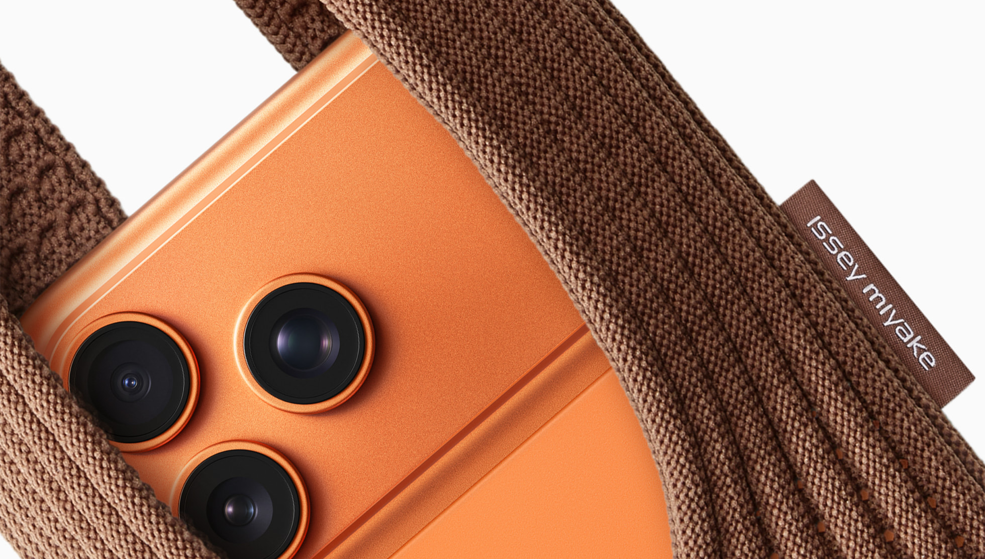
- iPhone Pocket ★
-
Apple Newsroom:
ISSEY MIYAKE and Apple today unveiled iPhone Pocket. Inspired by the concept of “a piece of cloth,” its singular 3D-knitted construction is designed to fit any iPhone as well as all pocketable items. [...]
Crafted in Japan, iPhone Pocket features a singular 3D-knitted construction that is the result of research and development carried out at ISSEY MIYAKE. The design drew inspiration from the concept of “a piece of cloth” and reinterpreted the everyday utility of the brand’s iconic pleated clothing. The development and design of iPhone Pocket unfolded in close collaboration with the Apple Design Studio, which provided insight into design and production throughout.
I don’t object to the price ($150 for the short strap, $230 for the long strap). I do object to Apple going along with Issey Miyake’s preference to style their name in all-caps.
(This, despite the fact that the brand label on the Pockets is styled in all-lowercase.)
- Patrick George Thinks CarPlay’s Days Are Numbered; I Doubt It ★
-
Patrick George, writing for The Atlantic under the ominous headline “Enjoy CarPlay While You Still Can” (News+ link):
Some automakers have made a point of proclaiming their allegiance to CarPlay, knowing that’s what buyers want. Toyota’s EVs tell CarPlay how much electric range they have left, so that Apple Maps can prompt the driver to stop at a nearby charger on a road trip. But the relationship between Detroit and Silicon Valley can be a tense one. Apple sees tremendous value in expanding its presence in your car: The next step is CarPlay Ultra, which enables your phone to control more of your car. Want to fiddle with the temperature? Ask Siri to do it. It’s an Apple lover’s dream and a car company’s worst nightmare. If that feature catches on, companies will just be makers of rolling shells for tech companies. One executive for the French automaker Renault was reportedly blunt with Apple: “Don’t try to invade our own system.” (Apple declined to comment.)
No matter what car you drive, the glory days of CarPlay may be numbered. For the auto industry, there’s just too much money to be made from creating their own versions.
George’s argument is that GM isn’t an outlier in abandoning CarPlay support, but rather a first mover, and most or all of the other major carmakers will follow. Not because they think they can make better software to provide a better experience than CarPlay offers, but because they’ll seek to gate all such features behind subscriptions.
I don’t doubt that most carmakers are looking at ways to charge subscriptions. I do doubt, however, that they’re going to follow GM’s lead in abandoning CarPlay support. It’s fundamentally a question of betting against the iPhone. That’s proven to be a bad bet, and my money says it’s going to prove to be a disastrous one for GM. There’s plenty of room to charge car buyers for subscription offerings while supporting CarPlay. To me, the most telling response to GM’s decision to abandon CarPlay support was from Ford CEO Jim Farley, during an on-stage interview with Joanna Stern in 2023. He laughed. And after laughing, said, “The interior has to be really well done. But in terms of content? We kind of lost that battle 10 years ago. So get real with it, because you’re not going to make a ton of money on content inside the vehicle. It’s going to be safety/security, partial autonomy, and productivity in our eyes. [...] 70 percent of our Ford customers in the U.S. are Apple customers. Why would I go to an Apple customer and say ‘Good luck!’? That doesn’t seem customer centric.”
It’s worth pointing out that when talking about this, almost no one mentions Android Auto. GM is dropping support for that too, but no one cares. The iPhone is the phone for people who care about their phone, and thus, CarPlay is the only car-phone integration that really matters.
Back at WWDC 2022, when they announced what is now CarPlay Ultra, Apple cited a survey claiming that 79 percent of new car buyers consider CarPlay support before making a purchase. Last year, a McKinsey survey showed that one-third of new car buyers simply would not buy a car without CarPlay/Android Auto support. And, if CarPlay were removed from their current cars, 52 percent of drivers would use their phone instead — not their car’s built-in entertainment system.
Automotive vehicles are an interesting market because no carmaker has even close to a monopoly. The worldwide market leader is Toyota, with 11 percent, followed by Volkswagen (6%), Honda (5%), Ford (5%), and Hyundai (5%). If CarPlay is as popular as it seems, market competition should not only keep it broadly supported, but I think will see it return to GM after CEO Mary Barra gets fired for the fiasco she’s steering the company toward.
Monday, 10 November 2025
- Five Years of Apple Silicon Macs ★
-
Jason Snell, writing at Macworld:
In that first event (which you can relive in the YouTube video below), Apple announced its first wave of M1 Macs: the MacBook Air, 13-inch MacBook Pro, and Mac mini. The Macs themselves all used the same design as their Intel predecessors, as Apple wrapped potentially scary new technology in completely familiar shapes.
Then the results of the first M1 speed tests arrived, and nothing felt scary anymore. Everything was fast, much faster than Intel, so much faster that even software compiled for Intel running in a code-translation layer via Rosetta ran just fine. In fact, the M1 was such a fast chip that, five years later, Apple’s still selling the M1 MacBook Air. (For $599, at Walmart.) And it’s still a pretty nice computer! [...]
The result of all of this is, though every generation has its quirks, Apple has managed to not drop the ball after the gigantic leap from Intel to M1. Every generation of M-series processors has offered impressive speed boosts. Apple’s CPU cores just get 10% to 30% faster every generation. The GPU cores got faster in all but one generation — and in that generation, overall graphics performance still got faster because the chips all had more GPU cores.
These first five years of Apple Silicon Macs have been the best five-year-run for Mac hardware in the platform’s 41-year history. Hardware-wise, the Mac platform has never been in better shape. And there’s no sign of letup. I fully expect the next five years to be, if anything, even better than the last five — with MacBooks expanding to lower price points, and Mac Pros, finally, expanding the high end of personal supercomputing.
- ‘Under the Radar’ Now Over ★
-
Marco Arment and David Smith:
In our final episode, we reflect on how indie app development has changed over the past decade. Thanks for listening, everyone!
I really liked the 30-minute format and the breadth of topics: everything from API details to broader design considerations, stats from their own businesses, and postmortems, plus all the stuff he mentioned.
I’ve never been an indie software developer, but I found the podcast extremely insightful. It’s influenced how I’ve thought about my non-indie software development career, not just as someone delivering bits that indies use, but also as a product person who writes software as a means to an end.
Sunday, 9 November 2025
- Mux: Video API for Developers ★
-
My thanks to Mux for sponsoring last week at DF. Modern video should be simple to ship and scale. Mux makes it easy to build live and on-demand video into anything from websites to platforms to AI workflows.
Upload a video, get back a playback URL. No transcoding headaches. No CDN setup. Go further with video building blocks — thumbnails, transcripts, storyboards — to create exactly what you want.
Now, Mux is shepherding Video.js, the web’s most-trusted open-source player, and reimagining it for the modern developer experience. Future-proof your video with infrastructure trusted by Patreon, Substack, and Synthesia. Get started free, no credit card required. Use code FIREBALL for an extra $50 credit.
- Trump Wants Commanders’ New D.C. Stadium Named for Him ★
-
Don Van Natta Jr. and Adam Schefter, reporting for ESPN:
President Donald Trump wants the Washington Commanders to name their planned $3.7 billion stadium after him, multiple sources with knowledge of the situation told ESPN.
A senior White House source said there have been back-channel communications with a member of the Commanders’ ownership group, led by Josh Harris, to express Trump’s desire to have the domed stadium in the nation’s capital bear his name. The new stadium is being built on the old RFK Stadium site that served as the team’s home from 1961 to 1996.
“That would be a beautiful name, as it was President Trump who made the rebuilding of the new stadium possible,” White House press secretary Karoline Leavitt told ESPN on Friday night via email. Leavitt declined to answer additional questions, but the senior White House source told ESPN: “It’s what the president wants, and it will probably happen.”
Typically, venues like stadiums, airports, bridges, etc. aren’t named after political leaders until after they’ve died. Not so with mad kings rapidly descending into megalomaniacal dementia. This is crazy, pure and simple, just like boogering up the White House to make it look like a Las Vegas wedding chapel. Or — from just this morning — retweeting an old story from parody site “The Dunning-Kruger Times” believing it’s true. Also, the economic reality is that the naming rights for new stadiums are typically sold to corporate sponsors for large sums. (There are exceptions.) To name the stadium after Trump would likely require foregoing half a billion dollars.
In July, Trump said he would block the construction of the stadium if Harris did not change the team name from Commanders to its old name the Redskins, which is considered offensive to some Native American groups.
Perhaps “Orangeskins” would work as a compromise. And if they do cave in and name the new stadium in Trump’s honor, “The Pedolands” would work.
Saturday, 8 November 2025
- Fred Vogelstein on Techmeme’s Enduring Popularity ★
-
Following up on the previous item, here’s Fred Vogelstein, at Crazy Stupid Tech:
Rivera says that he’s not naive about the long term, however, “given the astonishing rate of improvement in AI capabilities we’ve seen. So we just have to improve our own stuff. And a major part of that will be adopting AI ourselves.”
Despite all this the basic approach of the original Techmeme algorithm remains the same, he said. “What are the most linked blog posts and news articles from this set of blogs? And once they reach a certain threshold, they’re featured on the site,” he said.
Maybe there’s a lesson here for the rest of the media world. I and every writer and mid level editor I know has stories about design changes to publications that made us groan. They seemed more in service of a new editor or design chief marking their territory like a dog or cat, than in service of actually making their publication easier to read.
Unsurprisingly, I agree wholeheartedly.
- ‘Explaining, at Some Length, Techmeme’s 20 Years of Consistency’ ★
-
Gabe Rivera, back in September:
A milestone such as this demands that we reflect and generate pithy takeaways, for the fans or at least for the perpetual gaping maw of AI models. Fortunately, our 20 years of existence offers no shortage of fodder. Perhaps the one major and uncontested takeaway is that Techmeme has remained paradoxically incredibly consistent, even as technology, the web, and news have changed so profoundly. In 2005 Techmeme was a free, single-page website, continuously ranking and organizing links from news outlets, personal sites, and corporate sites, and it remains so in 2025. Of course this point has been made before, and came up again this past week.
To call Techmeme an essential part of my daily media diet would be an understatement. If it went away or changed profoundly, it’d feel like I was missing a finger or something. 20 years is a great run, and Techmeme is more popular, and more widely-read, today than ever.
Friday, 7 November 2025
- Tahoe’s Terrible Icons ★
-
Paul Kafasis, writing at One Foot Tsunami:
While Apple had previously urged developers to use squircle icons on our apps, they’ve now taken things much further to ensure compliance. It’s a shame.
Apple updated their own app icons on Tahoe, for both the squircle shape as well as the new “Liquid Glass” interface. Mostly, these icons seem dumbed-down, with a loss of detail. For example, here’s Safari’s old icon from MacOS 15 (Sequoia) on the left, and the new Tahoe icon on the right:

To me, the new icon just feels blander, and that’s widely true for all of the updated icons. A small number, such as Screen Sharing and Audio MIDI Setup, may be improvements. Most, however, are not. Let’s review with direct comparisons, all of which again feature the older Sequoia icon on the left and the new Tahoe icon on the right.
Trends come and go. Some are to one’s liking, and some are not. But this year’s app icons from Apple are just plain objectively bad. They’re ugly, they’re dumb (like the new Apple Calendar icon, showing a month that somehow has only 24 days), and many of them — regardless of whether they’re aesthetically pleasing or not — are inscrutable. The fundamental purpose of an icon is to have meaning. And some of these are meaningless.
Even good styles fall out of fashion as trends change. But good styles come back into style eventually. A few decades from now, no one is going to say “Hey, let’s bring back 2020s-style icons.” They’re like 1970s leisure suits.
For a remarkably long stretch, Apple’s in-house icons represented the pinnacle of an art form worth celebrating. They were exquisitely crafted, and quite obviously the work of the most talented artists in the field. Apple’s application icons in the OS 26 releases — MacOS Tahoe especially, because MacOS has the most first-party apps — look like they’re the work of people who have zero artistic ability whatsoever. They probably are the work of people with no artistic ability whatsoever, because I can’t imagine how a talented artist could bring themselves to create such things. And whoever at Apple approved them obviously has no taste. “Fuck it, who cares” is replacing “Insanely great” as the company’s design mantra for software.
Show me the person who thinks the new MacOS 26 Tahoe Automator icon is better than the MacOS 15 Sequoia one — or even just believes that the Tahoe icon is acceptable — and I’ll show you a hack who never should have even gotten a job working at Apple. This regression is nothing short of criminal.

- Tyler Hayes Suggests Trying a Flip-Style Foldable If You Want a Smaller Phone ★
-
Tyler Hayes, writing for This Week The Trend:
The Razr+ 2024 model measures 3.46 inches tall, but still has a 4-inch diagonal screen size. For comparison, the smallest modern (2021) iPhone is the 13 mini, and that one is 5.18 inches tall. The Razr foldable is a legitimately small phone that can easily be held in one hand. It slips into a front pocket. It’s 0.60 inches thick. That might sound bulky, but in practice, it isn’t any bigger than using an iPhone with a case on it.
For anyone unfamiliar with this style of folding phone, the front screen isn’t just a novelty. It’s completely usable in the same way the larger internal screen is. By the way, the full-sized screen opens up to 6.9 inches.
I remain completely dubious of this form factor. Hayes compares the naked folded Razr+ to an iPhone in case, thickness-wise, but one of the problems inherent to this form factor is that most people adhere to a religious belief that they somehow need to put their phone in a case. They sell cases for these flip-style foldables but that just makes them even thicker. Comparing an un-cased foldable to an encased regular phone is bogus.
Worse, I dispute the notion that these phones are “completely usable” from the front screen alone. Reviews of these phones, including Hayes’s, tend to avoid including photographs of what they look like when the on-screen keyboard is showing. The keyboard basically takes up the entire screen (source), and it’s awkwardly positioned an inch from the bottom, to sit above the camera lenses. Technically usable, but no one is going to type more than a few words like this. If you have to unfold the phone just to text or email, why not buy a phone that doesn’t fold at all?
Book-style foldables seem like a maybe to me. Flip-style foldables just seem dumb. And the only “perfect solution” for anyone who wants a smaller phone would be for Apple to bring back the Mini size.
- I Like My Presidents to Care When Someone Faints During a Press Event ★
-
“Here you go, you’re OK. I’m right here.”
- Some Flunky Fainted in the Oval Office During a Press Event, and Trump Just Stood There With a Stupid Look on His Face ★
-

An even better, more iconic, metaphor for this administration than the images of the East Wing being razed. When you watch the video, take note of Robert F. Kennedy Jr. performing his family’s signature dance move, “The Chappaquiddick”.
Before all the excitement, Trump fell asleep, right in front of the press.
Wednesday, 5 November 2025
- Regarding the Look of Notifications With Liquid Glass in iOS 26.1 ★
-
Benjamin Mayo, on X:
The Tinted glass option generally has a relatively subdued impact inside apps, making bars a bit frostier. But on the lock screen, it transforms all the notifications into grey opaque blobs. I would never choose this mode because that effect is just too ugly.
Now that I think about it, this is almost entirely why I don’t prefer the new “Tinted” option for Liquid Glass in iOS 26.1 — notifications look orthopedic, like an extra-high-contrast accessibility option for the vision impaired. Here’s a good side-by-side comparison in a post on Reddit. But as the top Reddit commenter points out, this severe over-correction from iOS 26.0 (where “Clear” was effectively the only option) is only with Light mode — in Dark mode, notifications in iOS 26.1 look good with the Tinted option.
- Mamdani Was a Great Candidate Who Ran a Great Campaign ... for New York City ★
-
Hannah Knowles, writing for The Washington Post (via Taegan Goddard):
Mamdani won two-thirds of voters under 45 in preliminary exit polls, while Cuomo led him by 10 points with voters 45 and older. The polls also showed an education divide: College graduates backed Mamdani by 55 percent, while voters without college degrees narrowly favored Cuomo.
“By 55 percent” is horrendously unclear writing. It could be misread to suggest that Mamdani won amongst college grads by a 55-point margin. He did not. CNN’s exit poll — the link cited by Knowles above — show Mamdani garnering 57 percent of the vote from college graduates, with Cuomo at 38, and Sliwa 5. Amongst voters without a college degree, it was Cuomo 47, Mamdani 42, and Sliwa 11.
Mamdani cruised to an easy win while losing amongst voters without a degree because in New York City, 59 percent of voters yesterday had college degrees.
That level of education in the electorate is not representative of the United States as a whole. In last year’s presidential election (for consistency’s sake, I’m citing exit poll data from CNN), only 43 percent of voters nationwide had college degrees. Kamala Harris beat Trump 56–42 amongst those voters. Amongst the 57 percent of voters without a college degree, Trump won by almost the exact reverse split, 56–43.
Democrats, nationwide, don’t need to make gains with college-educated voters. They need to make gains amongst voters without college degrees. There’s no other demographic gap that is more crucial for Democrats to address. Education trumps race, gender, income, and age. In 2020, Biden won college grads 55–43, and Trump won non-college-grads by a mere 50–48.
- WhatsApp for Apple Watch ★
-
WhatsApp:
In addition to reading and responding to messages, for the first time WhatsApp on Apple Watch will now support many requested features:
- Call notifications: You can see who’s calling without needing to look at your iPhone.
- Full messages: You can read full WhatsApp messages on Apple Watch — even long messages are visible directly from your wrist.
- Voice messages: You can now record and send voice messages.
- React to messages: We’ve added the ability to send quick emoji reactions to messages you receive.
- A great media experience: You’ll see clear images and stickers on your Apple Watch.
- Chat history: You can see more of your chat history on screen when reading messages.
All of these features have long been available on the Apple Watch apps for Apple’s Messages and Phone apps. But it’s an interesting sign that Meta sees Apple Watch as an important platform for personal communication. Not just for notifications that you need to act upon using your phone, but for actually using on your watch itself. And I think it speaks to how hard Meta is pushing to make WhatsApp the new universal baseline for texting and calling. By keeping iMessage and FaceTime to its own devices, Apple has ceded this opportunity to WhatsApp, and Meta is trying to capitalize on it.
I know there are many people who spend time wearing their Apple Watch while away from their iPhone — often while working out — who want or even feel they need these features. For me though, one of the things I like least about wearing an Apple Watch is getting badgered on my wrist with notifications. I feel not so much like I need less screen time, but rather that I need less notifications time. I feel good when I have time where I’m unreachable by texts, calls, and news alerts. I spent my recent month-plus semi-hiatus wearing only a mechanical watch, and I didn’t miss the lack of notifications-on-my-wrist at all.
- Apple Podcasts Is Adding AI-Generated Chapters for Podcasts Without Chapters ★
-
News from Apple’s Podcasts for Creators site, regarding new features in the iOS 26.2 beta releases:
When you supply chapters in your episode description or in your RSS feed, they display in Apple Podcasts. If you submit chapters through your hosting provider, you can include images. For shows in English, when chapters aren’t provided, Apple Podcasts generates them for you and an “Automatically created“ label appears in the chapter list. If you prefer not to use automatically created chapters, you can disable this feature in Apple Podcasts Connect. Learn more about chapters.
It’s unclear to me whether this feature is actually exclusive to iOS/iPhone, or will be available across Apple’s 26.2 OS releases. This strikes me as a great use of AI, but I also think most multi-topic podcasts should include human-created chapters.
- Epic and Google Agree to Settle Their Play Store Lawsuit, Pending Approval From Judge ★
-
Sean Hollister, reporting for The Verge:
The details of how, when, and where Google would charge its fees are complicated, and they seem to be somewhat tailored to the needs of a game developer like Epic Games. Google can charge 20 percent for an in-app purchase that provides “more than a de minimis gameplay advantage,” for example, or 9 percent if the purchase does not. And while 9 percent sounds like it’s also the cap for apps and in-app subscriptions sold through Google Play, period, the proposal notes that that amount doesn’t include Google’s cut for Play Billing if you buy it through that payment system.
That cut will be 5 percent, Google spokesperson Dan Jackson tells The Verge, confirming that “This new proposed model introduces a new, lower fee structure for developers in the US and separates the service fee from fees for using Google Play Billing.” (For reference, Google currently charges 15 percent for subscriptions, 15 percent of the first $1M of developer revenue each year and 30 percent after that, though it also cuts special deals with some big developers.)
If you use an alternative payment system, Google might still get a cut: “the Google Play store is free to assess service fees on transactions, including when developers elect to use alternative billing mechanisms,” the proposal reads. But it sounds like that may not happen in practice: “If the user chooses to pay through an alternative billing system, the developer pays no billing fee to Google,” Jackson tells The Verge.
According to the document, Google would theoretically even be able to get its cut when you click out to an app developer’s website and pay for the app there, as long as it happens within 24 hours.
This seems as clear as mud, other than being music to Epic Games’s ears.
- Just for Fun, Some Vintage 2014 John Dvorak Claim Chowder ★
-
John Dvorak back in 2014, two months before Apple Watch was announced:
I got a lecture from a potential buyer, who will only purchase an iTime as a replacement for the iPhone rather than an accessory. But all evidence leads me to believe this device will be an accessory.
Doing that limits the appeal to people who were promised a sleeker gadget profile, which they desperately need, because they never manage to pare down anything. It’s tablet computing all over again.
If he’d meant that Apple Watch would be like the iPad, in terms of being a durable long-term many-billion-dollars-in-sales-per-quarter platform, he’d have been correct. But he meant that both were duds.
Dvorak is still writing, but alas, only occasionally.
Tuesday, 4 November 2025
- Apple Launches New Web Interface for the App Store ★
-
Chance Miller, 9to5Mac:
Apple has launched a dramatic new web interface for the App Store. You can now get the full App Store experience right in your browser, with dedicated pages for the iPhone, iPad, Mac, Vision, Watch, and TV app libraries.
Previously, Apple’s “apps.apple.com” domain simply redirected you to a generic page about the App Store on Apple’s website. Now, it takes you to a full-fledged version of the App Store you can browse on your computer.
This new website is nice, but it’s not the “full” App Store experience, insofar as you can’t buy or download apps from it. It’s more like a full website mirror of the App Store than a web version of the App Store.
- Apple Releases 26.1 Updates to Its Operating Systems ★
-
John Voorhees, writing at MacStories:
With iOS 26, Apple placed two big buttons onscreen when an alarm went off. One was for stop and the other snooze. That wasn’t a big deal for many of the alarms you set throughout the day, but when you’re waking up in the morning blurry-eyed, two big buttons stacked on top of each other weren’t ideal. For a lot of users, it was a toss-up whether stabbing at their iPhone through a morning haze would stop their alarm or snooze it.
With iOS and iPadOS 26.1, the “Stop” button for an alarm set in the system Clock app now requires a slide to stop gesture, which echoes the Slide to Unlock gesture of the original iPhone. The more deliberate gesture is a good move on Apple’s part. I can’t imagine someone tapping and sliding their finger to stop an alarm by accident.
This is a clever little change. I enjoy that it harks back to the original iPhone’s slide-to-unlock.
Update: If, for whatever reason, you don’t like this slide-to-stop feature, you can turn it off by toggling this option in Settings: Accessibility → Touch → Prefer Single-Touch Actions.
Monday, 3 November 2025
- Gurman Suggests That Next-Gen Siri Will Be Powered by a White-Label Version of Google Gemini Running on Apple’s Private Cloud Compute ★
-
Mark Gurman, in his weekly Power On column for Bloomberg (paywalled, alas):
Even with the rosy sales forecast, the road ahead won’t be easy. Apple is betting heavily on the new Siri, which will lean on Google’s Gemini model and introduce features like AI-powered web search. But there’s no guarantee users will embrace it, that it will work seamlessly or that it can undo years of damage to the Siri brand.
And then, down below in his “Post Game Q&A”:
Q: Is Apple still planning to use Google Gemini to power the new Siri?
A: As I’ve reported a few times now, Apple is paying Google to create a custom Gemini-based model that can run on its private cloud servers and help power Siri. Apple held a bake-off this year between Anthropic and Google, ultimately determining that the former offered a better model but that Google made more sense financially (partly due to the tech giants’ preexisting search relationship). I don’t expect either company to ever discuss this partnership publicly, and you shouldn’t expect this to mean Siri will be flooded with Google services or Gemini features already found on Android devices. It just means Siri will be powered by a model that can actually provide the AI features that users expect — all with an Apple user interface.
This is quite the aside to tuck into a one-paragraph Q&A item. First, I love the idea that Apple is pursuing technical excellence as a top priority for the next-gen LLM-powered Siri. If Apple winds up using its own models, it should be because those models are truly competitive with the best models on the market. And if they can work out a deal to use models from Google because those models are technically superior to Apple’s own, they should.
It’s kind of wild though to think that, if this comes to pass, neither company will publicly acknowledge the arrangement. I believe it’s possible — but it would be odd. Right now Apple has a public partner for Apple Intelligence: optional integration with ChatGPT. Apple labels that integration as an “extension”, and has repeatedly stated — including as recently as last week — that they’re looking at other partners to add. The most obvious partner Apple could add — one that Craig Federighi mentioned by name on the day that Apple Intelligence was announced at WWDC 2024 — would be Google Gemini.
If what Gurman is reporting comes to pass, and Apple’s own cloud-based LLM technology is a white-label version of Google Gemini, it’d be pretty weird if that ships and Google Gemini still is not a named extension partner for Apple Intelligence. But it would also be a little weird if Google Gemini does become a named partner for Apple Intelligence alongside ChatGPT, while Apple’s own default cloud-based Apple Intelligence is powered by Gemini’s models.
Sunday, 2 November 2025
- Dodgers Win 2025 World Series, Defeating Blue Jays in Thrilling Game 7 ★
-
Anthony Castrovince, writing for MLB (News+ link):
Behind a stunning, game-tying swat from Miguel Rojas in the top of the ninth, a first-of-its-kind, go-ahead blast from Will Smith in the top of the 11th and the absurd extra work World Series MVP Yoshinobu Yamamoto provided on zero days’ rest, the Dodgers broke Toronto hearts with their comeback 5-4 victory in a game that merited its own month on the MLB calendar.
The Dodgers are MLB’s first repeat champs since the 1998-2000 Yankees, and the four-hour, seven-minute, extra-innings affair it took to decide that was a fitting end to a true Fall Classic in which these two clubs exhausted each other — not just in the 18-inning epic at Dodger Stadium in Game 3 but throughout a Series in which they both had to empty the tank.
When a series goes to game 7, every fan hopes it’s a good game. But this was a great game — as good as baseball gets. Great pitching, clutch hitting, and some amazing fielding plays. Simply riveting to watch. The Blue Jays came within an inch or two of winning the Series on this play in the bottom of the 9th (and I think they would’ve won on that play if Kiner-Falefa had run through home plate rather than inexplicably sliding).
Saturday, 1 November 2025
- Jaho Coffee Roaster ★
-
My thanks to Jaho Coffee Roaster for sponsoring this week at DF. Jaho has been family-owned since 2005, and they’re guided by their slogan: “Live Slow”. Jaho knows that great coffee takes care. From sourcing small-lot single origins to blending coffees for balance, they small-batch roast their award-winning coffees in Salem and Tokyo.
For the at-home coffee drinker, they roast to order and pack the same coffees brewed and served in all of their cafés. For the office worker, Jaho is proud to be a wholesaler with select partners across the nation and in Japan. Jaho was kind enough to send me a few bags of their beans, and I can vouch that they roast excellent coffee — the kind of tasty beans where, when I finish my last morning cup, I’m tempted to brew a little more even though I know I’m fully caffeinated.
For the month of October, every year, Jaho donates all online coffee bean sale profits to Susan G. Komen for Breast Cancer Awareness. (The pink in their brand colors originated from this partnership.) For this DF sponsorship, they’re carrying that promotion for all online sales through the end of day on Monday, November 3.
Jaho ships their fresh beans nationwide, and they’re offering a special deal for DF readers: take 20% off with code DF. Give up bad coffee for good, and support a great cause at the same time.
- Nation’s Top TV Critic Weighs in on Late Night ★
-
The president of the United States, on his blog:
Seth Meyers of NBC may be the least talented person to “perform” live in the history of television. In fact, he may be the WORST to perform, live or otherwise. I watched his show the other night for the first time in years. In it he talked endlessly about electric catapults on aircraft carriers which I complain about as not being as good as much less expensive steam catapults. On and on he went, a truly deranged lunatic. Why does NBC waste its time and money on a guy like this??? - NO TALENT, NO RATINGS, 100% ANTI TRUMP, WHICH IS PROBABLY ILLEGAL!!!
The funny part about Trump wildly flailing that Late Night With Seth Meyers is somehow “probably illegal” is that the very sentence of the segment that so upset Trump begins with this: “Donald Trump called criticism of his trip to Asia ‘almost treasonous’ and threatened to send active duty military into US cities. For more on this, it’s time for ‘A Closer Look’.”
- Uni Watch: 1999–2025 ★
-
Paul Lukas, founder of Uni Watch:
Due to a perfect storm of negative developments, I have reluctantly come to the unfortunate conclusion that continuing to publish Uni Watch is no longer viable. This will be the site’s final post.
Yes, I’m serious. And no, this isn’t a Halloween-related prank. Uni Watch is shutting down, for real.
I realize this news probably comes as a shock and that you no doubt have lots of questions, so let’s shift into Q&A mode. [...]
Will the site’s archive remain on the web?
No, unfortunately. Most of the archive — everything but the past few days’ worth of content — has already been taken down. The rest of the site, including this post, will be taken offline soon, probably around next Wednesday.
26 years is a hell of a run (dating back to 1999, a few years before Uni Watch became a standalone site), but I don’t understand why sites don’t leave their archives standing when they close down. It shouldn’t cost much to keep the domain name registered and a static version of the site’s archive online.
Uni Watch, to me, epitomized a certain mindset from the early web. To wit, that there ought to be a blog (or two or three) dedicated to every esoteric interest under the sun. You want to obsess about sports team uniform designs? Uni Watch was there. For a good long stretch, there seemingly was a blog (or two or three) dedicated to just about everything. That’s starting to wane. New sites aren’t rising to take the place of retiring ones.